Tuesday, February 7, 2017

What I see and what I do


Continuing on with my goal of making regular alla prima paintings, I wanted to think about colour and tone in the window setting and evoke spring in what I looked at. Today has been dreary and I think that's what made me reach for the pink and orange. I'll have to come back to this.  I applied some of the paint with a palette knife and some of the hottest colours in the brightest places need a little care and zing that will only be possible once things have dried a bit.
Strawberry and Orange Feast, oil on canvas, 20 x 20cm

Monday, February 6, 2017

Marks, Tone and Monoprints


There's an essay in Alice Mumford's book: Colour From Coast to Coast, which talks about colour versus tone and the tension she has felt to deal with both in her work.  She explains that if you look into light you can see more depth of field but that you will not see colour in such intensity and if light is behind you, you will see the colour but the view will appear more flat. Bonnard painted from his drawings and they are effusive with colour even though he looked into the Southern light because he seperated form and colour by drawing tonally and painting the colour. In life drawing I tend to draw tonally. With monotype you can't help but combine line, light and tone. I've always said that I need to work in different media to say things differently.  alice mumford has helped me to name it.

Today I took my 'monotype kit' to life drawing.  We had a new model, had 5, 10, and a 25 minute pose. Last week I drew Erin.


Saturday, February 4, 2017

What are the Colours of Spring?

Primose and Planning, pastel on paper, 14.5 x 16 cm
I wasn't tempted to reach for the too many muted colours when composing something that spoke to me of spring. Instead, my underpainting, crushed orange pastel with surgical spirit to fix it, was intense and my first marks, in a bright blue almost convinced me that it couldn't work. Instead I tried to keep the intensity, the free application of colour and shape and to create the belief that these objects belong together and are part of a story that hangs in the air.

Thursday, February 2, 2017

Using the same objects to say something else

Flowers and Musk, 26 x 26cm, pastel on paper

Using a slightly bigger piece of paper than I did yesterday, this time I coated some Fabriano with a deeper pale blue acrylic/pastel ground.  One of the things I always have trouble with in a garden is yellow and red flowers together with a backdrop of green grass… so I took out the yellow flowers, changed the background and changed vases. I like to get up close.  I like to find the shapes in the complexity.  I like a richer, deeper palette.  For me, this arrangement works better and there's nothing wimply about it!

The Mall galleries have put what they call 'selected work' up on the website for the the Pastel Society Exhibition.  I am on page six! 
http://www.mallgalleries.org.uk/whats-on/exhibitions/pastel-society-annual-exhibition-2017

Wednesday, February 1, 2017

Getting away from the Subject in Pastel

Spring on the Windowsill, pastel on paper 23 x 24 1/2
After the joy of my time looking at the 'blue room',  setting something up in another part of the studio felt impossible.  I had a crammed bouquet of spring flowers that I wanted to include, tulips, blue flags, roses and narcissus which felt impossible too (because although lovely, all those colours together defeat me every time).  I grabbed some clothes from the box under my bed, including the salwar kameez my mother made me with silk which Patrick had bought me before we were married. It is the green I associate with opportunity and love, quite a spring motif on a particularly grey day. I taped some turquoise mylar over the window so the light came through but the landscape behind was obscured and then I challenged myself to invent the window seat. The paper is medium size, for me, but I decided to stand back a little, in the same way I had been working in paint.


Getting the paper ready was troublesome as it pulled at the tape so I had to soak it and gesso it before I could even begin. Nevertheless I drew for a few hours yesterday and then all afternoon today.  There were many times when I wanted to abandon it. I find inventing part of a drawing in pastel, well, nearly impossible. Although I resolved this, as anticipated, it lands just this side of twee. Maybe I'll find a new 'blue room' tomorrow. 

Monday, January 30, 2017

Painting an 'afterthought'

Blue Room Afterthought, oil on canvas, 30 x 30 cm,

Although I intended to take down the blue room today, I just had to get one last long look at it before  I did.  In front of the table I had made (out of piled up boxes, a board and some fabric) is a chair.  On the chair is some more fabric, draped, and I sat on the chair at the start of last week to be photographed.  The artist becomes her still life. The chair, the cloth and the memory of the photography session hanging around the room between the subject and my easel.  What if I took a few steps back?  What if I shamelessly let everyone see that it was something I had set up in my studio, not something I happened upon?

Today after drawing group I intended to do a quick painting on a small canvas.  I have said over and over that I want to paint more and one way I thought that might happen was if I did more quick studies, alla prima painting in my colourist way. The 'blue room' beckoned.  I think, because I'd explored it in detail, over time, I was happy to use shorthand and the shapes and a way of decribing their textures guided me in this afterthought..

Sunday, January 29, 2017

I think it's just about finished - Blue Poppies on Table

Blue Poppy on Table 
Fully realising that the paint is wet, I'm about to take down my studio set up and move on to something new to think about in paint. So this is the final day, for now, on this painting. I have loved working in blue. I have loved walking into my studio and seeing blue in its many shades. A cliche, but it really is so difficult to know when to stop. Inventing the blue flowers adds a level of uncertainty that is different from painting entirely from life... Five minutes ago I nearly wiped out the card on the right - a vintage  Christmas card sent home by a soldier named John. That's what I'll think about as I clean the house and walk the fields. Should it stay or should it go?

Below are the earlier versions.  I wouldn't say the reproduction colour is perfect in any of them.


Saturday, January 28, 2017

A new blog to document a fused plastic experiment

Bananas, gloves, tortillas and lemons - fused plastic collage 23cm x 23cm


The other day my friend the artist Caroline Fish asked me to exhibit some fused plastic collages alongside her gorgeous ceramics, Jezz Meredith's prints and Jacqueline Dawson's jewellery at Craft Co in Southwold, in May. This invite came as I was thinking about which direction to go next with my fused plastic. I had an idea and this is the first piece that I've made with it in mind.  

I thought it would be interesting to document the idea, so I have created a new blog about the process.You can follow the blog here to keep up to date on how the experiment is progressing!  http://diningonplastic.blogspot.co.uk

Friday, January 20, 2017

Blue Poppies, day two

Blue Poppies - day two, oil on canvas,  40 x 54 cm.
Today before I got back to work I looked and consulted some of my favourite painters: Bonnard, Manet, Matisse and then I looked at Philip Sutton.  Day two is always a tough day for me.  On day two, I have committed an idea and it's either going to get better or go flat. Perhaps it is 'day twos' that make me reach for my pastels or make a monotype instead. Sustaining a way of painting with sleeps in between is plain hard. I think some people are different but I never know what's going to happen.  The brushes, the colours, the ideas seem to exist in a parallel universe and I am certainly not their master. 

Now I need to scrape down the piece of glass.  I will probably paint some paper and then I'll wash my brushes for day three, or not.

Thursday, January 19, 2017

Another angle another medium

It's a mistake to use a horizontal piece of paper when your image is vertical.  When I shifted to a larger format, I did not think about the orientation.  It just goes to show how away from things I have been… so, my second drawing, which was intended to be further away from my subject just got wider.  I mostly used the same pieces of pastel, so the first and second drawings are similar (look at the previous post).  I wanted to darken the space behind the opaline vase, so did get a few other blues out.

Christmas Rose in January II, pastel on paper, 26 x 18 cm
Today I got my oils out, chose a vertical canvas and stepped back. My idea was all about the foliage, to begin with but I inadvertently had some lavender shapes in the top third and I wondered about a few blue mecanopsis.  This is only the first day of painting, so I expect it will evolve further. I had shenanigans with my R & F paint sticks getting stuck but otherwise, it felt good to paint.
Blue Poppy and Christmas Rose, oil on canvas, 40 x 54 cm

Saturday, January 14, 2017

Ripples of Inspiration


I'm reading Matisse Diebenkorn, published by the Baltimore Museum of Art and the San Francisco Museum of Modern Art.  There is an exhibition looking at the influence of Matisse on Diebenkorn and this is the book from that exhibition. I wish I could see the paintings in life, but as second best, I bought it for myself for my birthday.  

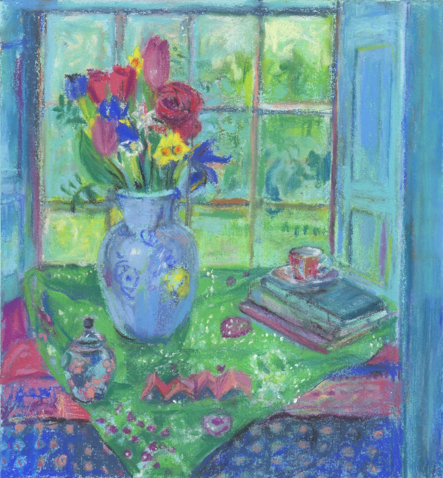
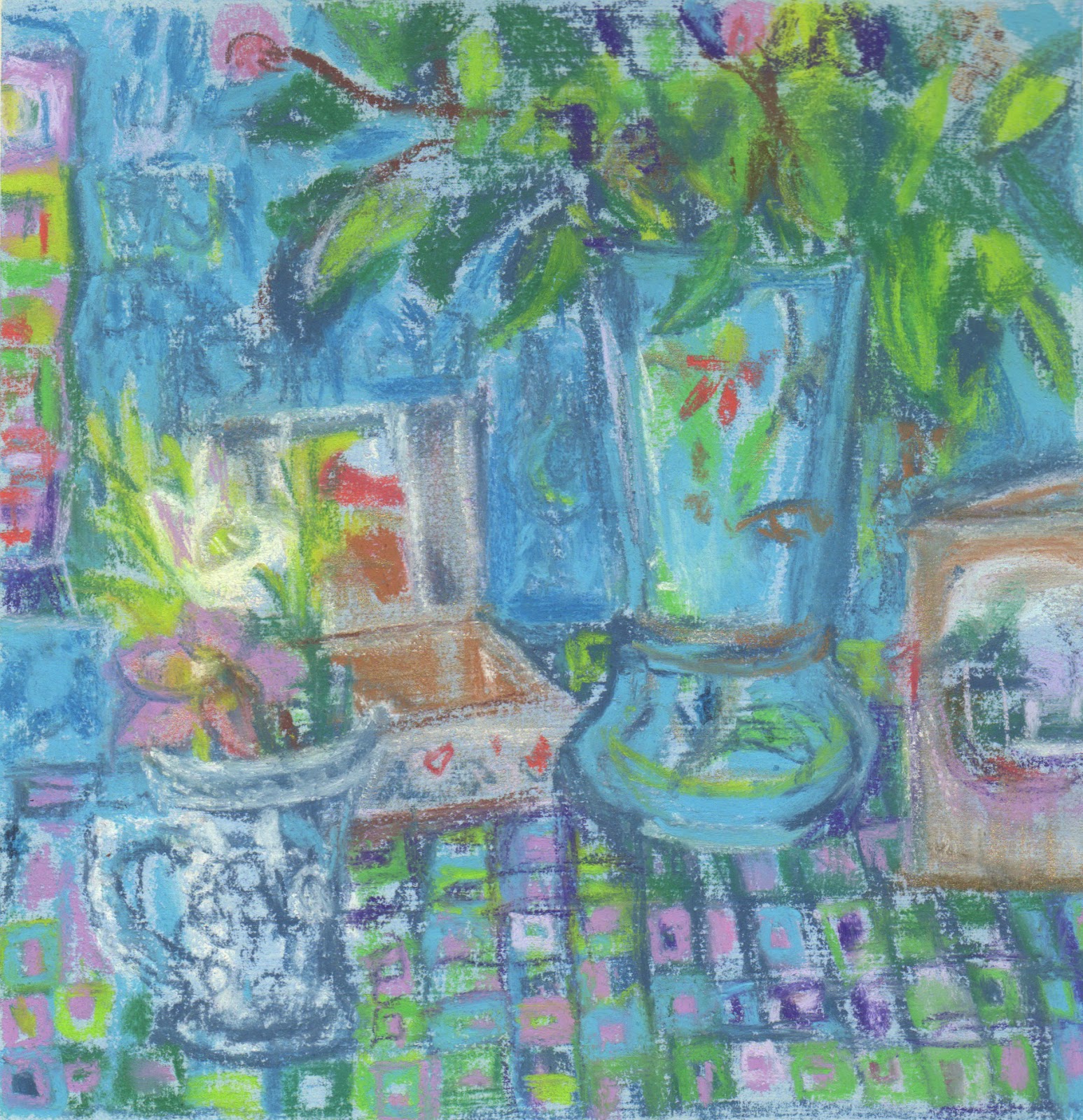
A few days ago I picked a bouquet of leaves to put in my new Opaline vase that I bought months ago at the Boule-In (Bildeston), and put in the 'Christmas closet'.  (Vases are one of my weaknesses, I can't say no to a beautiful vase…) The bouquet dried out in the kitchen but as it sat there I thought about what you do with just green, Today when everyone went out to Bury, I took the vase, picked some new leaves chose three different pieces of patterned blue fabric, and placed, removed, and moved objects that I found in the studio around on my set up: two boxes stacked on a chair with a board on top. I decided I needed a hellibore for height, for colour and for shape to finish off the composition. I looked at John Mcallister and thought about Matisse and Diebenkorn and waited to see what would happen on my 16 x 16 cm piece of paper that I had painted with some pale blue pastel ground I mixed.

I saw this a a preliminary drawing for something a bit bigger.  The next drawing is going to be rectangular and I will include more of the space, as that is what my three mentors would do.

Monday, January 9, 2017

Processing and experimenting

A visit to the botanics Glasgow 23 x 23 cm
gouache, watercolour and methyl cellulose on paper with fused plastic frame

Over the holdiays I had absolutely no time to work. I did look, mess around on my new iPad and explore mount cutting with my new tool. I also made more re-fused plastic badges. On one of the early mounts, I ripped the paper on the good side of the mount and that led to me to thinking about flipping the approach to framing that I had been exploring with my fused plastic.  In recent fused plastic the inside image was stitched fused plastic while the frame was painted.  I wondered whether the reverse would be equally interesting. 

One of the highlights of our trip to Glasgow was a visit to the Botanic Garden. 

As you might imagine, I am a big fan of the work of John McAllister https://www.artsy.net/artist/john-mcallister.  His colour, the way he uses frames and his use of pattern delight me! 

So all of that together was how I began to get back to work again, a little over the weekend and more today. I can't decide if it works or not.

Saturday, December 3, 2016

Two more from the Radio 3 series

My winter open studio was lots of fun!  I had a decent crowd of enthusiastic supporters on the preview evening and a couple of handfuls over the other two days. The most exciting thing was that all four of the framed pieces from the Radio 3 series sold!  These are the other two I framed. 

I 'curated' the show by putting words near the 'exhibits' This is what I said about the radio 3 fused plastic collage and stitch pieces:

Although I love to draw in black and white, colour makes my heart sing.  I feel that I solve problems while I am doing other things, so I began to wonder how what I listen to might influence what I am making.  This series of fused plastic collages were made while actively listening to Radio Three.  Radio 3 – I and II began with a Bella Bartok piece. What I found was that my process is longer than a piece of music, obviously, and in the end the fused plastic piece demands what it needs, so I begin to actively not listen. I would like to explore this further, perhaps looping music and actively listening throughout.


Monday, November 14, 2016

What do you focus on in 15 minutes?


Sue, who has organised and modelled for our life drawing group since it began more than 20 years ago, has been asking for 15 minute poses lately. Fifteen minutes is long enough to get alot down but for me, it is also enough time to tighten up and lose the energy of the pose. Drawing is such a relational thing, with every mark the betweenness narrows and it's easy to mush all your marks into something similar. Today I was thinking about the mark making in particular.

I began with a black and white drawing but aimed to work in colour for the session.  Esme, the model, is angular and although beautiful to draw, her poses can feel a little more posed than some of our veteran models. Her first few poses were standing and getting the model onto a square piece of paper without making her diminutive is always tricky.  Some people insist on getting all of the model in the frame.  I was taught that that wasn't essential, and for me it's all about the shapes. Each of the drawings is about 15 cm square on prepared cartridge paper.  Some have schminke pastel ground mixed with a bit of acrylic.  In others I have rubbed pastel into the paper and fixed it with surgical spirit.

I've put the drawings up in the order they were made. Each was a 15 minute pose.


Friday, November 11, 2016

On a Winter's Day Magic the Sun

This week has been a gloopy one.  I've been mired in admin and in a fog since the election. I have been getting lots done, but it has been unsatisfying stuff and I have barely done any real work.  Today was pre-selection day for the 2017 Pastel Society Exhibition and I always get butterflies in the run up to noon, so I did a little more admin and then took Lyra for an early walk, I was pretty convinced I wouldn't be able to work well just then. 

To be fair, it was a beautiful cold day and Suffolk couldn't have been more exquisite, but although I love the seasons, I know which seasons I like best. 

When I got back I logged on and found that this year I had both of my drawings pre-selected.  I call this 'art tax' because it means I have to pay even more to get them framed and to take the stuff down to London.  As faar as I can tell, so little of what is pre-selected gets through because priority goes to Pastel Society members. Nevertheless, obviously I was delighted!

I wanted to make two prints today.  Jo Hollis, framer extraordinaire, has cut me 8 mounts and I only have three prints ready to put into them. I am imagining a wall of mini prints as one of the 'exhibits' for my open studio. When I began this mini print I tried to feel the heat on my back and to magic another time of year in the zinc.

Tomorrow is the opening of the mini print exhibition in Bury St Edmunds and I'll be heading over.

Monday, November 7, 2016

Trial & Error in LIfe Drawing

Oops, I forgot my roller again today so the monotypes are greyer than I like. I was working on a small plate 7.5 x 10cm today, though, so I was able to be more exact than I usually can be in a 15 minute pose. 

When I make monotypes the marks I make become one of the key aspects of the work. In another 15 minute pose I made the drawing on top first and then spent the remaining five minutes being specific about the marks.


In a drawing session a few weeks ago, I remembered my roller but the first print was disappointing, the plate was beautiful, but the print was a let down.  A few days later I rolled some release agent onto the plate and although it is weak in value, it has more of the feel from the plate.

Sometimes working back into a failed print or drawing gives me a head start for a different drawing.  Originally this was a print of another model.  I put some clear gesso over it and worked back in with pastels.  although I am not convinced of the colour, the overall feel is much better than the original failed print!

Sunday, November 6, 2016

Beginning the Radio 3 Series


I usually listen to Radio Three while I work. I don't know what's coming next and sometimes I actively try to ignore what is being played. When I lived in Kenya, I would listen to opera loudly on my walkman to block out the bugs that flew in my face as I drew.  I didn't listen to the music, it was more of a wall of sound to help me respond to what I saw.

I began these collages with two things in mind.  I wanted to combine fused plastic and paper in colour studies related to the music I was listening to. It was Bartok.  I worked on one piece of plastic and then cut 2 pieces of A6 from it as a starting point for the two collages. In the first collage, I chose my paper before I began fusing the paper. I wanted orange. In the second I found the paper later. There was quite a lot of serendipity in my process and pulling it all together was the challenge.