 |
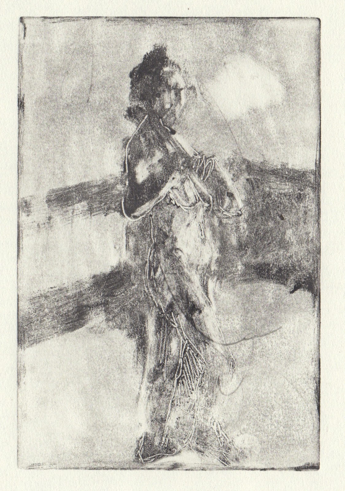
| Snow Light, monotype: akua intaglio on Heritage paper, 10x15 cm |
Tuesday, February 27, 2018
Snowday
Sunday, February 25, 2018
Pin the colour down before it fades
 |
| Reduced Flowers, pastel on paper 15 x 14 cm, pastel on paper |
The orange under the jam jar is a pair of PJs I bought from Anthropologie in their reduced reduced sale - I have been meaning to hem them for years, literally. The pattern to the left at the top is a scarf I got at a charity shop last year and the fuscia on the right is an Indian top that I got at the car boot a few years ago. The green cup was an early wedding present from Patrick when we'd first moved to Singapore. The purple is a placemat I bought in Rome. There is a cheese knife from south Africa on it and the book came from a used bookstore in the Southwest.
This small drawing took most of the day. In the past I might have stopped when it was freer and created the mood without pinning everything down. Perhaps I will return to that approach. Tomorrow when the sun comes up I will look again at the right of the jam jar lid.
Saturday, February 24, 2018
Colour of Morning Dog Walk


Sometimes when I walk I can't help but exclaim about a particular light or the slant of the horizon and recreating that was the goal. In the top monotype I rolled a bright pink over the plate and wiped and painted back in colour, thinking of Milton Avery. On the bottom this is the second pull. The first was nightlight and I wanted to find the light of cold in this one. The cold is coming!
Thursday, February 22, 2018
NO need to go far for inspiration
 |
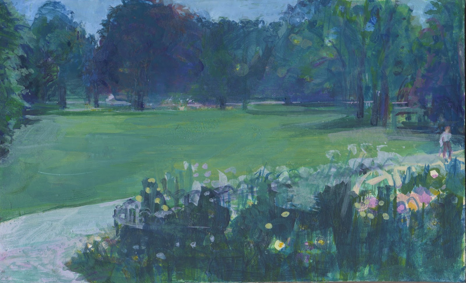
| View from Front Garden, pastel on paper, 14 x 15 |
I've been reading more of the Jason Gaiger book, thinking about how we read the marks on the page and whether denotation comes first. I suspect everyone can recognise that cold wintery sky.
Now maybe I will make those monotypes!
Wednesday, February 21, 2018
A few more from life


Sunday, February 18, 2018
Instead of daily pages…

Every morning we walk Lyra, rain or shine in some direction and home. On Saturday morning there was some spectacular ground fog rising up as the sun began to glow. I took my camera, something I rarely do and took some pictures as we walked, to have reference photos but also to focus my mind on what was special about this day at this time.
In the past I have drawn from photos by projecting them on the wall. I've used charcoal when I've done this and have tried to feel as if I was in the place where I took the photo, as I've drawn. This time, I used six dilutions of ink and thought about the value of what i was looking at. I used postcard sized photos I printed as reference. the ink is from the Works. I suspect I should buy something a little stronger, but for this it worked.
I thought about some of the things Neil Pittaway had shown us and talked about and worked at evoking the feel of a dog walk in the morning, not getting bogged down with making things 'right' just finding the feeling.
I worked on the ink sketches (A4 size) around our visit to Tina and Christopher's (for lunch) and again this morning. On Friday and Saturday my friends were talking about how they use 'daily pages' to begin their days. We walk Lyra and I think visually and it feeds into what I do.


Thursday, February 15, 2018
The Continuous attempt to solve problems from every angle.
 |
| Swallow Time, oil on prepared book page, (painted area 15 x 10 cm) |
First I found some book pages, glued then gessoed them and then I rearranged things from the previous pastel. This is something I do now. I try to finish what I start, ignoring structural elements if I can make things work and then look at what I've done and do it again differently. Matisse did that.
So the things in my head today were:
- use more paint
- don't fiddle (use a big brush)
- mix the exact colour to begin with and lay colours right next to each other
- use lots of variety, pace things
- design the page and use value to effect
- Dorothy Eisner
I am more purposeful. Working across media and in different ways leads to very different outcomes. Scale matters. Composition changes radically depending on the shape of the paper.
Wednesday, February 14, 2018
Hellebores and China Value and Design
 |
| Hellebores and China, pastel on paper, 46 x 42 cm |
I've been wondering about what kinds of objects people want to look at and whether that even matters… in other words is it truly about the colour and shape? And will naming things detract or enhance the viewer's experience? Would it work better if that orb ( a detail of the kimono) floating over the figurine's head was removed or is that shape interesting? What if the figurine had a differnt recognizeable face?
For me it all comes down to love. Can you feel the love, delight and story that got hold of me while I was working?
You can find the video that I mention above here:
https://art2life.lpages.co/value-with-motivation-intro/
Sunday, February 11, 2018
revisiting St James' Park
 |
| Final version St James' Park, egg tempera on panel, 26x16 cm |
Having had a few sessions working with egg tempera lately, I decided to revisit the panel I began with Ruth Stage back in June 2017. Ruth introduced me to working with egg tempera. Anthony Williams who also works in egg tempera held an NEAC workshop at around the same time, but his was a portrait drawing workshop. The two artists work is very different ways and with any media it's up to the person working with it to find something to say that the media enhances.
The picture above is the new version of what you see below, which was begun in the Mall Galleries learning centre. I worked from a drawing I made at lunch time and only had about 2 1/2 hrs to begin to find my feet with a new media and to find something to say about St James' Park. Not having the information in front of me (referring to a drawing instead of working from direct observation is always difficult for me but John Dobbs reckons you need to just fight through all those uncomfortable feelings to find something worthwhile and authentic to say. All I know is, I I have been moving the panel around the studio and wincing every time I caught sight of it, so I knew the process was going to be prickly but was absolutely necessary!
 | |
|
and Anthony Williams' work here:https://www.antony-williams.com
Before I began I looked at a few people to find direction, found my original pastel drawing and printed off a black and white version of the photo I took of the scene after I finished my drawing.
What I looked at for inspiration was images by Wolf Kahn and Thomas Lamb:
 |
| Wolf Khan, by Justin Spring, p 143 |
 |
| Thomas Lamb, Browse and Darby catalogue, 2017 |
I also read this article and bought a cheap pack of cosmetic sponges to exxperiment with 'smoother transitions'. http://www.kooschadler.com/techniques/Transitions-Egg-Tempera.pdf
I worked for most of the day, going in many different directions, sanding, scumbling, glazing, cross hatching and eventually found something to say that felt like me and reminds me of my monotypes. Phew.
Wednesday, February 7, 2018
A day of portraits
 |
| 1st pull Stacey, akua intaglio on paper 10 x 15 cm |
 |
| 2st pull (with added ink) Stacey, akua intaglio on paper 10 x 15 cm |
 |
| final print (press and release agent) Stacey, akua intaglio on paper 10 x 15 cm |
I covered a board with cling film (which I had brought) to use as a mixing tray as I had forgotten those.. I didn't have my spoon or barren so used the back of a fingernail brush and then a metal teaspoon to transfer the print. Carol doesn't have water in the studio so I had eggy hands after separating the yolk but it's amazing what you can ignore!
David posed first and I used my traveling egg tempera kit. He is very still. I used lots of egg yolk, working from blocks of colour to more detail. Because I didn't have a big area to mix colour on and because I had carried the loose pigment and some had intermingled, it was difficult to keep the colour fresh. We all find his beard difficult to deal with. I thought about Anthony Williams and wondered whether I should find out what other artists do.
When Stacey arrived I needed a new egg yolk and this time I had one of my hen's eggs. The yolk was much yellower so everything became more brown; this was a surprise. Stacey moved back from her forward leaning position and I had to stop as everything changed.
The series of monotypes followed.
 |
| Stacey, egg tempera on prepared panel 16 x 23 cm |
 |
| David, egg tempera on prepared panel 16 x 23 cm |
Tuesday, February 6, 2018
Plastic after plogging

It is: 'a new pastime taking off in Sweden that sees people going for a jog, and at the same time picking up litter. You pick and you jog – hence the term ‘plog.’
Yesterday I was running with Lyra and found two 'hedge balloons' which I stopped to collect and stuff in my poo bag. I am a plogger. Who knew? My eyes are always peeled for that perfect piece of plastic…
In general my plastic comes from a few different routes: people bring me plastic; I save obselete plastic that I get in my life and I find plastic when i walk and run.
This collage began with some red I got from a friend. It suggested Matisse to me as I moved forward. It didn't come easily but when I'd finished, I knew it was done.
Saturday, February 3, 2018
A week of working across media
 |
| Sound of Alcina |
 |
| C of plastic |
 |
| Sorting Plastic |
You'd laugh if you walked into my studio… it is about as chaotic as it gets. I am literally stepping on top of plastic. Things are balanced all over the place and I have many tea cups, some still full, scattered.
I seem to be moving from one idea to the next without a pause. Yesterday I was in London all day so today, after showing the recent egg tempera to Mick and Louise for feedback, I had some ideas and wanted to work on another panel to test them out.
Yesterday I drew in Trafalgar Square in my silent traveller in london sketchbook after spending a very enjoyable few hours with Fig's friend Jonny and went to life drawing with Mick.
 |
| Panel 2 (day 1) |
 |
| Matthew, monotype |


 |
| 5:45 pm Trafalgar Square |
Thursday, February 1, 2018
Exploring The Surface with Egg Tempera

I had forgotten that my previous experience of egg tempera was quite frustrating. It made me even tighter than I can be. That time, I worked from a drawing, which is always hard for me. I decided to think of this experiment as drawing with a brush rather than painting. I don't have tons of pigment. Some of it is from limewashing the walls when Earth and Reed were in Needham Market. Some of it I bought when I was wanting to use lime plaster on wattle and daub as a support, years ago. When I didn't have a colour I needed I took a bit of a broken pastel and crushed it in my mortar and pestle. I had no cadmium yellow, for example. That seems to work. But I should get a good red and a good yellow for the next panel. I discovered that a Q-tip is good at rubbing back to the support white colour. I learned that light on top doesn't seem to work, unless it's naples yellow. I used those pieces of glass from the IKEA frames leftover when I changed to UV glass, as palettes.
I worked pretty randomly, not knowing much and wonder if I went from bigger to smaller, which I kind of did, might result in more variety of strokes. That's what Anthony Williams does. Maybe you could focus the eye differently that way.
I began in the morning yesterday and then painted again last night - even though the light was totally different, finishing it off in today's light. Probably because of the colours and the brushstrokes (to me) it evokes Gaugin, or one of the Bloomsbury bunch. It's fascinating the way materials change the way you see, work and express yourself.
Subscribe to:
Posts (Atom)


