It's all so subjective… the way a painting can reach down into you and make you feel something. Yesterday I visited the Royal Society of British Painters for the private view. I have two pieces in the show and it was fun to see my work on the wall and watch people looking at them, reacting to them, but it was also a chance for me to see the work of those I admire and to speak to a few of the artists to say how much I am inspired by their work. I have chosen a few which, for me, are exquisite pieces of visual story-telling to share. If you can, go to the exhibit which is on from today through the 29th of Feb. You can see the catalogue here: https://www.mallgalleries.org.uk/whats-on/exhibitions/royal-society-british-artists-303rd-annual-exhibition-2020
 |
| Briget Moore |
 |
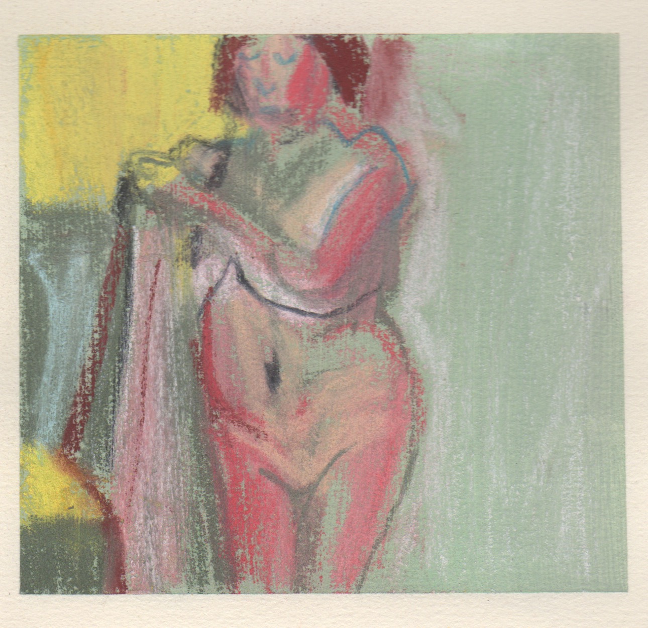
| Bridget Moore |
Bridget Moore, above, tells stories about memories from childhood. As I peer into the windows of her past I am the child and feel my arms stretch, the hoop go round and hear the dog barking. Her beautiful sense of colour, texture, form, composition… these very strong, yet small, paintings stir me.
 |
| Robert E Wells |
Robert Wells made one of my favourite paintings at last years' exhibition and this year his painting of his daughter was one which my family and I returned to often. He uses paint in a way that tells stories we can all remember too. He also evokes an age of painting and a fight with paint that makes his message especially poignant.
Below are two paintings by Alan Lambirth, but they are not the paintings in the exhibition. Alan doesn't have a presence on the internet, his work is not in the catalogue or in the online catalogue, so you will have to go to the exhibition to see his beautiful, beautifully framed vignettes of life. I think his work is all on the small wall, around the corner from my work. Like everything I am showing you, I would have any of his on my wall!
 |
| Alan Lambirth |
 |
Alan Lambirth Winner of the Michael Harding Award II
'Afternoon Tea' |
 |
| Richard Sorrel |
Richard Sorrel captures humanity with all its flaws. His gestural people are both beautiful and amusing. Richard works on a small scale and on a large scale!
 |
| Shanti Panchal |
Shanti Panchal evokes a world where the light is brighter and even the more mundane becomes exotic. I love his sense of colour, the way he builds his surface and how he can conjure a place with a face.
 |
| Melissa Scott-Miller |
Melissa takes apart london life and reflects it back to us so we are part of it. I have watched her work and her process is unique and results in these slices of London life that are instantly recognizeable and tell her story and our story. Up close the detail and the way she dabs paint unlocks a unique vision.
 |
| Annie Boisseau |
When I think of Annie Boisseau I think of smaller oils painted on board. They are each little gems. This luminous oil on canvas stopped us all in our tracks, though… It is bigger and what colour! Annie sketches outside and works in her studio to paint. The quality of light, the abstracted nature of the paint blend to create a place that you want to walk into.
John Pryke does something similar with pastel. His sky makes me look up at all skies, to feel I am there during the day and to promise to look harder the next time I am out at night.
 |
| John Pryke |
by Alan De Boton and John Armstrong which postulates that one thing we find in art is what we don't have, or what we need in order to balance ourselves.
When I talked to Alan and Bridget we all agreed that you do what you do. When I bumped into Mary (in front of Bridget Moore's work) who I met at a course delivered by Daniel Shadbolt, we agreed that there is something special in ambiguity.
 |
| Rebecca Moss Guyver - Colour of Dahlias after Frost |
 |
| Rebecca Moss Guyver - We Three Kings |
 |
| A crush of visitors at the Mall Galleries |
Hope you get a chance to visit this wonderful show! there was much much more that I liked and loved. I'm sure you will find your own too.