Saturday, December 3, 2016

Two more from the Radio 3 series

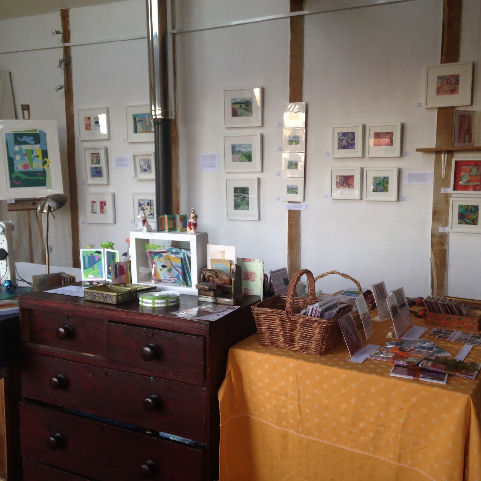
My winter open studio was lots of fun!  I had a decent crowd of enthusiastic supporters on the preview evening and a couple of handfuls over the other two days. The most exciting thing was that all four of the framed pieces from the Radio 3 series sold!  These are the other two I framed. 

I 'curated' the show by putting words near the 'exhibits' This is what I said about the radio 3 fused plastic collage and stitch pieces:

Although I love to draw in black and white, colour makes my heart sing.  I feel that I solve problems while I am doing other things, so I began to wonder how what I listen to might influence what I am making.  This series of fused plastic collages were made while actively listening to Radio Three.  Radio 3 – I and II began with a Bella Bartok piece. What I found was that my process is longer than a piece of music, obviously, and in the end the fused plastic piece demands what it needs, so I begin to actively not listen. I would like to explore this further, perhaps looping music and actively listening throughout.


Monday, November 14, 2016

What do you focus on in 15 minutes?


Sue, who has organised and modelled for our life drawing group since it began more than 20 years ago, has been asking for 15 minute poses lately. Fifteen minutes is long enough to get alot down but for me, it is also enough time to tighten up and lose the energy of the pose. Drawing is such a relational thing, with every mark the betweenness narrows and it's easy to mush all your marks into something similar. Today I was thinking about the mark making in particular.

I began with a black and white drawing but aimed to work in colour for the session.  Esme, the model, is angular and although beautiful to draw, her poses can feel a little more posed than some of our veteran models. Her first few poses were standing and getting the model onto a square piece of paper without making her diminutive is always tricky.  Some people insist on getting all of the model in the frame.  I was taught that that wasn't essential, and for me it's all about the shapes. Each of the drawings is about 15 cm square on prepared cartridge paper.  Some have schminke pastel ground mixed with a bit of acrylic.  In others I have rubbed pastel into the paper and fixed it with surgical spirit.

I've put the drawings up in the order they were made. Each was a 15 minute pose.


Friday, November 11, 2016

On a Winter's Day Magic the Sun

This week has been a gloopy one.  I've been mired in admin and in a fog since the election. I have been getting lots done, but it has been unsatisfying stuff and I have barely done any real work.  Today was pre-selection day for the 2017 Pastel Society Exhibition and I always get butterflies in the run up to noon, so I did a little more admin and then took Lyra for an early walk, I was pretty convinced I wouldn't be able to work well just then. 

To be fair, it was a beautiful cold day and Suffolk couldn't have been more exquisite, but although I love the seasons, I know which seasons I like best. 

When I got back I logged on and found that this year I had both of my drawings pre-selected.  I call this 'art tax' because it means I have to pay even more to get them framed and to take the stuff down to London.  As faar as I can tell, so little of what is pre-selected gets through because priority goes to Pastel Society members. Nevertheless, obviously I was delighted!

I wanted to make two prints today.  Jo Hollis, framer extraordinaire, has cut me 8 mounts and I only have three prints ready to put into them. I am imagining a wall of mini prints as one of the 'exhibits' for my open studio. When I began this mini print I tried to feel the heat on my back and to magic another time of year in the zinc.

Tomorrow is the opening of the mini print exhibition in Bury St Edmunds and I'll be heading over.

Monday, November 7, 2016

Trial & Error in LIfe Drawing

Oops, I forgot my roller again today so the monotypes are greyer than I like. I was working on a small plate 7.5 x 10cm today, though, so I was able to be more exact than I usually can be in a 15 minute pose. 

When I make monotypes the marks I make become one of the key aspects of the work. In another 15 minute pose I made the drawing on top first and then spent the remaining five minutes being specific about the marks.


In a drawing session a few weeks ago, I remembered my roller but the first print was disappointing, the plate was beautiful, but the print was a let down.  A few days later I rolled some release agent onto the plate and although it is weak in value, it has more of the feel from the plate.

Sometimes working back into a failed print or drawing gives me a head start for a different drawing.  Originally this was a print of another model.  I put some clear gesso over it and worked back in with pastels.  although I am not convinced of the colour, the overall feel is much better than the original failed print!

Sunday, November 6, 2016

Beginning the Radio 3 Series


I usually listen to Radio Three while I work. I don't know what's coming next and sometimes I actively try to ignore what is being played. When I lived in Kenya, I would listen to opera loudly on my walkman to block out the bugs that flew in my face as I drew.  I didn't listen to the music, it was more of a wall of sound to help me respond to what I saw.

I began these collages with two things in mind.  I wanted to combine fused plastic and paper in colour studies related to the music I was listening to. It was Bartok.  I worked on one piece of plastic and then cut 2 pieces of A6 from it as a starting point for the two collages. In the first collage, I chose my paper before I began fusing the paper. I wanted orange. In the second I found the paper later. There was quite a lot of serendipity in my process and pulling it all together was the challenge.

Saturday, November 5, 2016

Leftover scrap experiments and the funny bunch

Figgy has been making badges.  You can see and buy them here: https://www.etsy.com/uk/shop/TheMineralFact?ref=shop_home_edit.  

As you will know, my mum makes all sorts of textile wonders, including her gorgeous beads that I have been inspired by and drawn from many times. Remember the Turquoise Muse? 


And then there's my sister with her zentangle beads too! 


What with Christmas approaching and an open studio coming up, my fused plastic scraps have been haunting me. Yesterday I put some of them together to make badges!


Aren't we a funny bunch!


Thursday, November 3, 2016

Objects or Colour? How Do We Connect to Imagery?

Haw Red Apples 18x18 cm pastel on paper

It's the last chance to choose an image for this year's holiday card, so today's challenge was to produce something that might be suitable. Last year I bought a poinsettia, yesterday I picked up the reddest apples I'd ever seen, on my walk through the orchard. So this year I thought I'd try a colour study still life.  As I selected the patterns and colours and then my pastels, I couldn't help over-egging the batter.  For me, colour is more important than objects in suggesting the joy and excess of December.

For the ground, I cut a piece of Fabriano to about 20x 20 cm.  I mixed some pigment and clear gesso in a shimmering raspberry square. I allowed myself more pastels than usual.  The really loose phase of the drawing was strong and then I went through  a disappointing phase until I ended with this.

Wednesday, October 26, 2016

The Time of Year for Dahlia Love

Orchid and Oriental
I've been getting work ready for a few upcoming group shows.  The Sentinel wanted pastel still lifes and it's that time of year when there isn't so much left in the garden besides the dahlias. This year my zinnias and roses have lasted until now too so there is some variety to the shapes. And for once I don't have to make excuses for grabbing the magenta when I choose my pastels.

Pinks and Greens
I'm trying to make my pastels a standard size, for framing purposes, but clearly mis-measured the top drawing.  The bottom is 16x16cm. Another observation is while the pastel spread on the top drawing in a buttery manner; I found the pastels I chose, or perhaps the pastel ground I chose in the bottom would only let me apply scratchy marks. I will always be a beginner!

Sunday, October 23, 2016

More Mini Prints

Weather Over Pear
Today I wanted to try making a few more prints.  My Akua Intaglio was a mess.  I am not the tidiest painter with ink and rarely wash my brush adequately because it is that little bit more difficult than swilling it in water.  I keep my inks in coasters and stack them to store them. Just setting them up makes my hands filthy.

I decided to refill and straighten the inks out with a palette knife before begining.  It took me over an  hour to complete this bit of housekeeping but during the process I realised a few things.  The inks had air dried to such an extent that they were much more like oil ink and had been behaving that way more… once they were cleaned up they were runnier and don't hold the line as well.  OOPS. The other thing I learned/rediscovered is that  I can mix bespoke colours using Akua pigment with blending oil, so I made a few colours. The blue int he sky is now a sky blue ready to use.
Chartreuse Light on Blue
What's nice about working this small is it is difficult to spend more than a few hours on a print, so in a day I had made two prints. Among other things, I am aiming to produce eight mini prints for my.  I'm not sure which print to send to Lesley at Red Dot to replace the print that sold, but I'm reconfiguring spaces on a small scale.

Thursday, October 20, 2016

What sticks in your mind

Jerusalem Artichoke & Opaline
I spend a little time most days on Pinterest.  I love finding new images and seeing how people resolve colour, light, composition, paint and drawing issues.  Sometimes an image sticks in my head for a long time.  Visual things sticking in my mind used to come from  the landscape, what I saw in my immediate environment, photos, paintings in galleries and museums.  Now there is so much more to look at and make sense of. I think I solve problems in the background for more of my day now. It's not that I am thinking about them, they are there in the betweenenss of my brain.

I have a deadline to get more work done so last night I went into the garden and cut two bouquets.  It was too dark to work then, but I looked at them and thought about a pinterest album I'd seen that morning of yellows.  I had filled the bouquet out with a few stems of jerusalem artichoke flowers. When I went to set something up to begin with, all of that stuff was stuck in my mind.  As I chose my colours Ivor Hitchens was tyhere helping.  Not really, obviously, but as I began working I thought of one of his bouquets.  The opaline vase is one of my flea market treasures.

Wednesday, October 19, 2016

a crazy quilt of colour

I came up with this way of making my cards a few years ago and now when I get low on cards, which has happened often recently, I get to make more. 

One of the 'stations' in my studio is my sewing machine.  Another 'station' is a temporary, very chaotic station, the plastic station.  I also need my printer and my computer. 

When I finish a series of cards (I often use a particular colour of thread per series), I put them in one of my vintage tins, ready to take to the next event.

Monday, October 17, 2016

Experiments with AKUA


Emily Looking left: monotype 10x15cm, Akua ink on zinc
Emily On the Stool monotype 10x15cm, Akua ink on zinc

First time back at life drawing for the season.  I arrived having forgotten my elevated drawing board so was stooping over the table. I had packed in ten minutes, throwing in a little of this and little of that.  I grabbed my traveling watercolour set at the last minute.

I had a big long table to myself; this is unusual, so I was able to spread out.  Sue organised Emily into ten minute poses and I decided that would be enough for some monotypes. I had forgotten my roller and I mixed greys with white and black for the first few.  They weren't very strong.  For the third print I decided to see what would happen if I used my watercolours with the AKUA ink. I diluted it with water and blending oil and painted it onto the plate, which I had rubbed release agent onto (leaving the ghost underneath). I mixed ink with watercolour, wiped areas away, used my fingers to dab. Logically it shouldn't have worked, but it did.

For, the final monotype of the day I worked only in black, but my palette was filthy and I seem to have picked up a bit of a pinky tint. By this point I was finding drawing backwards easier and someone in the class  had challenged me to put the whole body in the image.  Initially I wasn't all that interested in the pose, but the more I looked the more I saw.  This was almost a half hour pose and as sometimes happens, I seemed to channel Matisse.

Friday, October 14, 2016

Regrowth and Sky

Regrowth and Sky 7.5 x 10cm monotype
What I have noticed since returning from Maine is the verdancy of the fields, the brighter green and the angry sky. A few days ago while walking Lyra I was caught in a a surprise shower.  You could see the rain off in the distance as I set off and it caught me while on the back side of the farm. The weather seems to move fast and I half-expected a rainbow. 

The good news is that I sold one of my mini prints at the East Anglian Mini Print Exhibition and Lesley  (the curator) from Red Dot will be moving it to a new space in Bury St Edmunds in November.  She wants a new print. 

Early this morning I prepared some new plates, I took the ones I'd made earlier in the summer to Maine and didn't bring them back… Preparing the plates entails cutting some of them to size and filing the sides.  After that I tried to approximate the feel of a walk with the October weather and the green that dominates as the wheat comes up in Akua Intaglio ink, drawing backwards, of course.


Thursday, October 13, 2016

How do you deal with the ROMANCE OF A MOMENT

pastel over prepared book pages 20x20 cm
A few months ago I was going through my digital photos looking for something.  In the midst of my search,  I found a photo of Figgy that I had taken while she was cooking, a few years ago. I printed it out and left it on my work table, moving it to the side, propping it up, being with it but never doing anything with it.  I didn't know what I was going to do with it although I wondered if it might inspire a monoprint.

When I draw with pastel, I rarely use photos, but when I do I convert them to black and white so I am not hindered by the actual colour that is in the photo.  Yesterday afternoon, my first FREE moment in most of the past few months, I picked up the photo, chose some book pages I'd glued together and gessoed months before and painted the pages with a pale blue pastel ground.  Once it had dried,  I started to draw from the photo. The photo was rectangular so I cropped it in my mind before I began. What I didn't do was draw a black and white drawing first or convert the photo into a black and white image.  I drew from a colour photo. As the drawing progressed I struggled with the usual problems, trying to keep it loose enough not to kill it, editing it, letting the drawing decide what colour needed adjusting.  

I think the strength of the drawing is in the composition.  I may try to use the drawing to paint from.  I think an opaque jug on the left side would strengthen things.  I like the way the text makes delicate lines through the white of the shirt. And then I ask myself, is it too romantic to be strong?

Thursday, October 6, 2016

Back to Base

 Dahlia Joy and Plates
While cleaning up after readying myself for a few days in schools, I found some unwrapped items in a bag that I had bought sometime in the summer.  These virgin pastels have been calling to me ever since I found them, a few days ago.  I haven't had a moment to settle down in the studio after returning from Maine.  

Today I finally had an afternoon and even though I also wanted to get out my plastic, catch up on mail art and PAINT, once I'd picked a late summer bouquet it was obvious it was time to make use of those pastels.  THE JOY OF A LATE SUMMER BOUQUET…

There were seven of the the new pastels and I let myself use them all and then added a blue, a white and a chartreuse.   The shapes and colours behind the bouquet are heightened and not necessarily as they were. I would have gone on drawing longer but the light in the scullery made it impossible; perhaps as a result this feels loose and playful.

Friday, September 16, 2016

The Palette of Autumn

From Porch to Weibels, 4 3/4 x 5 1/2" pastel on book page
The first thing I do when I begin is to compose the image with my hands. Sometimes I realise I need something more to make the composition interesting, or a colour to move my eye around.  This view was very green and I had prepared a book page that was slightly horizontal. What I wanted was something slightly portrait, so I began imagining how I could jiggle reality to make the compostion work but be believable. Then I went in to select something colourful to hang over the porch. 

I chose my colours after that, I ended up with 12 colours and white. I'm blending colours on the page more than I used to and I seem to be working a bit closer to the colours I see. You need yellow greens and reds at this time of year and that's fun to explore.

Thursday, September 15, 2016

Off Season Views

From Kathy's Garden, Pastel on paper 6x6"

When I was a child I came to Maine off season as well as in high season. In the winter, early spring and thanksgiving my friends and I would roam everywhere and the island felt like we owned it.  Coming to Cranberry off season, (but only just) and as an adult I find that I am tempted to look for new views, from places I would usually need to ask permission to draw from.

Today I walked down to Kathy's and stood near her porch.  It was hot and bright and clear, late afternoon and I chose eight colours. Again I wished I'd had another green but resisted.  Donna came down to 'keep the garden alive' and at about 5pm I felt the betweenness come together and I walked home. 

Wednesday, September 14, 2016

Finding the balance in shifting light

From Deck to Barn, pastel on paper 6 x 6"


On a sunny day, midday, the light paints lines across the grass as quickly as you can note them in pastel, and then they shift. 

The way I work is to get an overall impression across the page and then to measure the betweenness over and over until the whole thing feels right. That shifting light is a real challenge. And which moment to try to freeze time is always the trick. I read somewhere that you could tell the weather by Constable's skies.  My time and light is not nearly as exact and I am really interested in the colours and the shapes, not recording things accurately so much. My time is a shifting time. 

Today I enjoyed the loose way I was seeing things.  Before I began I decided to foreshorten the lawn as a compromise to composition.  Perhaps letting go of the reality helped. I chose 7-8 colours and didn't add anything even though I longed for more diversity of green.  Limiting helped me today.
SaveSave

Monday, September 12, 2016

Under the Apple Tree 6 x 6" pastel on paper
I'm back in Maine, enjoying the riot of colour around me: the backdrop of the sea and the plants. Today I picked a bouquet from my mother's September garden, fashioned a table under the apple tree and sorted out the chaos of colour I had arranged.
Dahlia an Blue Hydrangea 6 x 6" pastel on paper
When I arrived I stood with my back to the left of the oven, delighting in the plants on the island and the light pouring in through the kitchen window.
Light on Livingroom Floor 6 x 6" pastel on paper
On another day it was the light on the wood floor and the kantha's hung over the folding screen that stopped me in my tracks.

Thursday, September 1, 2016

The Art of Acadia


I was very excited to receive my copy of The Art of Acadia yesterday and have barely had time to peruse it, let alone read if from cover to cover, but I can't wait to do that! Carl and David Little have put together their map of artists who have brought Acadia (Maine) to life over the years and they included me and one of my drawings!


Monday, August 22, 2016

Mini Monotypes of Suffolk at the East Anglia Mini Print Exhibition

Delighted that all three of my mini prints were accepted into the East Anglia Mini Print Exhibition which will be held at the new Garage Gallery in Aldeburgh, Suffolk. The exhibition runs from 23-28 September at:

The Garage Gallery
152 The High Street  
Aldeburgh Suffolk

Opening Times
Fri 23  -  11am - 7pm            Mon 26 - 11am - 5pm
Sat 24  -  11 am - 7pm           Tues 27 - 11am - 5pm
Sun 25 -  11am - 4pm            Wed 28 - 11am - 3pm

Lesley Jackson, from Red Dot art consultancy, is curating the exhibition and has a facebook page where you can see more about it here: https://www.facebook.com/eastanglia.miniprint and a website here: http://www.reddotartconsultancy.co.uk/east-anglia-mini-print
I think the monotype above will be my mini print for the browser, inspired by a recent visit to Wyken Vineyard.

Saturday, August 20, 2016

Lemon and Pomegranate before the rain

Lemon and Pomegranate 24x24cm
They were forcasting rain and strong winds, so I went out and cut three bouquets, knowing that my precious flowers would be battered.  For me, the process of fixing things in colour, light and form is enough.  Once I have done that I can let go and feel no regret.

I gessoed a 25 x 25cm piece of Fabriano on both sides so it would lie flat when I painted a pastel ground over it.  I used a pinky tint. The objects were selected and placed in the way I work when I am collaging abstractly, thinking purely of objects as blocks of colour. I worked from what I saw but I also tried to listen to the image that was appearing.  The left side is not as I saw it but what I think the painting needed. I kept feeling as if I were tightening up and was disappointed that I wasn't responding in the way I had hoped… I am taken by the work of John Bokor at the moment: http://kingstreetgallery.com.au/artists/john-bokor/ I am sharing the studio at the moment with our daughter and her friend and I wanted to be painting (where I think I can be a bit freer) but opted to draw instead because it takes less space, etc. Today I found I needed to describe accurately as well as to move around plutting colour down.  That's usually what happens when I haven't been working in a while. In the end I thought Gillian Ayres meets Jane Freilicher, or something.
SaveSave
SaveSave