Showing posts with label rebeccaguyverart.com. Show all posts

Saturday, August 3, 2019

Everytime I come to Cranberry..I see something new


From the 'Beach Party', pastel on paper 17 x 16 cm

I find myself in a place that I have been in many times before but as I find my pastels and look at what's in front of me the light is just a little different, the position throws something new into focus and I can't translate/record it fast enough. Above I stood at the end of the dock while tens of young people 18-27 and a few parents jumped off the dock, lounged on towels and played jazz from a speaker. It was a high ozone day so everything was a bit bluey haze.


The First Beach Trip, 2019, pastel on 'opened book' The Friendly Road.


A New View, Goergie's point, pastel on 'opened book', The Friendly Road.

Old Pine Story, pastel on 'opened book'  The Study Reader
I found a stash of used hardbacks at the new resale/antique shop on the island.  I created an 'opened book' for later and assembled a series of pages for single images with book pages.  I may donate this one to the fair for the raffle.

Trying time for Little Plants, pastel on 'opneed book', Gardens.


Monday, April 22, 2019

As Spring Becomes Summer

Tulip Blossom Pear, egg tempera on panel, 27x24 cm, 
I find that so much of what I begin with feels intuitive but may actually be intentional, even though my mind hasn't caught up with what I'm responding to yet. 

I picked some flowers from the garden, wanted to use the dress I'd impulsively bought at a charity shop that was a great colour and had a great pattern but that I would never wear. I liked the idea of the IBBI bowls inside one another… As I was matching things, trying to get the balance (without thinking about it) I chose some similar blue items with bits of bright red on them. I needed height and structure to work, orange, green, more fascia.  The last few items and re-arranging them always takes the most real looking and nudging time.  The green cup on the right came towards the end of the painting, not part of the original still life at all but necessary in the end.

So what's it all about? Why did I gravitate towards those colours in the first place? I'm not sure that I can answer truthfully now that I am done but it was starting to get hotter, the tulip and the figure has a blossom feel, it's all making me feel exuberant... but is that language or what I was looking at? It felt wholesome and fecund, how do you show that, create that mood? 

Which of the players in the arrangement did I want to focus on, what does that say about my mood, the season, my thinking?  Is it really just a case of nostalgia or that thing that I love about pattern and colour? You tell me.

Friday, March 29, 2019

Marginalia, exploration and the time all that takes

Opened Book:  My Little Bird Book, pastel on book pages, 30x19cm
 Yesterday I finished off the painting below.  It was a reaction to another painting which I began in the same spot; I added a few new things - I wanted to satisfy something that the other painting didn't have for me.  I was looking for some 'soul'. I wanted it to feel like paint. 

The drawing above is a reaction the painting below.  I set up a new still life but wanted to do something quick, spontaneous and experimental with it before I moved onto something more substantial.  It was afternoon and I knew the light wouldn't hold. I got out many books and looked for one that would be appropriate. I wanted a square format so I cut out a square piece of cardboard and put it over a few opened book pages looking for something that felt right. I prepared the book and gessoed the top pages then masked out an area with a pink/orange ground - a square in the middle. I drew and the result was a very chaotic image.  There were birds and owls on the side of each page and I selected a few words to show.  I used watercolour to create a frame around the pastel image. It didn't work.  I painted with black gouache over more of the words, some of the birds, right to the edge.  It didn't work. I extended the drawing . The end product makes me smile. The marginalia became some of the characters.  But, it was as much of a struggle as something 'more substantial'!

Oil on Canvas: Cherry Blossom Time, oil on canvas 30x30cm

This canvas is repainted over an old painting.  I began at night when the light was terrible.  I used the same paint that was already on my palette and returned to it over the course of four days.  I like it but if I go by what they say on instagram, it's not as popular as the previous one that is bright and fresh. 

Monday, January 28, 2019

The freedom of gifting your drawings

Deciding to make a sketchbook with a theme, in my opinion, creates a momentum of its own. Another thing I've found is that knowing that I am 'releasing' the drawings makes me freer and sometimes better. I discovered The Sketchbook Project https://www.sketchbookproject.com/ before Christmas and began putting my sketchbook together, due early March, over the weekend.  They say you can rebind your sketchbook with different paper so I began doing that.  After a hiccup I decided I needed four signatures for the pages to sit right and prepared them for pastel with gouache and ground. There are 32 pages so I need to make at least one drawing a day.

If you don't know about the Sketchbook project, you pay, they send you a sketchbook, you draw like mad and send your sketchbook back to them, in Brooklyn, and you never see it again unless you visit the Sketchbook project, or find it digitally online. Good thing I have no problems with letting go. 


Tuesday, January 22, 2019

Looking at myself

(study) Self Portrait in Red Chair - egg tempera on panel - 15x20
So I had lots of goals when I began the little egg tempera study. Reading Bonnard I thought about this statement: 'The artist who paints the emotions creates an enclosed world... the picture... which, like a book, has the same interest no matter where it happens to be. Such an artist, we may imagine, spends a great deal of time doing nothing but looking, both around him and inside him.' Patrick took a photo and using that in black and white, a mirror and my intuition I tried to project something about myself. I looked at Bonnard, in particular ' Vivette Terrasse c.1916.https://my-museum-of-art.blogspot.com/2014/02/pierre-bonnard-vivette-terrasse-c1916.html 
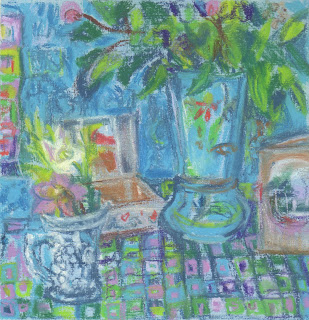
I wanted to make the surface exciting but to draw the viewer to my gaze.

Self Portrait in Red Chair - oil on canvas - 40 x 50
When I  finished the egg tempera I primed a canvas with kings blue and used the leftover paints from before Christmas that were still on my glass palette. I think I did that to avoid delay and maybe because I could blame the colour choices on that… mostly though I just wanted to get something down. At first it was really loose but I found that I wanted to do something that felt complete at the end and I didn't know how to do that without getting more explicit. I looked at Bonnard more and I looked at Julie Held. I have worked on this a bit more - the left side of the chair and the wall and the vase all  work better, but haven't photographed it yet. 

Monday, March 26, 2018

Three Media, three models

Feven, egg tempera on panel 16 x 23cm
Last week my portrait group came to my house.  Feven, the model, is visiting from Sweden and we swoon about her beautiful red braids. I dressed her in a chocolate velvet top. Each of the egg tempera panels was begun in a three hour session and completed the following day, laboriously. Both were sanded down mid working. I put a wash of colour thinned with egg over each area of colour so that the whole surface is evenly coated and shiny with egg at the end.  Who knows if that's the right way to work?

Feven, egg tempera on panel 16 x 23cm
Esme ink on paper 10 x 15.5 cm

Esme ink on paper 10 x 15.5 cm

Esme ink on paper 10 x 15.5 cm

Esme ink on paper 10 x 15.5 cm
 I took my new bottle of india ink to drawing today and mixed eight tones in a muffin tin using a dropper, ink and water.  I forgot my paper towels and had chosen questionable brushes but sometimes the struggle reaps better rewards…  The same is true with last week's monotypes at The Mall Galleries Learning centre. I didn't have time to roll the ink on the plate.  My travelling easel is warped so the plate doesn't work well unless I go down to the floor to roll. I couldn't find my sock for a while either and it was a thick cotton sock, not ideal for removing ink.  The ink had leaked out everywhere and my hands were inky to start too! We did a series of 5 minute poses and getting something done in 5 minutes with this medium is challenging!
Akua Intaglio on paper 10 x 15 cm,  NEAC life drawing

Akua Intaglio on paper 10 x 15 cm,  NEAC life drawing

Akua Intaglio on paper 10 x 15 cm,  NEAC life drawing

Thursday, February 23, 2017

Still Life by Colour

Yellow and Pink, 23 x 25cm, pastel on paper
While running my 30 minutes this morning, I decided to put myself under a new kind of pressure. I made no New Years resolutions this year but am chipping away at the things that need changing anyway. 

A few days ago I saw a twitter feed about a sketchbook open submission and I have been debating whether I could finish my altered pastel sketchbooks in time for the deadline.  Finishing them would have meant altering my course with the two that I have on the go. One is life drawings and the other is landscapes in Maine.  This morning I decided to attempt to make a new altered book sketchbook focused on whatever I was working on in the studio, so studies, after studies and related things and experiments. As I was looking at the set up I had made (the one with the orange and green) I considered how even as I was setting the still life up I kept thinking: THESE ARE NOT MY COLOURS. I wondered whether still life set-ups intentionally focusing on colour would teach me anything or lead my anywhere. 

Yellow and Pink was fun to compose.  Who knew I had any yellow. The big yellow motif behind the flowers is a plastic bag I found while walking.  The yellow things are lemons.

altered sketchbook still life by colour and experiments P 1 & 2
I started the altered sketchbook in Glasgow at Christmas but I hadn't had the time I envisaged and it went nowhere, so I began again leaving a little of what was there before.

Tuesday, February 7, 2017

What I see and what I do


Continuing on with my goal of making regular alla prima paintings, I wanted to think about colour and tone in the window setting and evoke spring in what I looked at. Today has been dreary and I think that's what made me reach for the pink and orange. I'll have to come back to this.  I applied some of the paint with a palette knife and some of the hottest colours in the brightest places need a little care and zing that will only be possible once things have dried a bit.
Strawberry and Orange Feast, oil on canvas, 20 x 20cm

Monday, February 6, 2017

Marks, Tone and Monoprints


There's an essay in Alice Mumford's book: Colour From Coast to Coast, which talks about colour versus tone and the tension she has felt to deal with both in her work.  She explains that if you look into light you can see more depth of field but that you will not see colour in such intensity and if light is behind you, you will see the colour but the view will appear more flat. Bonnard painted from his drawings and they are effusive with colour even though he looked into the Southern light because he seperated form and colour by drawing tonally and painting the colour. In life drawing I tend to draw tonally. With monotype you can't help but combine line, light and tone. I've always said that I need to work in different media to say things differently.  alice mumford has helped me to name it.

Today I took my 'monotype kit' to life drawing.  We had a new model, had 5, 10, and a 25 minute pose. Last week I drew Erin.


Saturday, February 4, 2017

What are the Colours of Spring?

Primose and Planning, pastel on paper, 14.5 x 16 cm
I wasn't tempted to reach for the too many muted colours when composing something that spoke to me of spring. Instead, my underpainting, crushed orange pastel with surgical spirit to fix it, was intense and my first marks, in a bright blue almost convinced me that it couldn't work. Instead I tried to keep the intensity, the free application of colour and shape and to create the belief that these objects belong together and are part of a story that hangs in the air.

Thursday, February 2, 2017

Using the same objects to say something else

Flowers and Musk, 26 x 26cm, pastel on paper

Using a slightly bigger piece of paper than I did yesterday, this time I coated some Fabriano with a deeper pale blue acrylic/pastel ground.  One of the things I always have trouble with in a garden is yellow and red flowers together with a backdrop of green grass… so I took out the yellow flowers, changed the background and changed vases. I like to get up close.  I like to find the shapes in the complexity.  I like a richer, deeper palette.  For me, this arrangement works better and there's nothing wimply about it!

The Mall galleries have put what they call 'selected work' up on the website for the the Pastel Society Exhibition.  I am on page six! 
http://www.mallgalleries.org.uk/whats-on/exhibitions/pastel-society-annual-exhibition-2017

Sunday, January 29, 2017

I think it's just about finished - Blue Poppies on Table

Blue Poppy on Table 
Fully realising that the paint is wet, I'm about to take down my studio set up and move on to something new to think about in paint. So this is the final day, for now, on this painting. I have loved working in blue. I have loved walking into my studio and seeing blue in its many shades. A cliche, but it really is so difficult to know when to stop. Inventing the blue flowers adds a level of uncertainty that is different from painting entirely from life... Five minutes ago I nearly wiped out the card on the right - a vintage  Christmas card sent home by a soldier named John. That's what I'll think about as I clean the house and walk the fields. Should it stay or should it go?

Below are the earlier versions.  I wouldn't say the reproduction colour is perfect in any of them.


Saturday, January 28, 2017

A new blog to document a fused plastic experiment

Bananas, gloves, tortillas and lemons - fused plastic collage 23cm x 23cm


The other day my friend the artist Caroline Fish asked me to exhibit some fused plastic collages alongside her gorgeous ceramics, Jezz Meredith's prints and Jacqueline Dawson's jewellery at Craft Co in Southwold, in May. This invite came as I was thinking about which direction to go next with my fused plastic. I had an idea and this is the first piece that I've made with it in mind.  

I thought it would be interesting to document the idea, so I have created a new blog about the process.You can follow the blog here to keep up to date on how the experiment is progressing!  http://diningonplastic.blogspot.co.uk

Saturday, January 14, 2017

Ripples of Inspiration


I'm reading Matisse Diebenkorn, published by the Baltimore Museum of Art and the San Francisco Museum of Modern Art.  There is an exhibition looking at the influence of Matisse on Diebenkorn and this is the book from that exhibition. I wish I could see the paintings in life, but as second best, I bought it for myself for my birthday.  

A few days ago I picked a bouquet of leaves to put in my new Opaline vase that I bought months ago at the Boule-In (Bildeston), and put in the 'Christmas closet'.  (Vases are one of my weaknesses, I can't say no to a beautiful vase…) The bouquet dried out in the kitchen but as it sat there I thought about what you do with just green, Today when everyone went out to Bury, I took the vase, picked some new leaves chose three different pieces of patterned blue fabric, and placed, removed, and moved objects that I found in the studio around on my set up: two boxes stacked on a chair with a board on top. I decided I needed a hellibore for height, for colour and for shape to finish off the composition. I looked at John Mcallister and thought about Matisse and Diebenkorn and waited to see what would happen on my 16 x 16 cm piece of paper that I had painted with some pale blue pastel ground I mixed.

I saw this a a preliminary drawing for something a bit bigger.  The next drawing is going to be rectangular and I will include more of the space, as that is what my three mentors would do.