Thursday, January 28, 2016

Art on the Inside of a mail art envelope


Part of most days is devoted to mail art.  People ask me what mail art is and I tell them it's art that travels through the post.  For me it is that other kind of art that makes me laugh and work obsessively, often purposelessly, although sometimes conceptually.  It is a different space for me and an essential one.  These two envelopes are going out today and I am dying to make some more in this 'style' later.  

I usually work in styles, or series in mail art.  These I'm calling 'unsealed envelopes' and the envelopes are made from life drawings I no longer need, and they have bespoke two sided fused plastic collages inside.  I have made the labels in a similar to the way I make my business cards with 'trash' fused plastic and clear labels. Obviously I have obscured the addresses with a bit of washi tape to keep people anonymous.


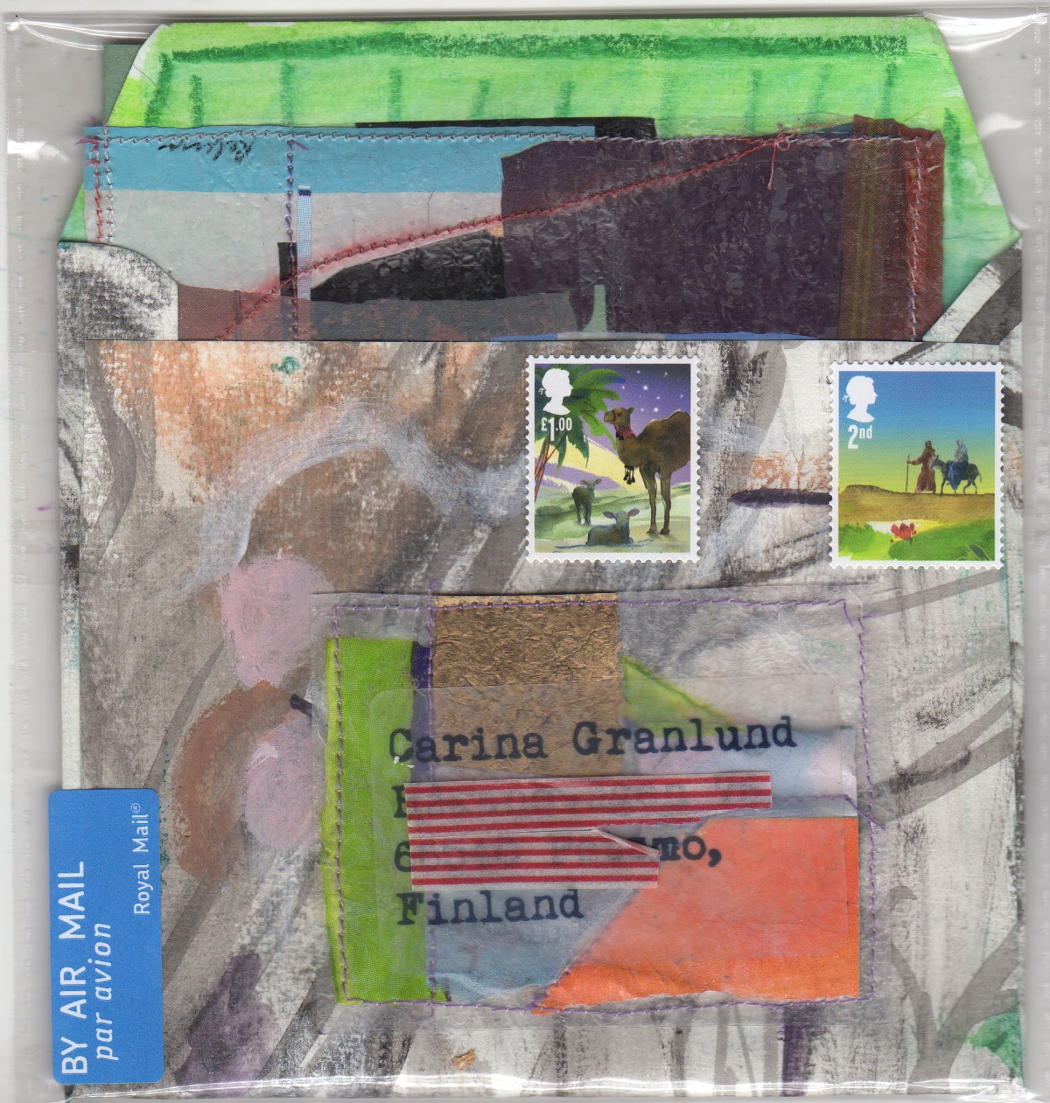
Below are the actual contents of the two envelopes in all their sides.


painting and drawing beads and textiles


Oil on paper 7 x 7"


Not long ago I prepared some heavy paper by gessoing it a few times on the front and back.  some time later I put some leftover turquoise green oil paint onto it.  Today I retrieved that and cut an 7 x 7" piece to see what would happen if I painted instead of drew today in my current series. The colours and materials of my set up were not harmonious in the way they have been to date. What I mean is, there were was a wider range of colour and value.  Infact half of what I chose to work from was black. and if Ihave one object that confounds me, it is that little yellow ginger jar.  It has a way of distorting.  When I started I thought I'd just do some quick oil sketches but I got interested in the paint surface.

Below is another of the bead series in pastel. I admired my neighbour's pashmina and she lent it to me to inspire and complement the beads.  In addition there is a bit of my son's african trousers and a silk skirt I found in cahrity shop.

pastel on paper 6 X 6"

Monday, January 25, 2016

Monday Drawings

A Selection of 2016 Monday drawings
Erin, pastel on paper 6 x 6
Since the New Year I haven't missed a Monday morning.  I get to the venue early, to help hang the plastic  in front of the window, to roll out the rug and to get a space on the side of the room where you can see the model.  If you are on the other side the model is backlit. Sue organises the sessions and we usually have some fast poses 1-2 minutes or 15 mins of a moving model and some longer poses, 10 - 30 minutes.

We have a range of models (in terms of age, hair colour, height, size, flexibility, agility). Many of the models have been coming for as long as I have been going (more than 15 years). Erin has been modeling for us for a year or two.  She can hold a pose in standing but doesn't 'fold' well.


Like Erin, Marilyn is athletic with long legs. Marilyn never moves and is always enthusiastic to push herself to hold poses until her feet turn blue.

Marilyn, pastel on paper, 6 x 6


Esme, pastel on paper 6 x 6


Esme has modelled for us twice.  Like the other two, she is brilliant to draw. She makes strong poses. Each model has her own character (we have a few men too) and for me, the trick is to stay loose enough to capture it and to avoid getting bogged down by the local colour and the setting.


Thursday, January 21, 2016

Peace, Energy and the Turquoise Muse

Turquoise Muse - Pastel on paper 6 x 6

Now that I have made a few pattern studies using my new muse: the fabric beads, I notice that arranging the fabric to create drama and interest is like building a nest.  I'm thinking colour, light and energy.  It's quite a restful phase in working. When I draw I find it is chaotic at first and then I find a peace in the image as things start to coalesce. I think keeping the drama and energy and suggesting peace is what I like about this new series.

Sunday, January 17, 2016

Resolution number one: paint more

Oriental Bouquet in January 30 x 30 oil on canvas
I sanded down a painting that was tight and unresolved from last spring and tried to apply what I'd learned from a small pastel drawing .  The drawing was done from life and much of the set up remained. I painted quite thickly at the start of last week and it was only dry enough to return to today. In the interim my ideas had moved on, the flowers had changed and I had begun a necklace series. 

In the same way that local colour can be a barrier to making the most interesting drawing, the objects in front of you can be too. Sometimes invention is the only solution.

initial 6 x 6 pastel drawing: Freesias and Kimono

Saturday, January 16, 2016

Textile studies


Often I buy things for the pattern and colour.  I don't have expensive tastes, most of my shopping takes place in charity shops and car boot sales.  I know I will use them in a drawing at the least, so I gather stuff. 

My mother, Janice M Moss,  makes fabric beads with delicious patterns in luscious colours and I wear them most days.  People stop me and comment on their beauty. 

I often mention that the I find it tough to navigate between figurative and abstract and when I was thinking about what I wanted to do this year, one of the ideas I had was to draw and paint figuratively about textiles in a way that would create abstract designs.  I thought the necklaces might be a good place to start. 

The cloth under the necklaces this time is a vintage bathrobe and a Mexican shirt that has a tiny headhole that makes it impossible to wear.   The drawing really is this dark but what you can't see in the scan is that the ground was made with metallic pigment that shimmers, so the circles, which shimmer in real life shimmer in the drawing a bit too.

I loved making this drawing so will revist beads.


Friday, January 8, 2016

Begin again with what you know


It's my first day back to the rhythm of what I do. So I began with what I know very, very well. This is where I stand to prepare food and it is the place where outside and inside merges, where if I am lucky I see the owl fly, the moon rise, the night fall.  I got bogged down by local colour a bit… why do I do that? But I'm satisfied by the rhythm and that was what I wanted to find today.


Thursday, December 10, 2015

Drawing in drawings


When I was in my teens I learned that anything is a still life and any place is an interior or a landscape.  You just have to look hard to see the magic.  We had a new model, Esme, last week.  It is hard to draw someone new.  But it's also exciting.  Someone like me, who enters into every drawing as though I have never drawn before, really has no idea what will happen when the new model begins to emerge on the page.  Local colour is repetitive… it's the same rust coloured cushion, the same white radiator, the same grey brown floor.  I shift the colours one direction and the other colours follow, if I'm lucky.

Yesterday I turned the page with Esme to the front of my pad and put it next to a new jug of flowers  I'd treated myself to.  I found a scarf I'd bought in Edinburgh at a second hand shop, a bowl from a different charity shop, my scarf and gloves and celery-coloured pumpkin I'd grown. I love the chaos of finding the rhythm and the energy without drawing the forms. Both drawings are 6 x 6"

I also love taking drawings or books and using them as objects in subsequent drawings!

Thursday, December 3, 2015

Colour to enliven a dreary day

Market Flowers and Silk
I had some errands in town and while there couldn't resist some flowers at the market.  The man who sells the plants and a few bouquets is such a sweetie, who could walk by without a purchase.  I was imagining the colours I'd pair with the flowers as I drove home on this grey windswept day. I was a bit frustrated that it was already getting dark when I got in from walking Lyra, but nothing like my boxes of pastels to chase away the December doldrums!

Tuesday, November 24, 2015

Discovering snow light

23 x 23 cm (framed) fused plastic on paper with paint and stitching

23 x 23 cm (framed) fused plastic on paper with paint and stitching

30 x 40 cm (framed) paint on book pages

I'm getting work ready for the upcoming Freudian Sheep exhibition that opens on the 5th of December, COLD. We had a little dusting of snow the other day and have had some hard frosts that bleached the grass and created the orangey-pink sky that is peculiar to the cold and I've been thinking about that.  I've just glued the work to board and I'm hoping that solves the wrinkles… if not will have to take apart and reassemble differently. 

Sunday, November 1, 2015

Scale, Shape and Versions

Late Dahlias, pastel on paper, 6 x 6" 

Late Dahlias V2  pastel on paper, 19.5 x  28 "
It's fascinating to see these next to each other on the same scale!  The top drawing (more than three times smaller) was made first and is complete.  The bottom drawing is not complete yet because the light faded and I could no longer see what I was drawing, so needed to stop. I made the first drawing, intending to use it to make a bigger piece. I began the second drawing by working from the first drawing, using many of the same colours, but I worked upside down. Once I had the gesture and the basic colours laid down I began working from life, the right way up. Because the second drawing was bigger than the first I needed to work on a table and the table was lower than my plein air easel, I was a bit further back too.  I hadn't made my mind up about whether I was going to cut the larger paper to a square.  In the end it worked to use the whole thing.

Here is the finished drawing, which has been pre-selected for the Mall Galleries Pastel Society exhibition!


Wednesday, October 28, 2015

Exploring Scale


Recently I was commissioned to make a bigger painting based on one of my smaller drawings. I approached this by drawing, but drawing bigger. Working much bigger 60 x 60 instead of 6 x 6 with pastels was a fascinating process!  It was much more physical and keeping big blocks of colour with small tools was a different challenge. The colour I can get with pastel is so rich and intense.  In the end I didn't make a painting.


This one is also big (50 x 50) and it was a challenge of a different sort.  I wanted to capture the rhythm of light and the mystery of the woods and to share my feeling of the meditative aspect of this space.  When I made the original drawing I was trying to get the detail down in a short space of time. With a bigger version I was trying to remember my feelings and translate them in light.

Wednesday, September 23, 2015

Daily drawing

When I have the most to do, on days with my longest lists, when I can't afford to be in the studio all day, I always put 'make a drawing' on my list.   It's hard to get through a long list, so before dinner I stop everything else and make my drawing. 

I'm reading a book of mindfulness exercises, hoping to find ideas for our exhibition at StowHealth and obviously I am practicing a bit of mindfulness as a result. (I wasn't sure what mindfulness was until I began reading the book). I like the book particularly because it uses paintings as a way into the exercises.  When I paint and draw I guess I am 'mindful', the world falls away and the space between me and what I see changes.  It is always difficult to tear myself away from something beautiful that I am looking at, it's easy to overwork a piece.

Another thing I am trying to do is to appreciate my flowers.  I walk through the garden, smell them, look at them but I also pick them and put them on the table.  Today I cut some flowers, pinned a two page spread of a map to the wall, grabbed some cloth, began to look and to find the space between me and my subject with my pastels.

Monday, September 21, 2015

Monday's model

Emily was asked to pose for 15 minutes today.  After a summer hiatus of drawing from the model, I could have used some quick poses to loosen me up.  Instead I began with charcoal on A3, measuring with my eyes, drawing, redrawing, teaching myself to LOOK carefully, trying to identify what makes Emily 'Emily'.

I used pastel for the last three drawings, this was the final one. I drew over something else.  It's 13 x 22 cm. My new fixative darkened it a bit.

Wednesday, August 26, 2015

A painter of flowers and views

This summer I painted in the landscape on Cranberry Island with a new friend and fellow painter, Ahni.  Ahni and I are about the same age and so we laughed together at ourselves oohing and ahhing over a beautiful landscape and arrangement of colour, we share a love of the scenery that you find in Maine. Ahni did an painting MA not too long ago and told me how she was pulled away from her natural interests towards something less conventional.  In the time since, she has reconciled herself to 'being a painter of flowers', at least that's what she told me while we were painting some of my mother's exquisite flowers. I think we all have to paint what we see, the things that get us excited. 

These two oil paintings are 40 x 40 cm. Blackeyed Susan and Book was painted from life and Norwich Jug and Maine View was painted holding the jug, looking at two pastel drawings, a piece of a black and white photo I took this summer and inspired by a Dorothy Eisner painting.

 Blackeyed Susan and Book

Norwich Jug and Maine View 
 You can see Ahni's work at: http://new.ahnikruger.com

Friday, August 14, 2015

Altered Landscapes

 One of the things I have been exploring in the last few months has been using old books to draw in.  I had tried it a few years ago but used a small book, drawing to the edges and I wasn't satisfied.  In my life drawing group Emily Fox sometimes draws in books and I noticed that she used larger books.  She draws on pages as they are, I tried glueing pages together, gessoing them and then masking areas on the page. I created a colourful ground with pastel and alcohol on each page.  I have been alternating between my altered book and my sketch pads in my life drawing group.  This summer I brought a book to alter to Maine.

The surface makes my pastels buttery and I experimented with shape of drawings, using what was on the page as a starting point.  The book is Plank Bridge by the Pool by Norman Thelwell, and in removing pages and gluing them together, I have created 21 pages to draw on.  So far I have only used six; I did lots of drawings in my sketch pads too. I am not sure whether to mix Cranberry Island and Suffolk imagery but suspect I won't be able to wait until next summer! Here are the images I have in my book so far.

Garden and Woods 14 x 19cm July 2015

Whistler Path End 14 x 19cm July 2015

Wetlands and Boatshed 13.5 x 12cm July 2015

Gertmenian House at Night 13.5 x 15.5cm July 2015

Beds and Flowers 14 x 10.5cm July 2015

Ocean View From House 14 x 9.5cm July 2015


Monday, July 6, 2015

Barn Red Boat Shed


We arrived on Cranberry Island yesterday and today was a hot sunny day.  One of the first things I unpack when I arrive is my box of pastels. It sits in the loft of the barn and is a series of little boxes organised by colour with lots of little pieces of pastels from unison to super hard sticks.  I also have some bigger sets which I borrow from. I brought some pads from England but for some reason when I created a few pastel/alcohol grounds before setting out, the paper buckled.  In the end I used a smooth water colour pad that I had earmarked for gouache collages instead.


It was afternoon when I had my first opportunity to do some drawing. What with the heat and the start of the mosquito season, I was not ready to step outside the confines of the garden fence. As I walked through the garden, I noticed that red barn on the shore is more visible than last year and thought it had plenty of complexity to help me switch off what Matt Khan calls, 'conscious intent or calculation'.  Today I limited myself to seven colours and then added a dark brown to get a darker value. It was slow going to begin with, in fact I was working pretty randomly at first, but once I had lots of colour down and started using my eraser I began to enjoy myself. It was that big pink woodchip path and those conifers that marked the turning point. the silver young silver birches helped me find the calligraphy.
I decided to ignore the fence. Elizabeth Mowry's advice, 'nature requires editing for the sake of clarity' is helpful to remember even when it's a fence not just a digitalis leaf. Last year the fence dominated. 

Always great to be back on Cranberry Island and to take my easel outdoors!


Tuesday, June 16, 2015

Distracted by plastic

My studio is clean and I have lots coming up later this week so the only thing I could fit in (between the usual mail art distraction) was a little plastic fusing. Not long ago I found a deflated balloon on the edge of a field and pocketed it. The worn gold was the starting point for this.  

I have been re-reading a couple of pastel books, looking for words for my workshop on Friday and Wolf Khan's use of 'calligraphy' was playing in my mind as I intuitively worked.

Monday, June 15, 2015

Pasteling Over


I arrived late at my drawing group today, caught behind a tractor.  The first pose had already begun. It was a ten minute pose and I didn't think it would be worth it to use a piece of my prepared paper so I found a pastel that wasn't working and began to transform it into a new person, a new pose, new light.  In the past I have wiped the old image away and have been left with a muddy background.  This time I simply began working on top. I did that all morning and these were the most successful products.   I like the feeling of time and the richness of the layering.