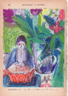
Some people freeze at a blank page. That doesn't happen to me but I do work more intuitively and feel liberated to move things around, change colour and make compositions in a different way when I work (quickly) in a sketchbook. At 58, even knowing that I sending a book somewhere to potentially have an audience doesn't make me too tight. I look forward to the time each day when I will draw without intending to do anything beyond draw. Obviously I am scanning the drawings - there will be 32 in the end that I'll send in the sketchbook to the Sketchbok project https://www.sketchbookproject.com. I'm not sure if I will ever use the drawings I'm making for anything else but I believe that just recording all these arrangements is making it easier for me to use those intuitive muscles in the future!
Sunday, March 3, 2019
Saturday, March 2, 2019
What Comes Next in a Series?
 |
| Car Boot Oranges, egg tempera on panel 23 x 16cm, |
I set up a new still life up a few days ago but it wasn't until yesterday that I had time to work. The still life was made up of objects I have bought at the car boot or from local charity shops as well as a few of my brighted spined art books. My goal was to create a companion piece for Jugs.
What you can't necessarily understand is that in Jugs the light is coming from behind and the pattern at the back is a kantha folded on a radiator under a window. This time the light is primarily natural but I also pointed lights from both sides. I chose similarly coloured objects to Jugs and this painting was made working from life.
Labels:
Car Boot Oranges,
Egg Tempera,
Jugs,
Rebecca Moss Guyver,
series
Monday, February 25, 2019
Is it good to struggle? I sure did!
 |
| Valentina, ink and pastel A4 30 mins |
On Saturday I went down to London for a course with John Dobbs at Heatherley's`: The Reductive Figure . I was excited but I had a few complications to contend with. I had a drop off for something I had been preselected for that I had to fit into the day. There were replacement buses from Witham to Newbury Park and I was meant to bring all the gear to paint with. As I was packing up I made the executive decision that I would not bring oils or even acrylics but would take a smaller kit (gouache and pastels) and paper rather than canvas. With everything scaled down I felt I would be able to travel down without incident.
John shared a David Park quote from A Painter's life and wanted us to paint directly, quickly and boldly. I had arrived a little late and was sandwiched in pretty tightly. I had to keep stepping sideways to see the model which is always a disaster. My contacts and my reading glasses weren't helping me to see very well and I was some distance from the model. Before I began I was already struggling. The first drawing (above) was the most successful as a whole. The second pose was a seated pose and I have to admit to throwing it away. After that one, John suggested I work on a part of the figure, the head and the shoulders. The goal was to say something that I WANT TO SAY about Valentina. I always notice her neck and the way her mouth turns down. I blame sidestepping for my lack of ability to see her as carefully as I might have. By this point I was regretting my materials. I had meant to bring charcoal too and thought I had, but for some reason it never made it into my bag. Every time John came by he told me it was good to struggle. I guess it was obvious!
 |
| Valentina, ink, gouache and pastel A3 30 mins |
 |
| 2+ hours Valentina, gouache & pastel A3 |
Labels:
Gouache,
ink,
John Dobbs,
life drawing,
pastel,
reductive figure,
Valentina
Friday, February 22, 2019
How the tiger got into the drawing.
 |
| Placid Stalking, pastel on prepared mount board, 30x33 |
When my day is uncomplicated it begins with an hour or more of drawing in my sketchbooks. As I draw I explore, I revise and dream about the future. I try to keep THOUGHTS out of my head but that's pretty tough. On a good day the planning for what's next comes after when I look at what I've done. Drawing in my sketchbooks can mean something finished, or it can be something open and about the next idea. That can be because I am impatient to get on, or it can be because I run out of time, or because I want to retain something unfinished for later. The drawings below are the pre-drawings for the drawing above.
 |
| Add caption |
I added the tiger and used it later in the bigger more finished drawing. Here I paid no attention to scale. Perhaps all of these ideas will translate into a painting?
Tuesday, February 19, 2019
Objects as inspiration
 |
| Jugs, Egg tempera on Panel, 23x16cm |
 |
| Sympathy in Green , pastel on paper, 46x46cm |
Monday, February 18, 2019
Snow of Memory
 |
| Snowy Walk, egg tempera on panel, 30x20, |
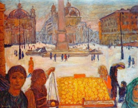
I have tried to keep the snowy light in my head so that I could make a little series of pictures of walking in the morning light. I did some drawings and took some pictures and tried to look and look. I looked through paintings and kept two books open as I worked on this: Wolf Khan, pastels and particularly: Looking towards St Peters (1963) and Bonnard (Phillips Collection exhibition) Piazza del Popolo, Rome.
 |
| Wolf Khan, Looking towards St Peters |
 |
| Pierre Bonnard, Piazza del Popolo, Rome |
The place and the situation are a collage of memories, stitched together to make a believable moment. The figure with the hat was added later and I removed some things that were distracting. The moon was a happy accident. a drop of water that removed the tempera.
Tuesday, February 12, 2019
The Figure in Context
 |
| Conversation with View, 23x16, egg tempera on panel |
I printed a photo of the panel and drew some figures in with a pastel pencil so I began. what i love about working on egg tempera that has set is that you can actually wipe off the bad drawing and it reamins exactly the same. It is permanent! and there is a differnt kind of underpainting to explore.
Sunday, February 3, 2019
When something works it's time to try it another way
 |
| Snowy Walk, egg tempera on panel, 30x20 cm, |
When I went to the Bonnard I saw how he used drawings to do the same thing and how he used animals as devices for colour and shape within the painting.
I think I'll do a series of these if I can find different things to say about it all.
Saturday, February 2, 2019
News From England
 |
| News From England, pastel on opened altered book |
And I'm still filling up my sketchbook for the Sketchbook Project. The mug was a gift from my friend who accompanied me to the Bonnard exhibition!
Thursday, January 31, 2019
Record what interests you (quickly), consider it, make changes and slow down
 |
| Tiger at the Table, pastel on paper 30x37cm |
I visited the wonderful, beautiful Bonnard at the TATE today with Bridget Moore. We were there for more than 2 hours and it was never unpleasantly crowded, really. How inspiring to be beside them all. SO much to think about.
 |
| Add caption |
Monday, January 28, 2019
The freedom of gifting your drawings
Deciding to make a sketchbook with a theme, in my opinion, creates a momentum of its own. Another thing I've found is that knowing that I am 'releasing' the drawings makes me freer and sometimes better. I discovered The Sketchbook Project https://www.sketchbookproject.com/ before Christmas and began putting my sketchbook together, due early March, over the weekend. They say you can rebind your sketchbook with different paper so I began doing that. After a hiccup I decided I needed four signatures for the pages to sit right and prepared them for pastel with gouache and ground. There are 32 pages so I need to make at least one drawing a day.
If you don't know about the Sketchbook project, you pay, they send you a sketchbook, you draw like mad and send your sketchbook back to them, in Brooklyn, and you never see it again unless you visit the Sketchbook project, or find it digitally online. Good thing I have no problems with letting go.
If you don't know about the Sketchbook project, you pay, they send you a sketchbook, you draw like mad and send your sketchbook back to them, in Brooklyn, and you never see it again unless you visit the Sketchbook project, or find it digitally online. Good thing I have no problems with letting go.
Thursday, January 24, 2019
Using a drawing to inspire a painting
 |
| The House with Green Shutters, pastel on opened book, 23x16 cm |
I made the drawing on the left first and when considering what to put on the right I knew I needed to make something bolder. Hydrangeas and peonies are the two flowers I think of when I think bold. I liked the scale of the figure and the acid green and purple. Still not sure about the sky. I've looked at Milton Avery, Dorothy Eisner and Fairfield Porter but will wait to let the paint dry again to test some alternatives.
 |
| Hydrangeas and Hat, oil on canvas, 30x40cm |
Tuesday, January 22, 2019
Looking at myself
 |
| (study) Self Portrait in Red Chair - egg tempera on panel - 15x20 |
So I had lots of goals when I began the little egg tempera study. Reading Bonnard I thought about this statement: 'The artist who paints the emotions creates an enclosed world... the picture... which, like a book, has the same interest no matter where it happens to be. Such an artist, we may imagine, spends a great deal of time doing nothing but looking, both around him and inside him.' Patrick took a photo and using that in black and white, a mirror and my intuition I tried to project something about myself. I looked at Bonnard, in particular ' Vivette Terrasse c.1916.https://my-museum-of-art.blogspot.com/2014/02/pierre-bonnard-vivette-terrasse-c1916.html
I wanted to make the surface exciting but to draw the viewer to my gaze.
 |
| Self Portrait in Red Chair - oil on canvas - 40 x 50 |
Monday, January 14, 2019
Jettisoning local colour for January
According to the Nabis from: https://www.theartstory.org/movement-les-nabis.htm, a painting was a harmonious grouping of lines and colors, with outcomes to include many different solutions. An artist's personal style was, in fact, accomplished through the choice of how to arrange these lines and colors. As an example of the Nabi approach, at the beginning of their meetings, they would recite the following "mantra" together: "sounds, colors, and words have a miraculously expressive power beyond all representation and even beyond the literal meaning of the words."
When I visited the Barber Institute last week, in Birmingham, to see the current Vuillard exhibition, I came away remembering that I don't have to stick to local colour and that my instinct, even my handwriting has always been about colour and pattern primarily. I reflected that last year taught me how to see acccurately and how to record what I see better but that my personality can sometimes be obscured when I think too hard about all of that.
Today, arriving late to drawing, I worked quickly to put something authentic down. The two rectangular drawings below, 19 x 28cm were 20 minute poses made before the break. The square below those, 17 x 17 cm, was a challenge in that it was a 1/2 hour pose and I had to look hard to find something to say about it. The moment that I chose the blue, I began to feel it was about shapes and colour and no longer a model. The image at the top was the final drawing and it was about 25 minutes, 28 x 19cm, and the surfaces and the design elements of the arrangement inspired me. The ground was a lime green which guided me in colour relationships.
Sunday, January 13, 2019
January objects and artifiical light
 |
| What I found in January, pastel on tinted paper 16 x 16cm |
Friday, January 11, 2019
Zooming, changing the focus, abstracting shapes
 |
| charcoal on paper, 16x14 cm |
 |
| B & W print of oil pastel, crop |
 |
| B & W print of oil pastel, crop |
 |
| B & W print of oil pastel, crop |
 |
| B & W print of oil pastel, crop |
 |
| watercolour and gouache on book page |
 |
| pencil on paper 16 x 25 cm |
 |
| oil pastel on paper 17 x 12 cm |
Monday, January 7, 2019
Distemper as a medium
 |
| Capricorn Bouquet, distemper on panel, 20 x 25 cm |
I loved the start of the distemper process. Everything was loose and exciting. The rabbit skin glue mixed easily and the light was good. As the day wore on the glue got pesky (I think my studio was a little cool), the light faded and I tightened up. I think the main problem is I wasn't sure what I wanted to accomplish, not knowing the medium, it's hard to know how to use it. On top of all that, I had a bouquet of flowers I bought on sale from the grocery store ( three days ago) still in their wrapping, in the sink, and although I wanted to find an interior, I felt I should use the flowers. Also, when distemper doesn't cooperate, it REALLY doesn't cooperate. At first I thought of it like working with monotype ink - fighting the medium - In the end I had to get out a hotplate to keep the glue and the mixed distemper warm enough to use and then it dryed out and flaked off the piece of glass. Glass is cold, so perhaps not the best surface to mix on.
I have some other ideas and motifs I want to explore with distemper and it was only my first effort but I have the sense that it may be an uphill battle. You never know I might get up tomorrow and have a way to strengthen this, on the other hand it's probably best to move on.
Thursday, January 3, 2019
Armchair travelling
 |
| January Road Trip, pastel on paper, 16 x 16 cm |
I sized both sides of the paper and then gessoed one side before tinting the 'drawing window' with some ultramarine, yellow ochre and pastel ground. I was too impatient to locate my erasers (rubbers in the UK) so used the one on my crossword pencil when the pastel got too thick.
I wanted to have a good first drawing experience of 2019. I have done a few quick sketches in between things, but this is truly the first opportunity to do anything sustained for weeks. As you can imagine, this didn't draw itself at all. As usual I nearly gave up a few times but eventually I began to feel I knew the objects and they were beginning to speak to each other. At first the colours were a bit too bold for my goal - to create lush but subdued colour. Layers and patience prevailed.
Subscribe to:
Comments (Atom)


