Showing posts with label Vuillard. Show all posts

Monday, January 14, 2019

Jettisoning local colour for January

According to the Nabis from: https://www.theartstory.org/movement-les-nabis.htma painting was a harmonious grouping of lines and colors, with outcomes to include many different solutions. An artist's personal style was, in fact, accomplished through the choice of how to arrange these lines and colors. As an example of the Nabi approach, at the beginning of their meetings, they would recite the following "mantra" together: "sounds, colors, and words have a miraculously expressive power beyond all representation and even beyond the literal meaning of the words." 

When I visited the Barber Institute last week, in Birmingham, to see the current Vuillard exhibition, I came away remembering that I don't have to stick to local colour and that my instinct, even my handwriting has always been about colour and pattern primarily. I reflected  that last year taught me how to see acccurately and how to record what I see better but that my personality can sometimes be obscured when I think too hard about all of that.

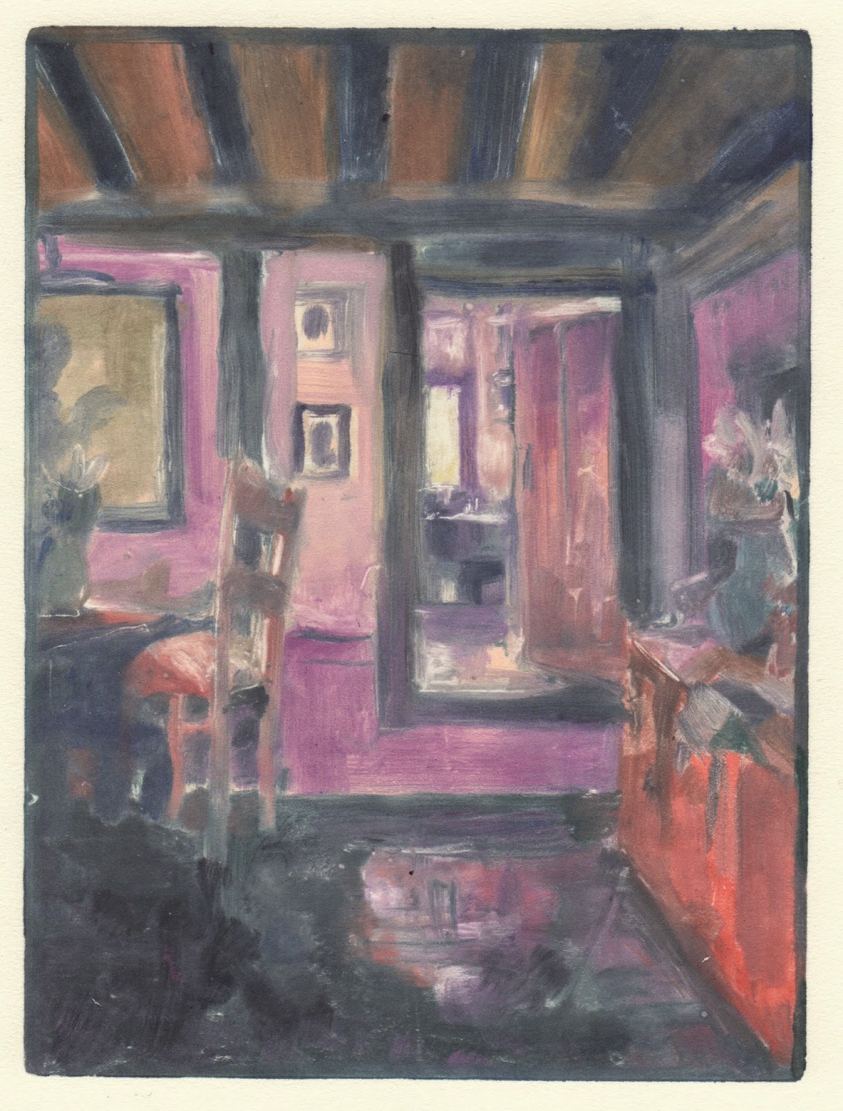
Today, arriving late to drawing, I worked quickly to put something authentic down. The two rectangular drawings below, 19 x 28cm were 20 minute poses made before the break. The square below those, 17 x 17 cm, was a challenge in that it was a 1/2 hour pose and I had to look hard to find something to say about it. The moment that I chose the blue, I began to feel it was about shapes and colour and no longer a model.  The image at the top was the final drawing and it was about 25 minutes, 28 x 19cm, and the surfaces and the design elements of the arrangement inspired me. The ground was a lime green which guided me in colour relationships.


Thursday, January 15, 2015

More light studies

Light from Dairy, monotype: Akua Itaglio on paper 6 x 8"
As I continue to investigate the light around corners in our house, I keep consulting Vuillard.  But I'm finding that I'm starting to listen to the monotype and use colour the way it demands, rather than slavishly laying Vuillard's colour=light onto my view.  The image below, Mother and Sister of the Artist got me started with finding darker darks.  I began fairly faithfully and then felt that the wall needed a magenta and then, of course everything had to accomodate that.  I also found I needed to edit, add and embellish my view. Maybe figures soon?
Mother and Sister of the Artist  by Edouard Vuillard, 1892

Light From Above Piano, monotype: Akua Itaglio on paper 6 x 8"

 This print was actually made before the one above. You can see that I was little more faithful to Vuillard's pallette. I have painted and drawn this view repeatedly in the past. This medium seems to solve it more for me.
Woman in Blue, by Edouard Vuillard, 1893
 

 I include this last drawing to show that as I said in an earlier post there are many prints that I pull back the blanket to in disappointment. 
Light from Upstairs Window, monotype: Akua Itaglio on paper 6 x 8"
There is no denying that the monotype is a process-heavy form of 'painting', the way I make them. When I look at a 'finished' plate I can get really excited - the plate suggests something but a little blemish, something missed, can kill the image. and then there's the fact that it's the mirror image and I might not calculate what that does with your eye. I think I got so interested in the shapes and colour when I was making Light from Upstairs Window that I forgot that I was after light..  It has a stillness that I like, but...
Light from Window upstairs, soft pastel over 1st pull monoprint 
And those disappointments hang around. One way I've found to banish them is to work back into the print  In this case I used my first pull.  I often soak up the ink after I've sketched the structure onto the plate, to check it, that's my first pull.  This was one of those totally unfinished prints.  The problem is the pastel doesn't like the printmaking paper, but in this case I like the scratchy effect. It is not even remotely related to the intention of the monotype but the disappointment is further away.

Tuesday, January 13, 2015

Light behind wedding chest

For every satisfying print there a handful of disappointments. It comes back to the tension between light and colour, for me. I am planning to do a few black and white prints to work in tone to convey light, but the thing is, I LOVE COLOUR, so marrying those two things is the ideal.

Today I consulted Vuillard. Wonderful Vuillard who tells stories with rooms using light and colour. I think he helped.