Friday, May 5, 2017

Struggling with Green

Green Vases Flowers and Bowl, Oil on canvas 40 x 50 cm
Getting Green right in a painting and in reproduction seems to be tricky. A long time ago I remember telling my father that I thought green was the hardest colour. It went something like this:  I had been making a monoprint of my mother (bent over gardening) between the house and the barn.  It was late in the season and the grass was fading but I decided the grass should be a yellow green. My dad walked by and I was in that tormented state when nothing seems to fit with anything else in the picture. I asked him what colour he thought was the most difficult to make work.  He asked me in reply and I told him, green. 'I thought you were going to say that,' he said. In the end I reconciled the green in some way and the monoprint hangs in the bathroom, reminding me of the conversation and him. 

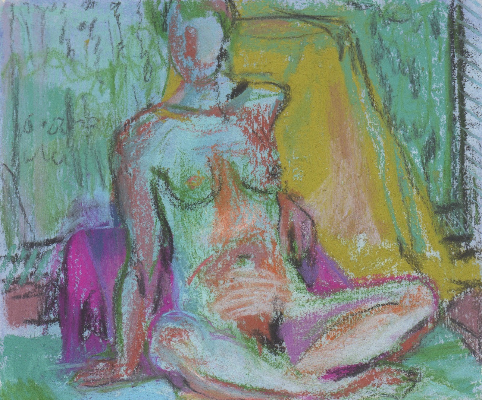
For some reason I challenged myself to work through colours for the month of May.  From experience I find yellow and lime green are tough to make work in any quanity in a picture so I began there.  The sketchbook page, below, works better for me than the painting above. I painted all day yesterday and in the end wiped down large areas and changed the composition.  The colour isn't quite what it is.  The green on the right is deeper.  It's quite wet after working back into it this morning, so it needs some time before I can think about it again. I came across Annie Williams on Pinterest https://www.royalwatercoloursociety.co.uk/artists/109-annie-williams/overview/
and had been thinking about her work as I put things together to draw.


Monday, May 1, 2017

Making the most of an opportunity

Green Vases and Bowl, 24 x 22 cm, pastel on paper

I wasn't able to start drawing today until too late to finish before the light disappeared . I'm not sure if I will return to this or begin another version. Today was about green.

It's been a busy few weeks and it feels as if I have had no time to do anything other than tie up loose ends: framing, typing up bios and price lists, putting together a portfolio, picking up work, and then hanging two exhibitions and attending them.

When I can't spend all my time making work it can feel frustrating, but that is ridiculous!  All of that other stuff is part of the whole and I've learned that if I see time as opportunity then it's easier to feel good about the non-painting activities.

Last month I made three opportunities.  I took a pre-selected pastel down to the NEAC annual exhibition for final selection.  I put together a portfolio and submitted it for the New English Drawing Scholarship and I submitted an altered sketchbook for the Annual Radley Sketchbook Exhibition (Parker Harris) and one of those three opportunities was successful.  You just never know, and I find that by making the opportunities I apply myself differently and with zeal and that makes new opportunities.

The exhibition at Craftco is exciting.  I love seeing my 2D work (plastic collages) with ceramics.  Since I know Caroline's work, I have been thinking about it as I've worked and I am pleased with the way it looks hung and together.

Craftco , Southwold, Exhibition through May 30th

Thursday, April 6, 2017

Color possesses me


The title for this piece comes from a Paul Klee quote, Color possesses me. I don't have to pursue it. It will possess me always, I know it. That is the meaning of this happy hour: Color and I are one. I am a painter." 

I began with the latest pieces of plastic I had acquired: a Marks and Spencer's bag, a Jacobs cream crackers packet, a bag of mixed nuts, salad bags, and a Doriano biscuit wrapper.  I added a bit of that kelly green from an old RA mailing (not members this year) because I needed that. I had been thinking about Klee, Mali Morris - she's coming to talk in Colchester on Friday, Howard Hodgkin and Rothko.  In my mind these people gravitate towards bold shapes and colours. The Marks and Spencer's bag and my recent foray into grids for Nichola Orlick's exhibit in Kyoto was still in the back of my mind. I had finished putting a portfolio together for something coming up, so felt light, happy.  It was happy hour.

With my stitching I like to accentuate colour relationships, to move them back, bring them forward and the colours in the frame seemed to make the most of the inner life of the happy hour. It was hard to keep it simple but I resisted the temptation to complicate things.

High Stile was where we stayed in the Lakes.  Happy Hour in HIgh Style says Jazz to me.

The above is copied from my post in Dining on Plastic: http://diningonplastic.blogspot.co.uk
(sometimes I like to highlight the overlap between my experiments in plastic and all the other experiments I make in other media … apologies if you see it in two places.  


This bouquet was sent to me for Mother's Day by our adorable children from a florist in Kersey, a village nearby. I was still quite sick on Mother's Day and rushing to prepare for our trip to the Lakes, but I managed to record something about it in my new altered sketchbook:

The flowers travelled in the Defender up to the Lakes, back down and were beautiful until Saturday morning when I went out and picked a bouquet with my niece, Gracie. You might recognise some of the objects, reconfigured.  I glued some paper onto the vase. 
Spring Green and Book, pastel on paper,  A4

Friday, March 24, 2017

Library with Red Sarong - oil on six canvases

Library with Red Sarong  - oil on six canvases 40 x 30cm each
Paintings are problems and as I've got older I have learned to accept imperfection, to compromise and to let go.  It used to be that I loved starting things and dreaded seeing them through to their conclusion.  I would paint over everything at the first sign of something that didn't work. Now, if I have to move something, late into the painting or take it out completely it isn't such a drama. If a colour doesn't work I'll look for a long time and then begin testing alternatives. Believablity is what matters more than everything else. And I don't mean, 'is it realistic?'

Painting these six canvases has been an interesting problem and coming back and forth to it for a week has been fun. When I composed the still life I thought about the composition of each of the panels so had done some of the work before I began.  I knew quite a lot about the subject because I had made a big pastel drawing of it the week before. I only had to move things around a little as I worked. 

In order to paint something so long I had to move it and myself lots, so my perspective was changing more than usual but I tried not to let that bother me, as long as it was believable. There were lots of patterns and how much to simplify, how true to the colours I saw I wanted them to be, and how to tie everything together in terms of colour, shape and value were the main problems.

I anticipated taking the pieces apart to work on the individual parts, but in the end I decided this time I wouldn't.  Next time I will.  That will be a different experiment. I am very curious to see what they look like framed individually next to each other,how that will change things, and I'm sure that will inform my next experiment.

A few days ago, when I was beginning to despair of the red, I started a new sketchbook and invented new colours, stood at a totally different angle and unwinded with my pastels.

Hyacinths, Tulips and Daffodils

So later today I'll pack up the still life and begin thinking about what comes next. 

Sunday, March 19, 2017

Grids of sorts


At 16 - I went to the Animal Fair, Battisford, England, 2017

Later in the year one of my mail art friends, Nichola Orlick is hosting an exhibition at a gallery in Kobe, Japan. It is called Half Hundred Swing and is an homage to Joseph Cornell. We have been asked to make box collages. I have been thinking about it for some time and I earmarked this weekend to complete it. I read a book about Cornell Vision of Spiritual Order by Lindsay Blair that I found in a charity shop four or five years ago.  Before I began working on the collage, I  browsed throught the book and wrote down these words: 'childhood, swan, owl, bunny, body, self, repetition, arrangement, demarcation, compartmentalisation, colour, coding, tangential relationships, people, outside, set rules, ritual, alternative worlds.'

I had been saving a box that I found around Christmas and what I had been thinking about was how I could divide up the space to create depth using fused plastic. I thought I could use some mount board in some way. I got out my big bin of  plastic and started pulling pieces out looking for inspiration. I'm not sure you can see but each of the rectangles is a different height. It was fun and I think it may lead to something else later on. Arranging the rectangles was tricky.  I think  in the future playing more with colour, light and height could be interesting. This time I wanted to use some of the motifs Cornell was interested in.


At the end of last week, I began painting my six 40 x 30 canvases. I decided to attach them together to begin with and so far I haven't taken them apart.  I think I will.  Such a long canvas is unwieldy and it is difficult to see things, also the idea is six canvases, in the way Hockney did that. It's still early days and my goal is to make each of the rectangles work in itself.  The bouquet in the middle looks nothing like it did when I began, all the flowers were in different places and I was struggling with that.  That panel is the weakest one so far. Having spent so long drawing a version of the arrangement has meant that I have solved some of the problems and am able to focus on the colour and the shapes in a different way. I nearly changed the red because I've used a lot of red lately, but now that I am working on it I am loving the red.


Thursday, March 16, 2017

Still Red Room

Still Red Room, pastel on fabriano 64 x 46 cm
One reason I love to work from life is that I can create something that reminds me of a place.  When I put together a still life I am inventing a place and trying to get it to feel real.  This time, without meaning to, I put many barriers in my way to success. 

I was determined to use some yellow lillies that two of my Albanian friends, who I know from Suffolk Refugee Support, gave me as a present.  I have spoken about having a hard time making yellow and red work for me, in garden and in drawings so by choosing a red, a very red, backdrop I was bringing this to a head. There were also some flourescent orange roses in the bouquet and again, that was troublesome. Additionally as I worked I realised, there were too many open cups and something too small in the foreground of the set up; so with a mix of invention, addition and seeing colour differently to the way it existed in front of me, I think I found a way to resolve things. For me, the overall feeling of this is quite still, maybe serious in a camp kind of way. Perhaps I could have varied the marks a bit more, but in order for it to be believable, this was what I found.

I'm going to get some new flowers later on so that tomorrow I can begin on the six canvases!

Saturday, March 11, 2017

From Sketchbook to something bigger

Looking at part (of the still life) I

Looking at part (of the still life) II

View of Patrick's side of the bureau and the view from above the bureau
My altered sketchbook only has four pages left. As I've worked through it, it has increasingly dominated my life. Deciding to draw in it every day has amplified the feeling that I might have run out of ideas.  So I am in a heightened state of alert.  I've noticed things I might not have noticed and that's great. What I've remembered is that there are beautiful still life possibilities everywhere and all I need is a hand full of pastels and my sketchbook and my day is sorted. I'm drawing on both sides of the page, so these drawings will remain bound in the sketchbook.  


What's interesting is that I am always drawing anyway, but deciding to make the drawings in one place has changed the structure of my whole day. With that in mind, it's time to get on with some of my ideas, so yesterday I primed six canvases and today I constructed a big still life in my studio and prepared three big drawing surfaces to use to respond to the still life. Seeing the Hockney made we want to try using a series of canvases to interpret a scene, and since my scenes seem to be still lifes right now, I'm beginning with that.


Wednesday, March 8, 2017

Fishing for Biscuits with Cups and Clutter

Cups and Clutter

Fishing for Biscuits, fused plastic collage with stitching and paint (21 x 21cm)

Tomorow I go down to London to pick up my unsold drawing from the Pastel Society show. Although it would have been even better if it had sold, I am looking forward to meeting Keith (who I met at the opening of the exhibition) and seeing the Watercolour Competition Exhibition at Bankside where a few of my firends have work.  Today we celebrated International women's day with Suffolk Refugee Support at Burlington Halls, in Ipswich. It was fabulous to see the women in their finery and to sample some of their cuisine but it was most of the day and I didn't have much time to work.

I was able to finish last week's Dining on Plastic, though.  It was predominately made of vegetable wrappers - mostly different kinds of lettuce.  Earlier in the week, I polished off a packet of water biscuits and the shimmery royal blue comes from that. Andrex toilet paper blue is a staple and I didn't find any roadside plastic!

Yesterday I drew in my sketchbook as the light was fading.  I found a box of old pastels, so old I can't remember where they come from… were they Patrick's?   New colours are always inspiring and chasing the light makes you concentrate hard!

Monday, March 6, 2017

A smattering of inspiration


Although I caught the dreaded Tanzanian cold, I dragged myself to the studio and tried to put something down everyday.  I haven't really got much else done in the past week.  I did go to London to draw at the Pastel Society's event at the Mall, see the Hockney and the Nash and have people over for dinner and then visit two local exhibitions http://www.northhousegallery.co.uk/art-exhibition/artist/martin-fidler-and-melvyn-king/red-crag-project/  and  http://www.thesentinelgallery.co.uk, but in terms of beginning new work, that didn't happen. I'm feeling much better this evening, so am hopeful that tomorrow will be a painting day.

It's interesting to see how I use my two page spreads to respond or at least test something different on each side.  It's similar to the way I work, shifting from drawing to plastic to printmaking and painting. But I can't fail to notice that I've been jumping all over the place getting something down. Still it's a sketchbook and these ideas might come in useful sometime...


SaveSave

Monday, February 27, 2017

Marilyn in ten minutes

pastel on paper 13 x 14cm

altered book page spread  11 x 7cm pastel drawings

pastel on altered book page 21 x 14 cm

charcoal on paper 28 x 13 cm

pastel on paper 14 x 16 cm

For the first half of our drawing session, Sue asked Marilyn for five ten minute poses, although one lasted an extra five minutes.  The final pose was half an hour. I brought some images with me to inspire my palette and then began igonoring them, looking hard to see what the drawing needed that corresponded to what I was looking at.

I didn't put my pastels away at the end of each drawing so there is more consistency of colour than usual between them.  I prepared my ground and taped around the edges before I set off today and tried a few new approaches - watercolour with clear gesso and a little pastel ground, gouache with pastel ground, pastel with clear gesso.

Sunday, February 26, 2017

The Colours of Nightlight, altered sketchbook

The Colours of Nightlight, altered sketchbook February, 2017 
I was restless last night. I discovered a new artist on Pinterest and kept waking up thinking about his work.  Do you know Sandy Murphy's work?  I have pinned a lot in the past day... He attended the Glasgow School of Art and is a few years older than me.  His paintings astound me. You can see a few here:  http://www.thompsonsgallery.co.uk/artist.php/Sandy-Murphy-328/  He makes it look so simple and his colours make my heart sing.

Today in my altered sketchbook I thought about our walks with Lyra and the night light that is still hanging around as we walk in the winter. I tried to find the colours of daybreak and to keep things alive. 

Saturday, February 25, 2017

Sketching at the Edges of Abstraction


I know logically that shapes are shapes and a cup or a flower is just a shape of colour, but I think differently about things I can name and use my pastels differently as I draw.  I often feel that my best drawing happens when I am truly confused and can't understand the things I can name so they become simply colours next to each other rather than a hand or a foot or a petal. I hate that feeling, and the confusion isn't always good, but I wonder if it is about a different part of my brain being activated.

This altered sketchbook (using soft pastel) is about the edges where figurative and abstract mark making meet. I have said before that making fused plastic is a playful part of my practice where I am freed to respond and which is more like solving a puzzle than drawing.  It is intuitive and does require careful looking, but it isn't as rooted in eye-hand coordination, it is more about discovery. As I progress through the altered sketchbook, will it be possible to combine the two in a different kind of drawing?

Last year I made a series of pastel drawings where I combined still life objects with some of  my painted paper collages, drawing about the two together.  They were surprising. Is this a direction that could be intriguing?

These are the last two of my dining on plastic pieces.  You can see more about them and the other from previous weeks at that blog here:
.http://diningonplastic.blogspot.co.uk
Mozarella and Mangoes at the Pier

Carrots Downriver


Thursday, February 23, 2017

Still Life by Colour

Yellow and Pink, 23 x 25cm, pastel on paper
While running my 30 minutes this morning, I decided to put myself under a new kind of pressure. I made no New Years resolutions this year but am chipping away at the things that need changing anyway. 

A few days ago I saw a twitter feed about a sketchbook open submission and I have been debating whether I could finish my altered pastel sketchbooks in time for the deadline.  Finishing them would have meant altering my course with the two that I have on the go. One is life drawings and the other is landscapes in Maine.  This morning I decided to attempt to make a new altered book sketchbook focused on whatever I was working on in the studio, so studies, after studies and related things and experiments. As I was looking at the set up I had made (the one with the orange and green) I considered how even as I was setting the still life up I kept thinking: THESE ARE NOT MY COLOURS. I wondered whether still life set-ups intentionally focusing on colour would teach me anything or lead my anywhere. 

Yellow and Pink was fun to compose.  Who knew I had any yellow. The big yellow motif behind the flowers is a plastic bag I found while walking.  The yellow things are lemons.

altered sketchbook still life by colour and experiments P 1 & 2
I started the altered sketchbook in Glasgow at Christmas but I hadn't had the time I envisaged and it went nowhere, so I began again leaving a little of what was there before.

Wednesday, February 22, 2017

Back from Mall Galleries


Pauline and I arrived at the Mall Galleries for the private view of the Pastel Societies' annual exhibition before 5 pm on Monday.  That gave us time to look around and try to find people whose work we admired. I was delighted to find my pastel eye height in the first room, above a pastel I had particularly liked from the catalogue. I had a label with my name on it and the words, exhibitor. Everyone was welcoming and the atmosphere was wonderful.  The room filled so that we were all pressed in to hear Jeanette Hayes (Pastel Society President) and Michael Portillo (Chairman of the Federation of British Artists) speak. 


Talking to Keith Bennett, the artist of the pastel below mine.

Michael Portillo


Spicy Vermillion - pastel on paper, 25 x 23cm,  Feb 2017

Yesterday and today I began making pastels again, with the hope that something will satisfy me enough to enter again next year!

Monday, February 13, 2017

The quiet of Emily

13.5 x 14 cm
 Our models are all very different. With one, you might get the feeling that you have caught them in the moment between something else; another tells a story with a shoulder.  With Emily, it's as though she stops time. Today I was using the side of my pastel to approximate areas of colour and light.  I used my eraser very little and just drew over to make adjustments.  I like the loose peaceful feel of some of what I drew. The first four sketches are ten minute poses.  The last was 25 mins.  
13.5 x 14cm

13.5 x 14cm

16 x 16 cm

16 x 15.5 cm

Sunday, February 12, 2017

Visiting Parndon Mills

After Parndon Mill series of 9 matted fused plastic collages (A6 )

Pamela Yeend and I went with Jane Lewis to Parndon Mill on Friday.  http://www.parndonmill.co.uk/gallery/current-exhibition-gallery
Jane Lewis and Caroline Fish have a show that is on now and I wasn't able to go to the opening a few weeks ago, so I was delighted to get there.  Making the journey with two artists was perfect. Parndon Mill is in Harlow and it takes 1 1/2 hrs from Boxford, where Jane lives.  It was a long day, but wow was it worth it! Sally Anderson and Roger Lee, brought the place to life in the 60s and 70s and now it is both a gallery and studios for artists.  Caroline and Jane's work looks stunning together and the setting of the mill is beautiful too. If you live anywhere nearby, it is definately worth visiting, but hurry, the exhibition ends on the 19th of February.

Pamela, Jane and I went on to the Gibberd Gallery next.  There was an open on but the permanent collection was the draw.  It has an eclectic mix of some exciting work from the past. You can see some of it here: http://gibberdgallery.co.uk/index.php/collection/watercolours

After that we went to see Simon Carter's opening at the Minories - also inspiring. 

In response, yesterday I began a new project, the results are above.  Now that I have my own mat cutter, the opportunity to use fragments beckons! I think I am sending these out as mail art.  One thing I discovered was a way of creating Diebenkornesque whites using fused plastic, see the top left, after Parndon Mill IX.