Showing posts with label pastel on paper. Show all posts

Saturday, February 25, 2017

Sketching at the Edges of Abstraction


I know logically that shapes are shapes and a cup or a flower is just a shape of colour, but I think differently about things I can name and use my pastels differently as I draw.  I often feel that my best drawing happens when I am truly confused and can't understand the things I can name so they become simply colours next to each other rather than a hand or a foot or a petal. I hate that feeling, and the confusion isn't always good, but I wonder if it is about a different part of my brain being activated.

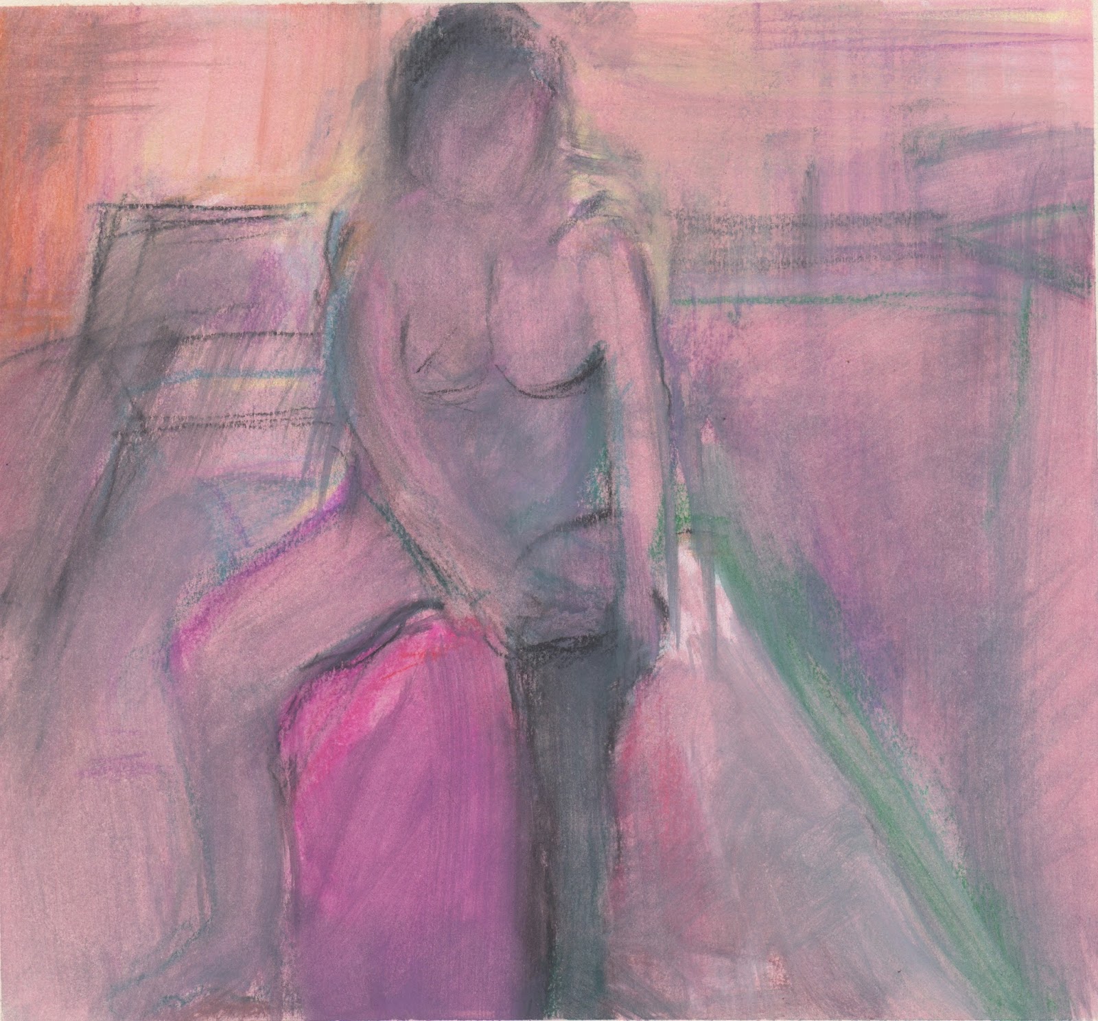
This altered sketchbook (using soft pastel) is about the edges where figurative and abstract mark making meet. I have said before that making fused plastic is a playful part of my practice where I am freed to respond and which is more like solving a puzzle than drawing.  It is intuitive and does require careful looking, but it isn't as rooted in eye-hand coordination, it is more about discovery. As I progress through the altered sketchbook, will it be possible to combine the two in a different kind of drawing?

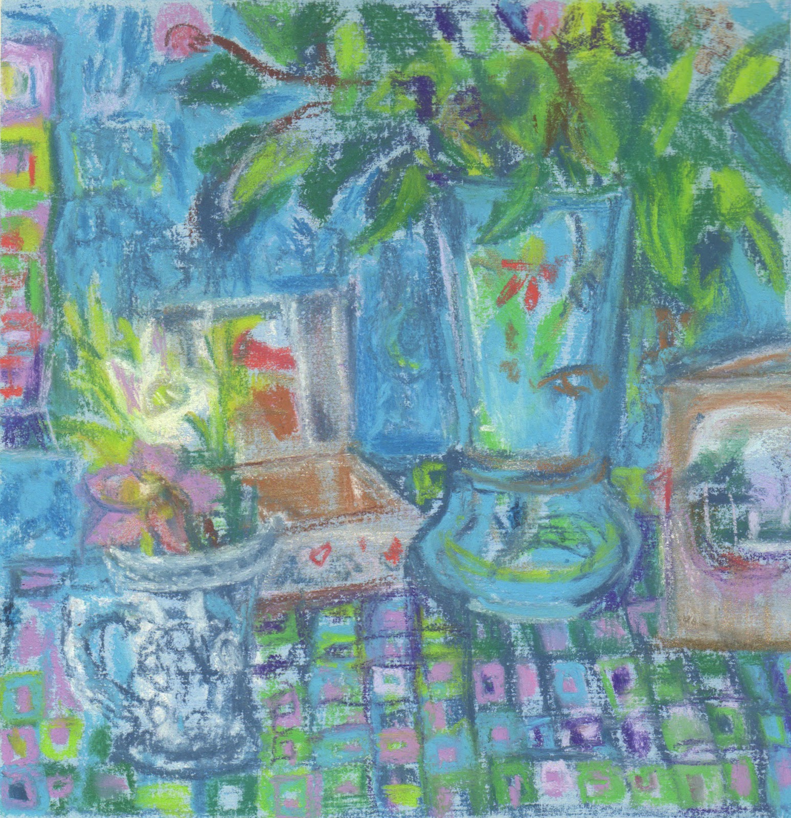
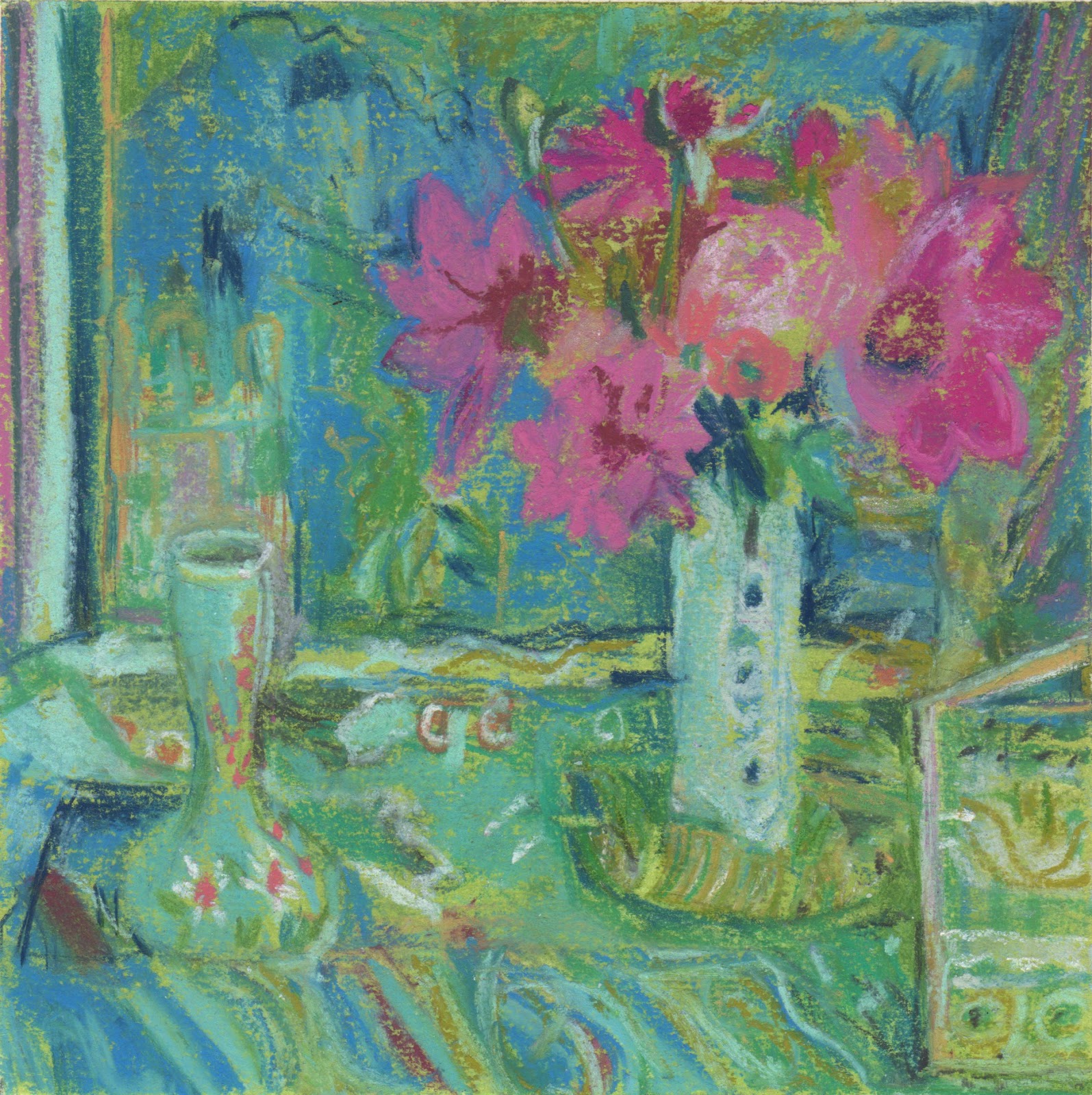
Last year I made a series of pastel drawings where I combined still life objects with some of  my painted paper collages, drawing about the two together.  They were surprising. Is this a direction that could be intriguing?

These are the last two of my dining on plastic pieces.  You can see more about them and the other from previous weeks at that blog here:
.http://diningonplastic.blogspot.co.uk
Mozarella and Mangoes at the Pier

Carrots Downriver


Monday, February 13, 2017

The quiet of Emily

13.5 x 14 cm
 Our models are all very different. With one, you might get the feeling that you have caught them in the moment between something else; another tells a story with a shoulder.  With Emily, it's as though she stops time. Today I was using the side of my pastel to approximate areas of colour and light.  I used my eraser very little and just drew over to make adjustments.  I like the loose peaceful feel of some of what I drew. The first four sketches are ten minute poses.  The last was 25 mins.  
13.5 x 14cm

13.5 x 14cm

16 x 16 cm

16 x 15.5 cm

Saturday, February 4, 2017

What are the Colours of Spring?

Primose and Planning, pastel on paper, 14.5 x 16 cm
I wasn't tempted to reach for the too many muted colours when composing something that spoke to me of spring. Instead, my underpainting, crushed orange pastel with surgical spirit to fix it, was intense and my first marks, in a bright blue almost convinced me that it couldn't work. Instead I tried to keep the intensity, the free application of colour and shape and to create the belief that these objects belong together and are part of a story that hangs in the air.

Thursday, February 2, 2017

Using the same objects to say something else

Flowers and Musk, 26 x 26cm, pastel on paper

Using a slightly bigger piece of paper than I did yesterday, this time I coated some Fabriano with a deeper pale blue acrylic/pastel ground.  One of the things I always have trouble with in a garden is yellow and red flowers together with a backdrop of green grass… so I took out the yellow flowers, changed the background and changed vases. I like to get up close.  I like to find the shapes in the complexity.  I like a richer, deeper palette.  For me, this arrangement works better and there's nothing wimply about it!

The Mall galleries have put what they call 'selected work' up on the website for the the Pastel Society Exhibition.  I am on page six! 
http://www.mallgalleries.org.uk/whats-on/exhibitions/pastel-society-annual-exhibition-2017

Saturday, January 14, 2017

Ripples of Inspiration


I'm reading Matisse Diebenkorn, published by the Baltimore Museum of Art and the San Francisco Museum of Modern Art.  There is an exhibition looking at the influence of Matisse on Diebenkorn and this is the book from that exhibition. I wish I could see the paintings in life, but as second best, I bought it for myself for my birthday.  

A few days ago I picked a bouquet of leaves to put in my new Opaline vase that I bought months ago at the Boule-In (Bildeston), and put in the 'Christmas closet'.  (Vases are one of my weaknesses, I can't say no to a beautiful vase…) The bouquet dried out in the kitchen but as it sat there I thought about what you do with just green, Today when everyone went out to Bury, I took the vase, picked some new leaves chose three different pieces of patterned blue fabric, and placed, removed, and moved objects that I found in the studio around on my set up: two boxes stacked on a chair with a board on top. I decided I needed a hellibore for height, for colour and for shape to finish off the composition. I looked at John Mcallister and thought about Matisse and Diebenkorn and waited to see what would happen on my 16 x 16 cm piece of paper that I had painted with some pale blue pastel ground I mixed.

I saw this a a preliminary drawing for something a bit bigger.  The next drawing is going to be rectangular and I will include more of the space, as that is what my three mentors would do.

Wednesday, October 26, 2016

The Time of Year for Dahlia Love

Orchid and Oriental
I've been getting work ready for a few upcoming group shows.  The Sentinel wanted pastel still lifes and it's that time of year when there isn't so much left in the garden besides the dahlias. This year my zinnias and roses have lasted until now too so there is some variety to the shapes. And for once I don't have to make excuses for grabbing the magenta when I choose my pastels.

Pinks and Greens
I'm trying to make my pastels a standard size, for framing purposes, but clearly mis-measured the top drawing.  The bottom is 16x16cm. Another observation is while the pastel spread on the top drawing in a buttery manner; I found the pastels I chose, or perhaps the pastel ground I chose in the bottom would only let me apply scratchy marks. I will always be a beginner!

Thursday, October 20, 2016

What sticks in your mind

Jerusalem Artichoke & Opaline
I spend a little time most days on Pinterest.  I love finding new images and seeing how people resolve colour, light, composition, paint and drawing issues.  Sometimes an image sticks in my head for a long time.  Visual things sticking in my mind used to come from  the landscape, what I saw in my immediate environment, photos, paintings in galleries and museums.  Now there is so much more to look at and make sense of. I think I solve problems in the background for more of my day now. It's not that I am thinking about them, they are there in the betweenenss of my brain.

I have a deadline to get more work done so last night I went into the garden and cut two bouquets.  It was too dark to work then, but I looked at them and thought about a pinterest album I'd seen that morning of yellows.  I had filled the bouquet out with a few stems of jerusalem artichoke flowers. When I went to set something up to begin with, all of that stuff was stuck in my mind.  As I chose my colours Ivor Hitchens was tyhere helping.  Not really, obviously, but as I began working I thought of one of his bouquets.  The opaline vase is one of my flea market treasures.

Saturday, August 20, 2016

Lemon and Pomegranate before the rain

Lemon and Pomegranate 24x24cm
They were forcasting rain and strong winds, so I went out and cut three bouquets, knowing that my precious flowers would be battered.  For me, the process of fixing things in colour, light and form is enough.  Once I have done that I can let go and feel no regret.

I gessoed a 25 x 25cm piece of Fabriano on both sides so it would lie flat when I painted a pastel ground over it.  I used a pinky tint. The objects were selected and placed in the way I work when I am collaging abstractly, thinking purely of objects as blocks of colour. I worked from what I saw but I also tried to listen to the image that was appearing.  The left side is not as I saw it but what I think the painting needed. I kept feeling as if I were tightening up and was disappointed that I wasn't responding in the way I had hoped… I am taken by the work of John Bokor at the moment: http://kingstreetgallery.com.au/artists/john-bokor/ I am sharing the studio at the moment with our daughter and her friend and I wanted to be painting (where I think I can be a bit freer) but opted to draw instead because it takes less space, etc. Today I found I needed to describe accurately as well as to move around plutting colour down.  That's usually what happens when I haven't been working in a while. In the end I thought Gillian Ayres meets Jane Freilicher, or something.
SaveSave
SaveSave

Monday, April 25, 2016

Drawing from Life Exhibition and new directions


Last week my life drawing group had an exhibition in Bury St Edmunds.  I showed my colourful pastels (a selection below).  There were sixteen of us represented in the gallery and it was a strong, varied show. The gallery shots have two walls missing… I meant to take them later, as there were people in front, so you miss out seeing the work of Judith Glover and more by Pamela Yeend and Anna Dixon Smith.  Drat, I forgot!  Here is link to the catalogue that I put together for the exhibition and which has work by each of the artists.  


Now that the work is down, when I went to the group today I felt I needed to step away from my pastels and work in a different media.  I couldn't find my chamois and I had been making mono prints so I decided I would take some Akua ink, a small plate, a brayer, a barren, a spoon and a small sketchbook to print into.  

The setup for the sessions has changed and I find it difficult to make an interesting pastel anyway because there isn't enough 'confusion' to compose my squares/rectangles.  Working purely in light in a gestural way with ink would be different! I forgot my paintbrush, but Anna lent me one. We had thee minute, ten minute and twenty minute poses.I work with a rag taking ink away.


Sunday, April 24, 2016

Working Bigger with Beads

Bead Generation 37x45cm Pastel on Paper

In the run up to Suffolk Open Studios, I thought I would see what happens if I work directly  from life on a bigger format using my bead motif. I am working on Fabriano with a pastel ground tinted with acrylic. I chose a pale pink that you may be able to see in the right corner. I tried to chose objects (fabric) that would encourage me to use a variety of marks. The objects are just about life size. The patterns and colours are felt rather than rendered.  The orange shape is more beige in life but that killed things. While drawing, I listened to Shakespeare tributes on radio three, mostly classical music, but there were some sonnets too:

That time of year thou mayst in me behold
When yellow leaves, or none, or few, do hang
Upon those boughs which shake against the cold,
Bare ruined choirs, where late the sweet birds sang.
In me thou see'st the twilight of such day
As after sunset fadeth in the west;
Which by and by black night doth take away,
Death's second self, that seals up all in rest.
In me thou see'st the glowing of such fire,
That on the ashes of his youth doth lie,
As the death-bed, whereon it must expire,
Consumed with that which it was nourish'd by.
   This thou perceiv'st, which makes thy love more strong,
   To love that well, which thou must leave ere long.

And Lear:

We two alone will sing like birds i' the cage:
When thou dost ask me blessing, I'll kneel down,
And ask of thee forgiveness: so we'll live,
And pray, and sing, and tell old tales, and laugh
At gilded butterflies, and hear poor rogues
Talk of court news; and we'll talk with them too,
Who loses and who wins; who's in, who's out;
And take upon's the mystery of things,
As if we were God's spies: and we'll wear out,
In a wall'd prison, packs and sects of great ones,
That ebb and flow by the moon.

The necklaces were made by my mother, and they are emotional pieces in themsleves for me. Beautiful objects held in her hands and laboured over. Each object has a story and even when I am not thinking, just laying colours next to each other, I suspect I can't help but think on some level about these things as I draw.  Time contracts and I put the pieces together in what I hope is an honest way.

Friday, February 26, 2016

Painting from daily drawings


Oil on canvas 25 x 25cm
                              Jar Jug and Vase with Flowers


It's difficult to photograph wet paintings but it's even more difficult when it's getting dark when you do it, so I will shoot this again in the light, but I wanted to end my week with a finished painting  that I began by referring to one of my daily drawings that I'd made earlier in the week.  

I love seeing them here together.  And can remember each of the choices and struggles I had to get to the finished painting.

Pastel on paper 6 x 6"

Sunday, February 14, 2016

Different media for different purposes


Sue pulling on sock, Pastel on paper 22 x 24cm

Figure with Beads, pastel on paper 6 x 6"

At my life drawing group recently someone asked me how I came to begin making my 6 x 6" pastel life drawings.  I told her that it is all about the colour.  It's interesting the way different materials work to enhance the subject matter and what I want to say. I find pastels and their direct colour suits me when I want to get something down and I want to create a mood. They can also explain light. Big charcoal drawing are about gesture and light for me. I often use my drawings to begin something else. Figure with Beads was a starting point for Japanese Interior with Figure, if you can believe it...

Homework pastel on paper 6 x 6"
Because oil paint usually requires time and different ways of applying it, I use it to describe different things. I have the same preoccupations but the process yields different results.  If I were someone who made pictures in the same way every day I suppose my results would be different and much more similar to each other, but the way I was taught, by my California School abstract expressionist teachers, was to begin every day as though you know nothing and find a way through. Perhaps that explains my willingness to work across media 

Japanese Interior with Figure oil on canvas 40 x 40 cm

Spring Beads and Royal Blue pastel on paper 6 x 6"


Thursday, January 21, 2016

Peace, Energy and the Turquoise Muse

Turquoise Muse - Pastel on paper 6 x 6

Now that I have made a few pattern studies using my new muse: the fabric beads, I notice that arranging the fabric to create drama and interest is like building a nest.  I'm thinking colour, light and energy.  It's quite a restful phase in working. When I draw I find it is chaotic at first and then I find a peace in the image as things start to coalesce. I think keeping the drama and energy and suggesting peace is what I like about this new series.

Thursday, December 10, 2015

Drawing in drawings


When I was in my teens I learned that anything is a still life and any place is an interior or a landscape.  You just have to look hard to see the magic.  We had a new model, Esme, last week.  It is hard to draw someone new.  But it's also exciting.  Someone like me, who enters into every drawing as though I have never drawn before, really has no idea what will happen when the new model begins to emerge on the page.  Local colour is repetitive… it's the same rust coloured cushion, the same white radiator, the same grey brown floor.  I shift the colours one direction and the other colours follow, if I'm lucky.

Yesterday I turned the page with Esme to the front of my pad and put it next to a new jug of flowers  I'd treated myself to.  I found a scarf I'd bought in Edinburgh at a second hand shop, a bowl from a different charity shop, my scarf and gloves and celery-coloured pumpkin I'd grown. I love the chaos of finding the rhythm and the energy without drawing the forms. Both drawings are 6 x 6"

I also love taking drawings or books and using them as objects in subsequent drawings!