Monday, June 15, 2015

Pasteling Over


I arrived late at my drawing group today, caught behind a tractor.  The first pose had already begun. It was a ten minute pose and I didn't think it would be worth it to use a piece of my prepared paper so I found a pastel that wasn't working and began to transform it into a new person, a new pose, new light.  In the past I have wiped the old image away and have been left with a muddy background.  This time I simply began working on top. I did that all morning and these were the most successful products.   I like the feeling of time and the richness of the layering.

Wednesday, May 6, 2015

Light differently


Not so long ago I had some surgery so I could get the full quota of light into my eyes again.  Since then I have been seeing light differently.  I am not sure if colour is different too but I am aware of light inside and outside more.  Transitions are sharper.  Lately I have been using monotypes indoors and pastels outdoors to say something about light.


Monday, April 20, 2015

Afternoon light

While walking the dog today, I noticed a few local places that I want to draw.  I intended to pack my plein air easel, a pad and some drawing materials and return to one spot when I passed the newly opened silver birch that is just unfurling its leaves at the front of our house.

I find the Suffolk landscape too open.  I like to look through and to make sense of confusion.  Maine is perfect for that.  It turns out Suffolk can be too.  And today I didn't have to take my easel far. There is nothing better than chasing the afternoon light across the page… When I started the planes in the grass were stark and linear. Later they were more like zebra stripes and the shadow on the house repeated the triangle at the bottom.  Magic!

Repeating a pose


The format of my weekly life drawing group has changed. For one, there is no more tea. Sigh. because of this, the fixed timings are no longer fixed.  After break we used to have two twenty minute poses. Now the break is ten minutes and at no particular time, so it's a little more fluid. Today the consensus was to do a series of the same three poses three times.  Timings were 2, 5 and 15 minutes. Of course the poses weren't exactly the same.  The top drawing is 6 x 6 and was a 15 minute pose.  the two altered book pages (5 x 8) were each 5 minutes.  The bottom drawing 4.5 x 8.5 was another 15 minute pose.   


Tuesday, March 31, 2015

Sun Trap (painted paper collage) 17 x 24 cm


While getting ready for my first exhibition at The Freudian Sheep https://www.facebook.com/freudiansheep?fref=nf, a gallery in Ipswich that shows work by local 'upcoming' artists I've been making painted paper collages and fused plastic. When I took pieces to Jo Hollis (who frames my work), I wondered about working on thicker paper.  This is my first experiment on a thick watercolour paper I had on hand. It's possible to float the piece and avoid the wrinkled feel of lighter paper. I also tried tearing, rather than cutting here.

After visiting the Diebenkorn exhibit at the RA, I felt I wanted to work bigger in fused plastic.  This has been problematic because pieces don't always want to lie flat and I am not sure about how well they will hang. I experimented with sewing and gluing them onto paper and flattening them under books but the movement was compromised. I was able to make some bigger work eventually.  This piece is glued onto foam board.

Solar Yoga (Fused Plastic Collage) 23 x 26 cm


Thursday, March 5, 2015

Freedom and colour studies


Can you explain why these playful pages are so effortlessly, honestly exhuberant and why (and how) I can believe in them?

What do you want to say and how do you say it with paint?

Orange Bouquet


Millstone

Night at Nayland Farm

 Sue

Looking Down on Macabre colour

I find that for some reason when I paint I forget who I am and what I want to say.  As I am painting any one canvas I think I know but when you look at them side by side it's clear I am floundering! I am more sensitive about painting; I care what people think more than I do when I draw, make a print, fuse some plastic or make a book. As a result, when I paint I don't think I create a body of work that is identifiable or consistent.  I know it's there, but I can't access it day in day out. It's curious.


Some of my recent life drawings

Emily 

Marilyn

Emily

Marilyn

Marilyn

Marilyn

Sue
I went to a gallery recently to show my work and although they were really positive about some of my work, the person I spoke with felt that my life drawings were too 'traditional'.  

My wonderful life drawing class is a mix of different kinds of artists, former draughtsman, artists who simply love to draw and abstract painters work alongside each other. When we draw, there are gasps and sighs and we all talk about the shapes.

Thursday, January 15, 2015

More light studies

Light from Dairy, monotype: Akua Itaglio on paper 6 x 8"
As I continue to investigate the light around corners in our house, I keep consulting Vuillard.  But I'm finding that I'm starting to listen to the monotype and use colour the way it demands, rather than slavishly laying Vuillard's colour=light onto my view.  The image below, Mother and Sister of the Artist got me started with finding darker darks.  I began fairly faithfully and then felt that the wall needed a magenta and then, of course everything had to accomodate that.  I also found I needed to edit, add and embellish my view. Maybe figures soon?
Mother and Sister of the Artist  by Edouard Vuillard, 1892

Light From Above Piano, monotype: Akua Itaglio on paper 6 x 8"

 This print was actually made before the one above. You can see that I was little more faithful to Vuillard's pallette. I have painted and drawn this view repeatedly in the past. This medium seems to solve it more for me.
Woman in Blue, by Edouard Vuillard, 1893
 

 I include this last drawing to show that as I said in an earlier post there are many prints that I pull back the blanket to in disappointment. 
Light from Upstairs Window, monotype: Akua Itaglio on paper 6 x 8"
There is no denying that the monotype is a process-heavy form of 'painting', the way I make them. When I look at a 'finished' plate I can get really excited - the plate suggests something but a little blemish, something missed, can kill the image. and then there's the fact that it's the mirror image and I might not calculate what that does with your eye. I think I got so interested in the shapes and colour when I was making Light from Upstairs Window that I forgot that I was after light..  It has a stillness that I like, but...
Light from Window upstairs, soft pastel over 1st pull monoprint 
And those disappointments hang around. One way I've found to banish them is to work back into the print  In this case I used my first pull.  I often soak up the ink after I've sketched the structure onto the plate, to check it, that's my first pull.  This was one of those totally unfinished prints.  The problem is the pastel doesn't like the printmaking paper, but in this case I like the scratchy effect. It is not even remotely related to the intention of the monotype but the disappointment is further away.

Tuesday, January 13, 2015

Light behind wedding chest

For every satisfying print there a handful of disappointments. It comes back to the tension between light and colour, for me. I am planning to do a few black and white prints to work in tone to convey light, but the thing is, I LOVE COLOUR, so marrying those two things is the ideal.

Today I consulted Vuillard. Wonderful Vuillard who tells stories with rooms using light and colour. I think he helped.

Thursday, January 8, 2015

Light around corners

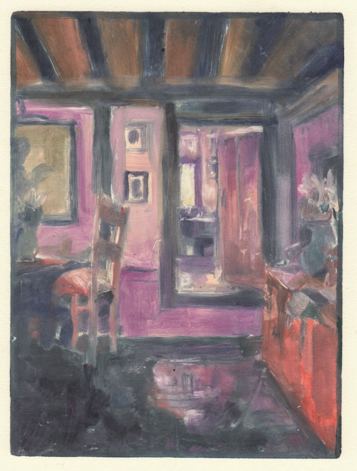
Light in Hallway: monotype Akua Itntaglio on Rives BFK 6 x 8"
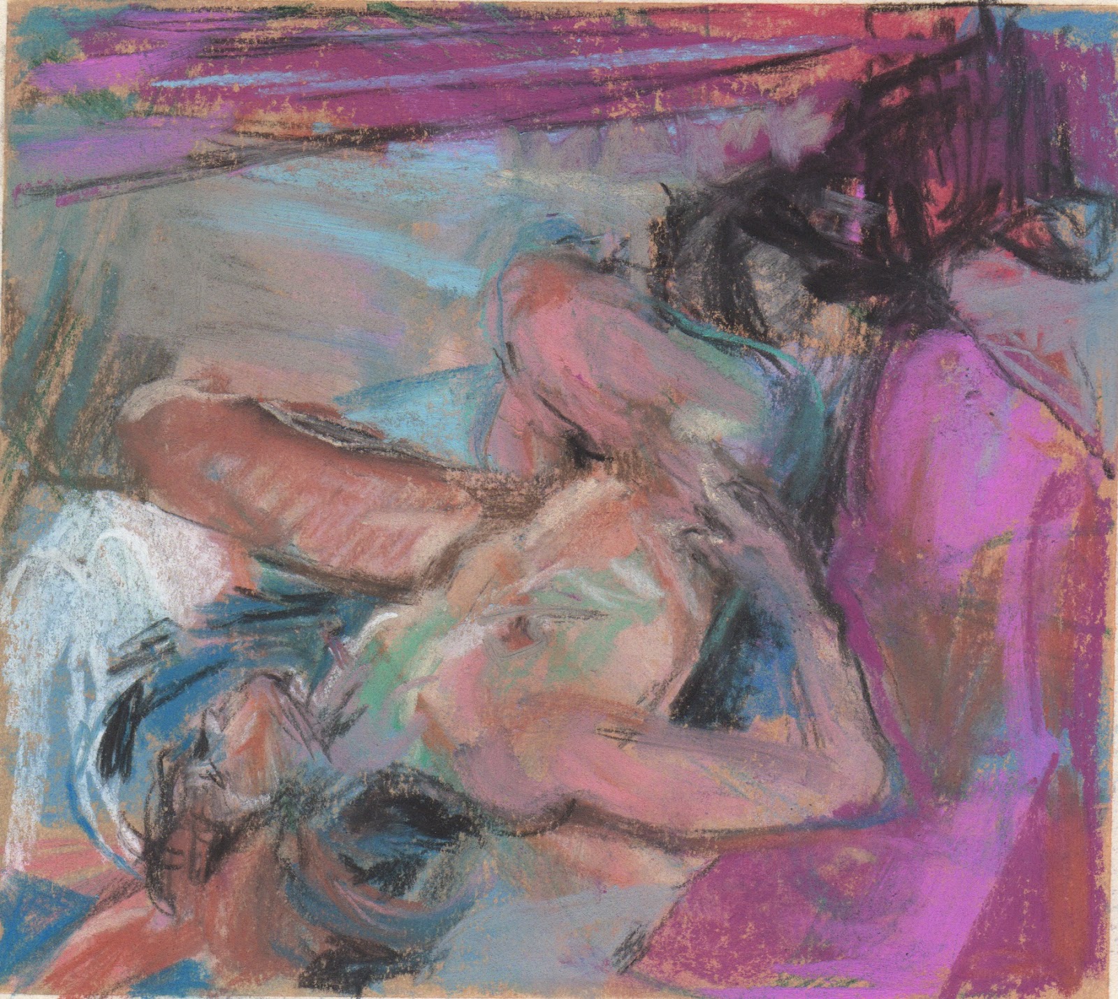
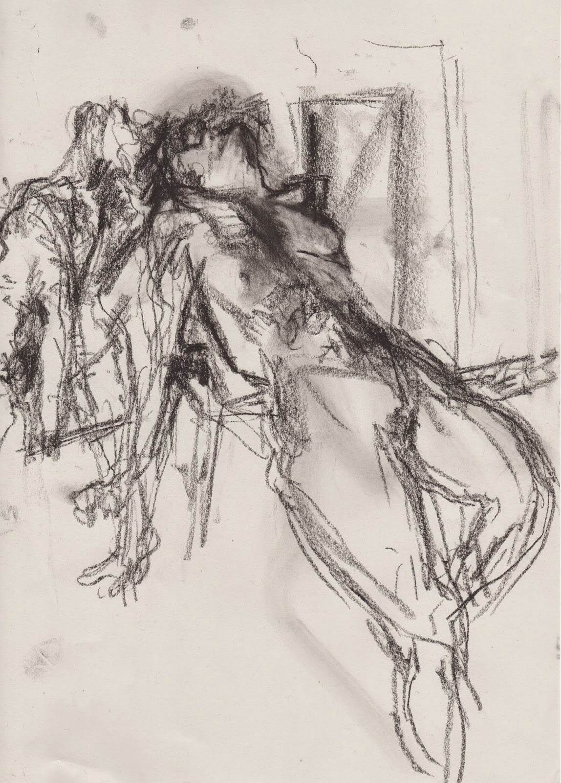
 I'm starting a new series!  And today is the first day I've had in more than a month to work for most of the day. I have been wanting to get back to monotypes, to really explote the water-based inks and to use what I've learned from Diebenkorn, fused plastic and my recent pastels. One day last month it hit me as I was coming around the corner of our living room that light around corners is related but not specific to the work I've been doing and would be an exciting aspect of my world to study.

Today, especially this morning when I got to work, it was dark, even though it should have been light and I seized the opportunity to go around the house looking at the light around the corners.  I took lots of photos.  I decided to flick throuhg my Hiroshige book to look for colour inspiration.  The spread below felt like the day, and I liked the wedge of green, so that's where I began.
I got the room prepared, for the first time since I've had the press!  I cleared off surfaces, made a wetting station, a working station and adjusted the press, even re-filed the edges, changed the paper, etc. If I don't begin at the beginning, I don't take the work seriously, and I rush.  I am delighted with the colour of the print!  The ink has potential, even if it doesn't do quite what oil-based ink does.  I also used plenty of brushes and found cleaning them and using them immediately after cleaning straightforward for the first time. I used hot water with the soap!

I'm excited to see what happens next.

Wednesday, November 19, 2014

Studying Matisse's colour


There's a part of me that likes to go out and 'find inspiration' and I consider wandering and gathering ideas important, but when I started this blog, a long time ago, I also knew that I have more than enough material to keep me busy FOREVER and it's a just a case of looking at what I have around me, intently, to see what's next. 

What better place to look again than with Matisse.  

Thursday, November 6, 2014

Bouquet and Spy Notebook (2 versions)

Oil on canvas 30 x 30 cm

pastel on paper 6 x 6 inches

Using a drawing as a starting place for a painting is fraught with pitfalls.  I've been reading about Degas and there was a comment about how it is commonly agreed that drawings are 'inferior' to paintings. The statement wasn't made as a value judgement, simply as reflection. The book went onto say that Degas, contrary to most artists, managed to make drawings that were accepted and appreciated as much as any painting.   

Although I call myself a painter, I draw more than I paint.  I love paint and to paint, but I find the immediacy of drawing helps me to get down the esssentials and quite often those essentials say it all. For me, with painting, there seem to be more things that need to come together and I can't pull it off as often. 

A painting takes on a life of its own, distinct from the drawing.  I could paint the painting exactly like the drawing, but it doesn't really work, the idea becomes lifeless.  It's like paint by number. Instead, I try to let go but also must admit to making the mistake of hanging onto well painted or exciting passages even when they are no longer relevant.  And then that conflict between making it real and making it correct is always a struggle, too. 


Friday, September 19, 2014

Summer drawings

Towards Gertmanian House

From Apple Tree

Maine was a fruitful time for drawing! I ordered a new plein air easel that is just like the one I have in England and that provedthe perfect tool for daily drawing.  We had few mosquitos this summer in our garden, so many of my drawings were made there.  In the first few drawings I thought about what Simon Carter does and used what was infront of me to create the mood of the place. And then I was liberated, I don't feel that I need to record what I see with accuracy… I am interested in capturing the feeling of a place, so after a few outings I began to move things around on the paper, to edit and to embellish in a what I hoped would make the place more itself.

Now that I am back, I am using some of the drawings as new starting points for paintings, prints and even other drawings but also am continuing to draw in pastel in the same format. Here in Suffolk I don't have a garden on my doorstep that inspires me the way the Maine garden does, but I do find flowers, interiors and stuff gets me excited, so my motifs are different, and of course I am back to experimenting with plastic!

All drawings are soft pastel on paper (6 x 6).  From Apple Tree was sold at the Artists of Cranberry Isles Exhibit.  You can see more of my garden drawings on pinterest.


Flowers Under Dogwood

Still `life From Clemetis

Election Result Bouquet


Friday, June 13, 2014

Gardens


With sublime weather and a little widow of time, I have been taking my folding easel and a bag of pastels to gardens.  These small drawings have attempted to suggest summer light. It's difficult not to get nostalalgic when looking at the beauty of nature!

Friday, May 23, 2014

Fused plastic portrait 2

I am wondering about creating a Victorian photo album of fused plastic portraits? How would that work? Or are these icons? Should the people be real or imagined - they have been invented so far...   What other materials would I need?  Would it be interesting?

I have a new sewing machine and I'm not sure what I was doing wrong yesterday but the stitches were not right.  Today it worked dreamily. I even used the knee lift! I will have to go back and prick out the other stitches and correct...