Wednesday, October 28, 2015

Exploring Scale


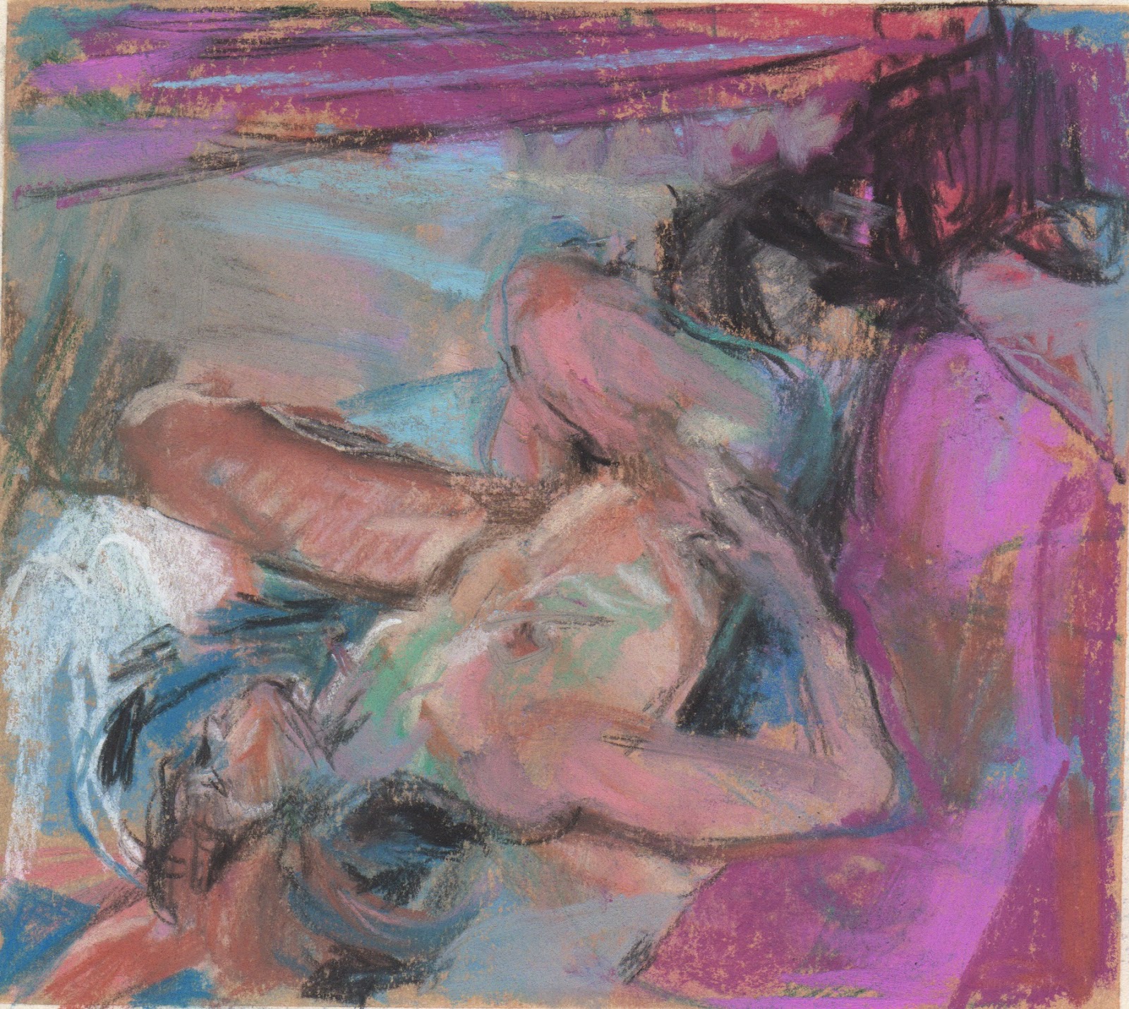
Recently I was commissioned to make a bigger painting based on one of my smaller drawings. I approached this by drawing, but drawing bigger. Working much bigger 60 x 60 instead of 6 x 6 with pastels was a fascinating process!  It was much more physical and keeping big blocks of colour with small tools was a different challenge. The colour I can get with pastel is so rich and intense.  In the end I didn't make a painting.


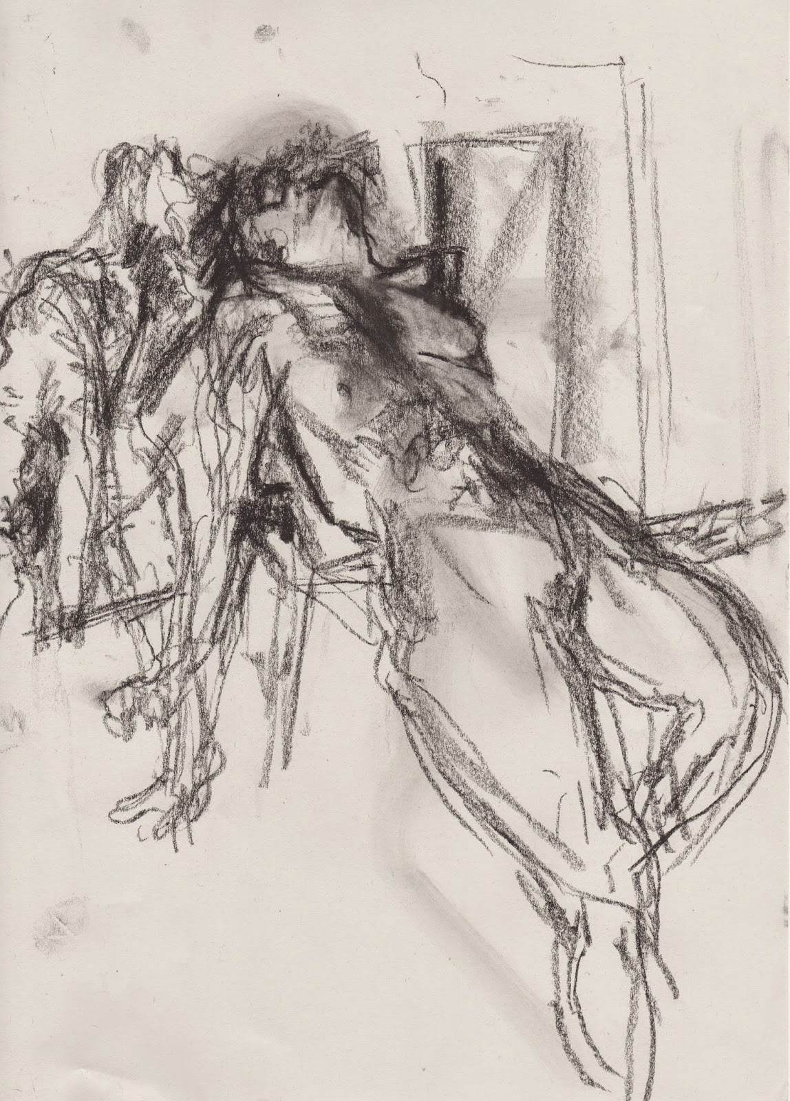
This one is also big (50 x 50) and it was a challenge of a different sort.  I wanted to capture the rhythm of light and the mystery of the woods and to share my feeling of the meditative aspect of this space.  When I made the original drawing I was trying to get the detail down in a short space of time. With a bigger version I was trying to remember my feelings and translate them in light.

Wednesday, September 23, 2015

Daily drawing

When I have the most to do, on days with my longest lists, when I can't afford to be in the studio all day, I always put 'make a drawing' on my list.   It's hard to get through a long list, so before dinner I stop everything else and make my drawing. 

I'm reading a book of mindfulness exercises, hoping to find ideas for our exhibition at StowHealth and obviously I am practicing a bit of mindfulness as a result. (I wasn't sure what mindfulness was until I began reading the book). I like the book particularly because it uses paintings as a way into the exercises.  When I paint and draw I guess I am 'mindful', the world falls away and the space between me and what I see changes.  It is always difficult to tear myself away from something beautiful that I am looking at, it's easy to overwork a piece.

Another thing I am trying to do is to appreciate my flowers.  I walk through the garden, smell them, look at them but I also pick them and put them on the table.  Today I cut some flowers, pinned a two page spread of a map to the wall, grabbed some cloth, began to look and to find the space between me and my subject with my pastels.

Monday, September 21, 2015

Monday's model

Emily was asked to pose for 15 minutes today.  After a summer hiatus of drawing from the model, I could have used some quick poses to loosen me up.  Instead I began with charcoal on A3, measuring with my eyes, drawing, redrawing, teaching myself to LOOK carefully, trying to identify what makes Emily 'Emily'.

I used pastel for the last three drawings, this was the final one. I drew over something else.  It's 13 x 22 cm. My new fixative darkened it a bit.

Wednesday, August 26, 2015

A painter of flowers and views

This summer I painted in the landscape on Cranberry Island with a new friend and fellow painter, Ahni.  Ahni and I are about the same age and so we laughed together at ourselves oohing and ahhing over a beautiful landscape and arrangement of colour, we share a love of the scenery that you find in Maine. Ahni did an painting MA not too long ago and told me how she was pulled away from her natural interests towards something less conventional.  In the time since, she has reconciled herself to 'being a painter of flowers', at least that's what she told me while we were painting some of my mother's exquisite flowers. I think we all have to paint what we see, the things that get us excited. 

These two oil paintings are 40 x 40 cm. Blackeyed Susan and Book was painted from life and Norwich Jug and Maine View was painted holding the jug, looking at two pastel drawings, a piece of a black and white photo I took this summer and inspired by a Dorothy Eisner painting.

 Blackeyed Susan and Book

Norwich Jug and Maine View 
 You can see Ahni's work at: http://new.ahnikruger.com

Friday, August 14, 2015

Altered Landscapes

 One of the things I have been exploring in the last few months has been using old books to draw in.  I had tried it a few years ago but used a small book, drawing to the edges and I wasn't satisfied.  In my life drawing group Emily Fox sometimes draws in books and I noticed that she used larger books.  She draws on pages as they are, I tried glueing pages together, gessoing them and then masking areas on the page. I created a colourful ground with pastel and alcohol on each page.  I have been alternating between my altered book and my sketch pads in my life drawing group.  This summer I brought a book to alter to Maine.

The surface makes my pastels buttery and I experimented with shape of drawings, using what was on the page as a starting point.  The book is Plank Bridge by the Pool by Norman Thelwell, and in removing pages and gluing them together, I have created 21 pages to draw on.  So far I have only used six; I did lots of drawings in my sketch pads too. I am not sure whether to mix Cranberry Island and Suffolk imagery but suspect I won't be able to wait until next summer! Here are the images I have in my book so far.

Garden and Woods 14 x 19cm July 2015

Whistler Path End 14 x 19cm July 2015

Wetlands and Boatshed 13.5 x 12cm July 2015

Gertmenian House at Night 13.5 x 15.5cm July 2015

Beds and Flowers 14 x 10.5cm July 2015

Ocean View From House 14 x 9.5cm July 2015


Monday, July 6, 2015

Barn Red Boat Shed


We arrived on Cranberry Island yesterday and today was a hot sunny day.  One of the first things I unpack when I arrive is my box of pastels. It sits in the loft of the barn and is a series of little boxes organised by colour with lots of little pieces of pastels from unison to super hard sticks.  I also have some bigger sets which I borrow from. I brought some pads from England but for some reason when I created a few pastel/alcohol grounds before setting out, the paper buckled.  In the end I used a smooth water colour pad that I had earmarked for gouache collages instead.


It was afternoon when I had my first opportunity to do some drawing. What with the heat and the start of the mosquito season, I was not ready to step outside the confines of the garden fence. As I walked through the garden, I noticed that red barn on the shore is more visible than last year and thought it had plenty of complexity to help me switch off what Matt Khan calls, 'conscious intent or calculation'.  Today I limited myself to seven colours and then added a dark brown to get a darker value. It was slow going to begin with, in fact I was working pretty randomly at first, but once I had lots of colour down and started using my eraser I began to enjoy myself. It was that big pink woodchip path and those conifers that marked the turning point. the silver young silver birches helped me find the calligraphy.
I decided to ignore the fence. Elizabeth Mowry's advice, 'nature requires editing for the sake of clarity' is helpful to remember even when it's a fence not just a digitalis leaf. Last year the fence dominated. 

Always great to be back on Cranberry Island and to take my easel outdoors!


Tuesday, June 16, 2015

Distracted by plastic

My studio is clean and I have lots coming up later this week so the only thing I could fit in (between the usual mail art distraction) was a little plastic fusing. Not long ago I found a deflated balloon on the edge of a field and pocketed it. The worn gold was the starting point for this.  

I have been re-reading a couple of pastel books, looking for words for my workshop on Friday and Wolf Khan's use of 'calligraphy' was playing in my mind as I intuitively worked.

Monday, June 15, 2015

Pasteling Over


I arrived late at my drawing group today, caught behind a tractor.  The first pose had already begun. It was a ten minute pose and I didn't think it would be worth it to use a piece of my prepared paper so I found a pastel that wasn't working and began to transform it into a new person, a new pose, new light.  In the past I have wiped the old image away and have been left with a muddy background.  This time I simply began working on top. I did that all morning and these were the most successful products.   I like the feeling of time and the richness of the layering.

Wednesday, May 6, 2015

Light differently


Not so long ago I had some surgery so I could get the full quota of light into my eyes again.  Since then I have been seeing light differently.  I am not sure if colour is different too but I am aware of light inside and outside more.  Transitions are sharper.  Lately I have been using monotypes indoors and pastels outdoors to say something about light.


Monday, April 20, 2015

Afternoon light

While walking the dog today, I noticed a few local places that I want to draw.  I intended to pack my plein air easel, a pad and some drawing materials and return to one spot when I passed the newly opened silver birch that is just unfurling its leaves at the front of our house.

I find the Suffolk landscape too open.  I like to look through and to make sense of confusion.  Maine is perfect for that.  It turns out Suffolk can be too.  And today I didn't have to take my easel far. There is nothing better than chasing the afternoon light across the page… When I started the planes in the grass were stark and linear. Later they were more like zebra stripes and the shadow on the house repeated the triangle at the bottom.  Magic!

Repeating a pose


The format of my weekly life drawing group has changed. For one, there is no more tea. Sigh. because of this, the fixed timings are no longer fixed.  After break we used to have two twenty minute poses. Now the break is ten minutes and at no particular time, so it's a little more fluid. Today the consensus was to do a series of the same three poses three times.  Timings were 2, 5 and 15 minutes. Of course the poses weren't exactly the same.  The top drawing is 6 x 6 and was a 15 minute pose.  the two altered book pages (5 x 8) were each 5 minutes.  The bottom drawing 4.5 x 8.5 was another 15 minute pose.   


Tuesday, March 31, 2015

Sun Trap (painted paper collage) 17 x 24 cm


While getting ready for my first exhibition at The Freudian Sheep https://www.facebook.com/freudiansheep?fref=nf, a gallery in Ipswich that shows work by local 'upcoming' artists I've been making painted paper collages and fused plastic. When I took pieces to Jo Hollis (who frames my work), I wondered about working on thicker paper.  This is my first experiment on a thick watercolour paper I had on hand. It's possible to float the piece and avoid the wrinkled feel of lighter paper. I also tried tearing, rather than cutting here.

After visiting the Diebenkorn exhibit at the RA, I felt I wanted to work bigger in fused plastic.  This has been problematic because pieces don't always want to lie flat and I am not sure about how well they will hang. I experimented with sewing and gluing them onto paper and flattening them under books but the movement was compromised. I was able to make some bigger work eventually.  This piece is glued onto foam board.

Solar Yoga (Fused Plastic Collage) 23 x 26 cm


Thursday, March 5, 2015

Freedom and colour studies


Can you explain why these playful pages are so effortlessly, honestly exhuberant and why (and how) I can believe in them?

What do you want to say and how do you say it with paint?

Orange Bouquet


Millstone

Night at Nayland Farm

 Sue

Looking Down on Macabre colour

I find that for some reason when I paint I forget who I am and what I want to say.  As I am painting any one canvas I think I know but when you look at them side by side it's clear I am floundering! I am more sensitive about painting; I care what people think more than I do when I draw, make a print, fuse some plastic or make a book. As a result, when I paint I don't think I create a body of work that is identifiable or consistent.  I know it's there, but I can't access it day in day out. It's curious.


Some of my recent life drawings

Emily 

Marilyn

Emily

Marilyn

Marilyn

Marilyn

Sue
I went to a gallery recently to show my work and although they were really positive about some of my work, the person I spoke with felt that my life drawings were too 'traditional'.  

My wonderful life drawing class is a mix of different kinds of artists, former draughtsman, artists who simply love to draw and abstract painters work alongside each other. When we draw, there are gasps and sighs and we all talk about the shapes.

Thursday, January 15, 2015

More light studies

Light from Dairy, monotype: Akua Itaglio on paper 6 x 8"
As I continue to investigate the light around corners in our house, I keep consulting Vuillard.  But I'm finding that I'm starting to listen to the monotype and use colour the way it demands, rather than slavishly laying Vuillard's colour=light onto my view.  The image below, Mother and Sister of the Artist got me started with finding darker darks.  I began fairly faithfully and then felt that the wall needed a magenta and then, of course everything had to accomodate that.  I also found I needed to edit, add and embellish my view. Maybe figures soon?
Mother and Sister of the Artist  by Edouard Vuillard, 1892

Light From Above Piano, monotype: Akua Itaglio on paper 6 x 8"

 This print was actually made before the one above. You can see that I was little more faithful to Vuillard's pallette. I have painted and drawn this view repeatedly in the past. This medium seems to solve it more for me.
Woman in Blue, by Edouard Vuillard, 1893
 

 I include this last drawing to show that as I said in an earlier post there are many prints that I pull back the blanket to in disappointment. 
Light from Upstairs Window, monotype: Akua Itaglio on paper 6 x 8"
There is no denying that the monotype is a process-heavy form of 'painting', the way I make them. When I look at a 'finished' plate I can get really excited - the plate suggests something but a little blemish, something missed, can kill the image. and then there's the fact that it's the mirror image and I might not calculate what that does with your eye. I think I got so interested in the shapes and colour when I was making Light from Upstairs Window that I forgot that I was after light..  It has a stillness that I like, but...
Light from Window upstairs, soft pastel over 1st pull monoprint 
And those disappointments hang around. One way I've found to banish them is to work back into the print  In this case I used my first pull.  I often soak up the ink after I've sketched the structure onto the plate, to check it, that's my first pull.  This was one of those totally unfinished prints.  The problem is the pastel doesn't like the printmaking paper, but in this case I like the scratchy effect. It is not even remotely related to the intention of the monotype but the disappointment is further away.

Tuesday, January 13, 2015

Light behind wedding chest

For every satisfying print there a handful of disappointments. It comes back to the tension between light and colour, for me. I am planning to do a few black and white prints to work in tone to convey light, but the thing is, I LOVE COLOUR, so marrying those two things is the ideal.

Today I consulted Vuillard. Wonderful Vuillard who tells stories with rooms using light and colour. I think he helped.

Thursday, January 8, 2015

Light around corners

Light in Hallway: monotype Akua Itntaglio on Rives BFK 6 x 8"
 I'm starting a new series!  And today is the first day I've had in more than a month to work for most of the day. I have been wanting to get back to monotypes, to really explote the water-based inks and to use what I've learned from Diebenkorn, fused plastic and my recent pastels. One day last month it hit me as I was coming around the corner of our living room that light around corners is related but not specific to the work I've been doing and would be an exciting aspect of my world to study.

Today, especially this morning when I got to work, it was dark, even though it should have been light and I seized the opportunity to go around the house looking at the light around the corners.  I took lots of photos.  I decided to flick throuhg my Hiroshige book to look for colour inspiration.  The spread below felt like the day, and I liked the wedge of green, so that's where I began.
I got the room prepared, for the first time since I've had the press!  I cleared off surfaces, made a wetting station, a working station and adjusted the press, even re-filed the edges, changed the paper, etc. If I don't begin at the beginning, I don't take the work seriously, and I rush.  I am delighted with the colour of the print!  The ink has potential, even if it doesn't do quite what oil-based ink does.  I also used plenty of brushes and found cleaning them and using them immediately after cleaning straightforward for the first time. I used hot water with the soap!

I'm excited to see what happens next.