Monday, April 15, 2013

Fused plastic collage


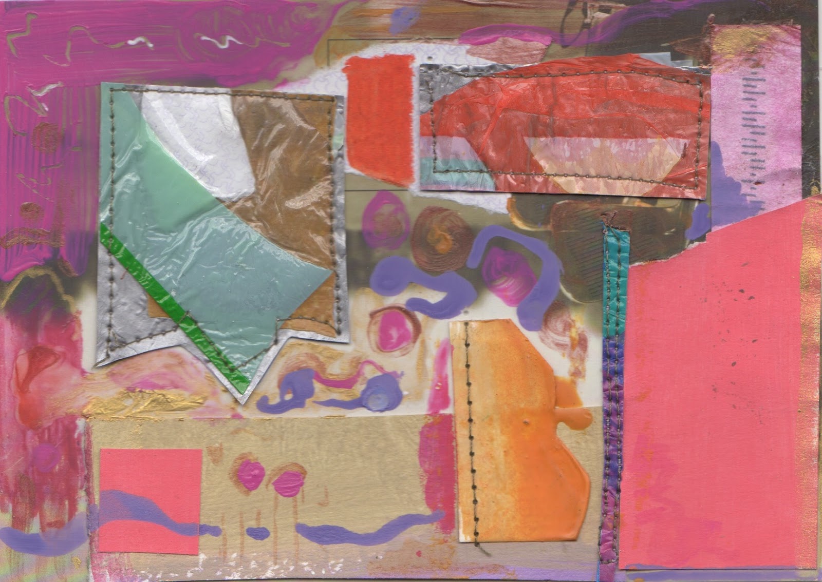
I have decided to do a series of these, to take them beyond their mail art potential. It turns out with careful handling most plastics can be fused and incorporating paper as a layer gives me even more possibilities. Yesterday I found myself asking for a bag, even though I had a cloth bag... some of the flimsy bags produce a different kind transparency.  Heavy duty bags are absolutely opaque. 

Wednesday, April 10, 2013

using life drawings in a large painting

This is a painting that is certainly not painting itself, but am enjoying the challenge of trying to juggle lots of ideas and experiments at the same time. Beginning with a life drawing I painted over another painting that had been painted over another painting.  If I think about it I can see traces of each. Somewhere along the way I decided the nude needed some clothing.  I will go and do a colour study and see if I can figure out what colour I need on the cloth over the chair and then I will decide about the shape of the clothing that it needs to become... I also need to find the life drawing that I filed somewhere and can't find so I can think about those feet.

Friday, April 5, 2013

When to stop?

The struggle over how much to say, the memory, in my ear, of Dorothy Eisner telling me not to model.  The way people like a particular painting that painted itself ... I took my pastels into the room with the loved painting and drew on top of a scan of where I'd got to on this painting in the hope of finding what should happen next, wondering if the loved painting would offer answers. Back in the studio I didn't look at the pastel result as I worked, but it had warmed me up, probably. Later I compared and took from the pastel what seemed to be missing. Still not sure if it's finished.

Thursday, April 4, 2013

Considering the role of white and black on colour

                                             A                                                B
Both of these studies are 6"sq.  I began study 'a' feeling very rusty about colour studies.  My next task (from David Hornung's colour workshop book) was to create a 'free study' and the previous reading was about the use of white and black around colour and the impact on adjacent colour. I thought I'd see what happened with black and white and try to jog my memory around an understanding of colour relations.  I used neocolour 2 (water soluble crayons) and portfolio water soluble oil pastels first.  They are messy to work with if you are trying for precision. I didn't begin thinking 'this is the plan' I had a loose objective and perhaps choice of materials didn't really suit where I ended up going... but it gave my a chance to think about texture, something I hadn't considered before.  The task was to use each colour at least twice.  I didn't  plan value or hue constraints. I wanted to use a variety of materials.  I wanted to add some pattern. Could I have too many variables going on here? In the end I used paper scraps, Caran D'ache gouache, black permanent pen and white paper.  Whatever colour I laid down on the square, I put the same colour on another piece of white paper to cut and collage elsewhere. 

In the second study I wanted to see what would happen if I seperated the blue/greens from the red/yellows.  I was also thinking I was putting the darker value at the top.  But as I responded to the image I found I needed a rich, deep more prismatic red/orange. The lemon yellow is quite cool and I put the cobalt violet with the blue greens...  so the end result was a wider range of values, a similar range of hues and more black in 'b'.  Although much is similar I prefer the gesture in 'b'.

Wednesday, April 3, 2013

warming up with a new material

Whenever I take a break from painting and drawing, (and these breaks are always about making space for something else - in this case a family holiday and experiments in plastic), I always find it difficult to begin again.  I can't remember where I left off, what I was thinking.  This time I took a look at what I'd been doing and the barrier was that I wanted a bit of time to warm up before entering into that space because I liked some of the beginnings. I have never really used oil pastels, preferring chalk, and I wondered whether using an unfamiliar material would result in something different. This 16 X 24 cm drawing is a response to one of my unfinished paintings.

Tuesday, March 19, 2013

Bottles and Snowlight

What with all this talk of snow again in the forecast, I got into a snow mind, rearranging some landmarks from my studio and beyond.

Tuesday, March 12, 2013

Snowlight in Maine summer


Woke up to white and the pink light of sun on snow.  Not sure why I took today's big blank canvas and painted summer in Maine but the snow colours were definately on my mind.  I think Figgy calls them 'sweet' colours.  I worked the same way I had yesterday, inventing a scene in charcoal from drawings, memory/imagination and  parts of a few photos.  My challenge was to use some yellow green and make it believable.  

Monday, March 11, 2013

New beginning colour and shape


Working from drawings, imagination and parts photos I began today with charcoal. It is drawing group Monday but what with the snow and not having the regular car I decided to stay home.  
I began drawing because I wanted to consider the light and shapes. When I finished I realised I'd done what I often do, put a line down the middle of the space.  Not sure why but I thought an ironing board would unify things, create some more complication and create a reason for the woman on the chair. 
This is only a few hours of painting so will come back to it again, and probably again.

Friday, March 8, 2013

Working in all directions


My preferred wayof working with pastels has always been plein air, or from life, anyway.  This is a departure. I decided to draw from a painting that began as a drawing that I abstracted and invented.  This is not as abstract as the painting, so more invented. I like the painterlyness of it.

Thursday, March 7, 2013

Figure with Deckchair

This painting was stalled for some time.  I wondered what would happen if I collaged some pastel drawing motifs onto it.  It was obviously Maine so I found a few drawings and attempted to translate the energy to the painting. I put one of Rose Hilton's catalogs at my feet and began.

Tuesday, March 5, 2013

Oriental lillies

This is my painting response to my earlier post, Notwithstanding Local Colour.  This painting has layers of paint under it, a tree painting a very loose vibrant overpainting over that and this which has tightened up but has some interest for me anyway.  I hope I can return to it and resolve it, but for now I'll turn it towards the wall.  It's mysterious the way you can paint many different ways  in a short space of time...

A few drawings


Life drawing every monday.  I've been going to the same group since I moved to England 13 years ago. When I was teaching full time it was impossible to get to Sudbury, but mostly I go now. There is the occasional new model, but Blue has been modeling for the group all along.  I missed it  but apparently she modeled when nine months pregnant, years ago. The sessions have a loose structure.  Sue, a model herself, started the group 20 something years ago and is in charge.  Usually I am in a rush in the morning and it's lucky if I remember everything but yesterday I decided to prepare something different for the session.  I rubbed pastel into paper that I'd outlined with masking tape.  I treated the pastel in three ways: I brushed mineral spirit on two rectangles, clear gesso over another and brushed fixative over the final one.  Each was a different colour.  There were two on a page.  I had no idea what would happen at drawing or even if I would feel like using them.  In the previous session I only used charcoal.  I never really know which tool I'll grab when Sue says, 'this will be a three minute pose,' or whatever.

Sue strucutred things in a way she never has before.  She asked Blue to pose three different ways and to hold each pose (in rotation) for 1 min, 5 minutes and 10 minutes.  So, we would have three opportunities to draw Blue in each pose. The top drawing is one of the three ten minute poses.  The other two are 20 minute poses (which is the routine) after our break.  

Thursday, February 28, 2013

Revisiting old territory

It's always exciting when you breathe new life into a painting you've put aside. Still not sure where this is going, but like the energy so far.

Wednesday, February 27, 2013

notwithstanding local colour


I expect some of this will serve as the basis for a painting. Tried to think colour studies rather than local colour while drawing a familiar interior.  It reminds me of the interiors I made when I was a teenager.  Same handwriting, same area of interest.  


Tuesday, February 26, 2013

How do I use life drawings?

The barrier of reproducing something REAL from a brief life-drawing experience has meant that I have avoided using my life drawing in my painting and printmaking work, except to get the gesture of a figure to use in a monotype.  Patrick thinks this is untapped territory. I think I am sensitive about being branded 'nostalgic' or 'romantic' too, so hundreds of sketches languish in folders and sketchbooks.  
But this morning I decided to try to put all that aside and to do something finished with a life drawing.  
I can still remember Keith Boyle, one of my painting teachers, and our discussion about my love of Bonnard.  He used the word 'decorative'. I suppose Mattise, Modigliani, Gaugin they might be branded with that same word. 

Saturday, February 23, 2013

a real postcard for the virtual drawing group from Tina

Tina and Christopher wrote to thank us for a dinner we hosted recently.  Tina writes, ' A postcard to join the collection.' I have a few of Tina's postcards but I suspect she is referring to my mail art collection.... Tina calls this beautiful pastel, one of many that she has created at the flat in Aldeburgh, Anemone Blanda.  Many thanks Tina!

Friday, February 22, 2013

Painting structure

Another 6x8 monotype, this time trying to collage drawings and ideas in a painterly way. All the colour is invented.  What I notice about working with Akua Intaglio inks is that cleaning between colours is problematic because although you can do it with water you really need warm soapy water and then the brush should dry and when I am working quickly I just never seem to realy clean my brushes properly so I get a muddy feel unless I am fastidious, which I never am...

I also forgot to roll the release agent onto the image before printing until I had the paper ontop of it, so I had to lift up the corners and roll and I got bits of red all over the place, accidentally. 

I took a photo of the plate before I printed it.  It's interesting to see how different the final print is...

Wednesday, February 20, 2013

Thinking colour in monotype

The first thing to say is that this image isn't really accurate in terms of colour, the original being more subtle with richer oranges and not so much red. I need to calibrate/profile things better between camera, monitor and printer,  but I don't want to invest in any more equipment until I am happy with the images I'm making...

The next thing to say is that this is that Akua Itaglio Ink and it just doesn't hold the line as well as oil based ink, so far.  I used a zinc plate whihc does seem to help and I think I'm beginning to use the pigment better, but I had more detail in the face and during printing it smudged.  I rolled the release agent over the top, pre-printing as I worried that the ink might have dried too much for spoon printing. Rolling a film of relase agent makes me nervous and it did throw up a few specks of random colour so I added a few finishing touches after, perhaps that contributed to the smudge problem.


Wednesday, January 30, 2013

The struggle of working big

So this one is big - 24 x 36 Inches and has been a few different paintings. The original painting was landscape, with some interesting shapes and some painting that I liked, but the subject was ultimately unappealing to me.  So I turned it portrait direction and in Bob Lahotan style I looked for something, somewhere in the original painting to begin with again.  Eventually it happened but the second image referred to a 5 minute sketch from life drawing and although it had potential, I didn't believe it. In Septmeber, I  had thought I'd do a series of hat paintings based on a trip to a day of open gardens when I followed a hat around.  That felt like another place to begin again  so I painted in the figure. It needed more stuff, so amoung other things, our bowl, lamp and sideboard appeared today. 

I continue to struggle with tight and loose, how much to define, colour and grey, line and all that decorative.

I think my mother would recognize similar painting on her folding screen, so maybe this is how I paint, my handwriting?

Friday, January 25, 2013

Clearing Snow

Having used the pure pigment of gouache, these Akua intaglio inks are a bit pale by comparison, but I thought they might be able to approximate snow light in their own way, so I moved aside the oils and began.  Even though I find making monotypes so arduous at the start, as I begin to finish there is usually a sense of wonder and delight.  They take time, focus and luck. I love rubbing the paper with the wooden spoon , lifting up the corner and seeing what it all means in reverse etc...

Thursday, January 24, 2013

Snowlight colour studies under the influence of Hiroshige

No sun up this morning while walking the dog and the colours and light at the end of the lane reminded me of Hiroshige. I wondered whether using Horoshige's colours in one of my colour studies would create the feel of snow. I tried to think about colour ratios, very loosely, and grabbed, tore and cut paper quickly. I wanted to keep away from reproducing the structure. Clearly missed an opportunity to use my favourite melon orange, in my haste, though.


Wednesday, January 23, 2013

Snowlight by woodshed

These 'snowlight' oil sketches have become a part of my day.  The snow is still pristine in our Nayland Farm micro-climate. the original is a bit duller, a bit more like the grey snowlight of today.

Monday, January 21, 2013

Snowlight in studio

Heavy snow last night and overcast today. I only have titanium white, I wonder what lead white would do? 


Also making snowlight mailart, drawing on colour studies and gouache painted paper.

Friday, January 18, 2013

Snowlight (inside) 2

The snowlight is flat today.  They say snow is coming and in 'pathetic fallacy' terms the snowscape looks malevolent, not playful.
I realised I don't have a col red (carmine) in my oils, so found it difficult to get a low key fuscia.  In the end I turned to my neocolour.  Love the colour studies book! Also finding it manageable to do 5 X 7 oil sketches.

Thursday, January 17, 2013

Snowlight (inside)


This snow light is beguiling! That high key blue-green white-light through the window changes everything. Another tiny 5x7 canvas.

Wednesday, January 16, 2013

The light of snow

I'm spending my evenings working through David Hornung's book COLOUR: a Workshop for Artists and designers. As I often point out, I am terrible at following directions so this morning when the weather station alarm woke me (-10C), I suddenly realised I had been mixing my chromatic greys/grays incorrectly and the first thing I did after taking pictures of the pink trees and the blue sky etc... was to re-do last night's assignment. 

I think I was primed from that and was about to work one of my ongoing projects when I noticed the snow light.  I found a canvas 5 X 7 and tried to record it. They say it will be snowy for a few days.  Beautiful light!

making Pauline's covers

Pauline is a Suffolk writer who asked me create the cover for her first book, Utterly Explosive.  If you want to read her book go to: http://www.amazon.co.uk/Utterly-Explosive-Pauline-Manders/dp/1478208414

Tuesday, January 1, 2013

Waking to a New Year


Listening for Children

Upstairs I rake sounds through floorboards
tweezing the prosthetic ‘a’ to make sense
of chirps below.  My cheeks decipher walls,
a toe tug and time between years.
I count vertebrae,
sink through baklavaian sheets,
sleeping between teenage sounds,
wonder up aisles of half centuries,
while threading chain to sprocket
with bare hands.

RG 1.1.13


Young people sleeping in the studio.  Limited by the trash in the office bin.