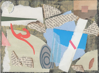
Pauline Manders, author and my neighbour, comes into my studio regularly, so she sees what I'm up to and occasionally I show her things that others might not see. I am interested in versions of things and how to translate between media. Colour studies became mail art books and pages of books become fused plastic collages. Pauline likes to see the progression. It helps her to understand the end result.
To see what Pauline is up to, visit her blog. I make her covers! http://paulinemandersauthor.blogspot.co.uk
Showing posts with label colour studies. Show all posts
Showing posts with label colour studies. Show all posts
Tuesday, February 11, 2014
Thursday, April 4, 2013
Considering the role of white and black on colour
A B
Both of these studies are 6"sq. I began study 'a' feeling very rusty about colour studies. My next task (from David Hornung's colour workshop book) was to create a 'free study' and the previous reading was about the use of white and black around colour and the impact on adjacent colour. I thought I'd see what happened with black and white and try to jog my memory around an understanding of colour relations. I used neocolour 2 (water soluble crayons) and portfolio water soluble oil pastels first. They are messy to work with if you are trying for precision. I didn't begin thinking 'this is the plan' I had a loose objective and perhaps choice of materials didn't really suit where I ended up going... but it gave my a chance to think about texture, something I hadn't considered before. The task was to use each colour at least twice. I didn't plan value or hue constraints. I wanted to use a variety of materials. I wanted to add some pattern. Could I have too many variables going on here? In the end I used paper scraps, Caran D'ache gouache, black permanent pen and white paper. Whatever colour I laid down on the square, I put the same colour on another piece of white paper to cut and collage elsewhere.
In the second study I wanted to see what would happen if I seperated the blue/greens from the red/yellows. I was also thinking I was putting the darker value at the top. But as I responded to the image I found I needed a rich, deep more prismatic red/orange. The lemon yellow is quite cool and I put the cobalt violet with the blue greens... so the end result was a wider range of values, a similar range of hues and more black in 'b'. Although much is similar I prefer the gesture in 'b'.
Thursday, January 24, 2013
Snowlight colour studies under the influence of Hiroshige
No sun up this morning while walking the dog and the colours and light at the end of the lane reminded me of Hiroshige. I wondered whether using Horoshige's colours in one of my colour studies would create the feel of snow. I tried to think about colour ratios, very loosely, and grabbed, tore and cut paper quickly. I wanted to keep away from reproducing the structure. Clearly missed an opportunity to use my favourite melon orange, in my haste, though.
Subscribe to:
Posts (Atom)


