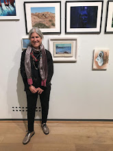
Pauline Manders, author and my neighbour, comes into my studio regularly, so she sees what I'm up to and occasionally I show her things that others might not see. I am interested in versions of things and how to translate between media. Colour studies became mail art books and pages of books become fused plastic collages. Pauline likes to see the progression. It helps her to understand the end result.
To see what Pauline is up to, visit her blog. I make her covers! http://paulinemandersauthor.blogspot.co.uk
Tuesday, February 11, 2014
painting from drawing
The first job is to look back over what I've done before. I was surprised to see that in my paintings value and line have been very secondary to my thinking, not always, but often. My drawings are about colour too but line and value are much more dominant aspects. So, I decided to work on that.
the top painting is very close to the original drawing. The one below began with a drawing and then took on a life of its own.
Drawing in colour
In the split second after a model strikes a pose, when you know you will only have minutes, to tens of minutes to say something, grabbing colours can be almost arbitrary. I usually start with three colours and then choose the next few to get a range of values and to complement my first choices. Sometimes the model is really quick and I barely have time to choose the first few and rely on what is in my hand to begin again.
I am starting to draw in order to paint, although in that split second I don't think I'm thinking about anything like that. I am just trying to get the shapes in the rectangle to work together.Not all poses or choices work, but a piece of something unsuccessful may inform something later.
Friday, January 31, 2014
Abstracting and turning
So I continue to explore the theory that if you start from something you know and have seen then abstraction becomes believable. I began with my ruler and looked for the shapes. Turning reality on its side was obvious.
Thursday, January 30, 2014
Almost Achromatic Interior
I find myself looking for ambiguous interiors that get me close to abstraction. Because there were larger shapes, I challenged myself to use colour believably but not entirely based on the local colour. I wanted to capture the feeling of the space and light in colour. I shifted between applying pastel, rubbing it off with a eraser and fixing it with surgical spirit.
Meanwhile we have been talking about minimalism at IUOMA. De Villo assembled mail art that is minimalist. I was wondering if anything I ever do or imagine might be minimalist, thinking that it wouldn't and then I thought of a beautiful stained ink box that i'd saved. I titled it 'Spirit of Morandi'. Perhaps our minds pair ideas, images…
Meanwhile we have been talking about minimalism at IUOMA. De Villo assembled mail art that is minimalist. I was wondering if anything I ever do or imagine might be minimalist, thinking that it wouldn't and then I thought of a beautiful stained ink box that i'd saved. I titled it 'Spirit of Morandi'. Perhaps our minds pair ideas, images…
Wednesday, January 29, 2014
Another view of Gurney in Somerset
Another drawing session where I used an image (taken recently) and projected it on the wall; I translated the colours into tone and line. This drawing is 9 x 13.5. Next I tried to change tone into colours using a previous colour study. I cut and fused the shapes as I saw them. The initial result didn't suggest the space or the light so I cut it all up again and tried to feel the space and use some but not all of the elements in the drawing to suggest what to do next. When sewing, I made a conscious effort not to repeat myself and to use the stiches as lines more intentionally than sometimes. The edges of the fused plastic were not even once I'd made a back. It was a wiggly organic form and I thought it might be a fragment, but in the end that didn't work.
Monday, January 27, 2014
Drawing Erin inpsires me.
I've only drawn Erin once before and that time I had a satisfying life drawing session too. There were about 15 of us in the group today and it's customary to wander around in the break and look at each other's work. I had a few compliments about this one, a ten minute sketch (5.5 X 6"). Sue wondered if I was inspired by one of the other artist's outfits, chartreuse and black. It might work that way…
Sue asked Erin to do a 15 minute sequence of movement and we drew it. We do this sometimes and it takes more concentration than anything. The 'chartreuse' Erin was drawn shortly after that sequence. I think drawing movement does something to your brain.
My 'style' of drawing doesn't really lend it self to movement drawing so results are never really anything, but the process seems to help, even more than a series of quick sketches.
This was my final drawing. I think I managed to loosen things up again. I think the other two are less successful, but they may have something for later.
Subscribe to:
Comments (Atom)


