Tuesday, April 10, 2018

Drawing through

Flowers on a Grey Day, pastel on paper, 28 x 28 cm
It was another one of those rainy days today. It was also the day I'd hear about an important open submission.  It's hard to get anything done on days when I'm waiting to hear.  But I wanted to change things around a little with the stilllife I had painted and approach it with pastels. I put some cloth over part of the existing background, shortened the daffodils, cut some new hellebores and draped a blue cloth napkin over the red box.  I put some fishing line across the back and hung one of my painted paper collages over it. The beginning marks were awful and I nearly quit repeatedly. The true colour on the right is orange and that flummoxed me for a time.

Once I'd heard I hadn't had either of the pieces I'd carried down to London on Saturday accepted, instead of allowing myself to wallow, I grew determined.  I knew that I would feel awful for a little while but that that would ebb and the best way around it was to draw through. 

And here is that other painting, finished.

Sunday, April 8, 2018

Yellow things


I wrote my blurb for the NEAC catalogue today and chose an image to send too.  Summing up the year was a little tricky, but good. One of the things I thought about and added before I pushed send was something I have realised about me. My process is about discovery.  I don't work in a totally premeditated way but it's also not quite the 'not knowing' way I was taught.  I realise I paint and draw to understand. So, I might set something up to test but I won't know where the painting and drawing will take me or even what I really want to find out until it's nearly over or maybe even later.  It's intuitive but I am discovering and learning as I go and that's why observation has mostly been my starting point. Knowing that feels good!

I continue to read the book I mentioned in the previous post, learning some things I guess I really ought to know…  I have been looking at art in galleries, books and museums checking to see if those RULES are hard and fast and the answer is a resounding 'NO'. I went to the Monet at the National on Friday and lo and behold Monet places his subject slap bang in the middle sometimes. His skies might be darker than the ground in some paintings too. Thinking about those things is never a bad thing, though. 

Today I wanted to test out one of my nine new canvas covered rabbit skin glue/gesso panels and decided to try to see if I could use the colour yellow in my composition (lots of daffodils at the moment). In general I find yellow and red difficult colours to use together so not quite sure why I did that except the things were nearby and once I'd arranged them they seemed to work.  I used the basic palette I was taught to use at Stanford and did not use any black. I loved working on the panel and Louise Balaam's advice to put a final coat of rabbit skin glue over the gesso was brilliant!  I will come back to this tomorrow and consider that blue glass vase on the right.

Wednesday, April 4, 2018

Drawing to take notes for painting

Spring Weather NF, pastel on paper, 10 x 16 cm
John Dobbs gave me a challenge when I visited him in his studio earlier in the year.  And then when he led the workshop painting the Thames in the freezling snowy weather, what he said made sense.  Today was the first day I have had time to begin the challenge.  To prepare, I have been reading Mitchell Albala's Landscape painting: essential concepts and techniques for plein air and studio practice. 

It was windy today and the weather was threatening rain but I lugged my easel out in the field and began by making a few thumbnail sketches.  I had the sun to my left and the wind was blowing the clouds northwest. I thought about four values: the sky, the ground, the slopes and the verticals (from my reading) and that made sense! In terms of composition, it isn't the most enlightened subject matter but because it's close by I can visit the spot regularly, something John suggests I will need to do.

What John thinks I should do next and forever more is to use my sketches/drawings to paint from.  He tells me that as I paint I will discover what information I haven't collected and then will need to go back and get it in order to paint something meaningful. When I painted the Thames that's what I did and I discovered I do remember things and I suspect that muscle just needs conditioning in order to use it properly. We'll see.

Wednesday, March 28, 2018

When the Title Comes First


Add caption
There's a Suffolk Open Studios group show coming up soon and I had to submit my titles weeks ago.  I am always determined to show new work, even if what I showed before only got one outing. This time I chose the titles for the work based on some things I had done recently.  You know the thing when you like something right after you do it or you think it will grow on you, only to find it just doesn't really work.  That was what happend with my titles for SOS this time. I'm just not sure about the pieces I made associated with the titles so this week's job was to see what I could do with the titles. The titles I was working to were: Jam and Book at Breakfast, and Daffs and Lemons.   The previous blog post has something I arranged to fit the title Daffs and Lemons and today it was the other title's turn. 

Monday, March 26, 2018

Still life and landscape

Egg tempera on panel, 16 x 23 cm
Thursday and Saturday was egg tempera day.  I wanted to change the face on the buddha but in the end reverted to a version of a buddha.  A laughing Buddha briungs good luck.
pastel on paper 13 x 15 cm
Today I reinterpreted the still life and added some lemons and daffodils because I need a picture with that title for an upcoming show. Now I have two to choose from!
Barns I, Akua Intaglio monotype
 Sunday was a monotype day. I made prints all day, hoping that I would love something enough to replace the print that sold at the mini print exhibtion in Stow on the Wold.
Barns II, Akua Intaglio monotype


Three Media, three models

Feven, egg tempera on panel 16 x 23cm
Last week my portrait group came to my house.  Feven, the model, is visiting from Sweden and we swoon about her beautiful red braids. I dressed her in a chocolate velvet top. Each of the egg tempera panels was begun in a three hour session and completed the following day, laboriously. Both were sanded down mid working. I put a wash of colour thinned with egg over each area of colour so that the whole surface is evenly coated and shiny with egg at the end.  Who knows if that's the right way to work?

Feven, egg tempera on panel 16 x 23cm
Esme ink on paper 10 x 15.5 cm

Esme ink on paper 10 x 15.5 cm

Esme ink on paper 10 x 15.5 cm

Esme ink on paper 10 x 15.5 cm
 I took my new bottle of india ink to drawing today and mixed eight tones in a muffin tin using a dropper, ink and water.  I forgot my paper towels and had chosen questionable brushes but sometimes the struggle reaps better rewards…  The same is true with last week's monotypes at The Mall Galleries Learning centre. I didn't have time to roll the ink on the plate.  My travelling easel is warped so the plate doesn't work well unless I go down to the floor to roll. I couldn't find my sock for a while either and it was a thick cotton sock, not ideal for removing ink.  The ink had leaked out everywhere and my hands were inky to start too! We did a series of 5 minute poses and getting something done in 5 minutes with this medium is challenging!
Akua Intaglio on paper 10 x 15 cm,  NEAC life drawing

Akua Intaglio on paper 10 x 15 cm,  NEAC life drawing

Akua Intaglio on paper 10 x 15 cm,  NEAC life drawing

Monday, March 12, 2018

After a studio visit

 As a response to a studio visit I am sending mail art to each of the people I visit.  For the most part, I think these have been welcome thank yous.  I simply can't help myself.  When I get home after a visit there is so much to process and I find that doing something purely intuitive  helps me to internalise something about the experience. 

I visited Arthur Neal's studio last Friday and saw a bevy of the most wonderful paintings that he has made over the years and more recently. Arthur's work comprises, people, landscape, interiors and still life. It was the studio that I decided to respond to. My still life arrangements are chosen for the characters they create, their patterns, their colour.  Something I have noticed recently is that men and the 'canon' in general, choose different kinds of objects to place in their still life arrangements.  There are often busts and angular objects.   Colour is different too.

I approached my reply to Arthur by fusing two main colours: yellow and blue.  (We had talked about yellow as a colour in work). I layered the colours and used a lot of the balloons I had found on walks as I was dipping into my unsorted bin of plastic and I have many blue balloons at the moment. 

I like to work in series and I felt this theme had that potential.  My second 'in the studio' piece was also on a yellow ground. 


 It was mother's day and I thought I would send one out to our son and daughter at their newish homes. I began thinking about what they do: a doctor and a writer/artist thinker.  I experimented with using a blue ground this time.  Interestingly when it came to choose who got what, my son got the blue one.


In the end there are 8/8 in this series.  They are all postcard size.  I have sent one to a local charity event I was asked to contribute to.  I will probably keep at least two to show later at Open Studios.


And finally I made a little book of my recent monotypes to send to Arthur along with the fused plastic and stitch.


Saturday, March 10, 2018

The Resistance of Materials


egg tempera on panel, 16 x 23 cm, Dawn,

I was listening to Start The Week on Monday http://www.bbc.co.uk/programmes/b09tc4fy as I drove to life drawing.  Tacita Dean used the words, 'material resistance' and it stuck in my mind.  

I could see chemicals developing a black and white print in a photo tray; the viscosity of ink on a brush being laid down on a zinc plate; the colour of pastel on a page in an altered book; plastic, sticking, bubbling, melting and of course paint: colours on a palette or egg in pigment, the way the brush drips and pools the paint… How could I use this resistance to do something more?  Is the way the materials resist at the heart of why I flit around them?  And then, how do we go beyond resemblance to something else using the chosen material? This week has been about that.

Above, the egg tempera began in the 2 1/2 hour session at my portrait group on Wednesday. When looking at it at home I could see a resemblance to Dawn but I wanted more and the media had been used to capture what I could of her without being used in a way that made more of the medium. 

Thursday, in the studio, with the panel, a clean palette, a slightly eggy egg, some fresh pigment and a few photos;  I tried to find a way to use the media to bring Dawn to life.   

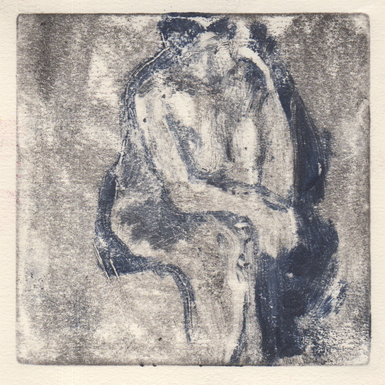
Akua Intaglio on zinc printed on Rives Lightweight with spoon

Last night at the NEAC drawing school session, I had my zinc plate and a slightly wider array of Akua intaglio colours than usual. How is this media different to the egg tempera and how could I use it to share my experience of the model in 45 minutes, in time to catch my train back to Suffolk?

Wednesday, March 7, 2018

The Sound of Stromness and Pigeons

The Sound of Stromess Fused plastic, paint and stitch 23 x 23 cm
While listening to Farewell to Stromness, thinking about a wonderful visit to Orkney last July and using only one specific piece of plastic from January (the orange from Sainsbury 40 tie handle food and freezer bags), I tried to find the sound of Stromness.  The snow is melting, the wind makes music through the moors. Land comes in and out of cloud and birds build their nests. Somewhere in my mind I am standing at a painting of a window in the Picasso Museum in Barcelona and birds sing from the canvas.

Monday, March 5, 2018

pastel over monotype

monotype plate before printing


monotype (ghost) with release agent

pastel over monotype
Excited to explore pastel over monotypes again! I generated about ten prints today in life drawing as we had a series of five and ten minute poses.  This is the final 25 minute pose. The plate is 10 x18 cm, which is a nice shape for Marilyn. I did not draw 'backwards' so the plate is the way I saw the image. I had forgotten two items this time: my roller and my brushes but luckily Judith lent me a brush.  One brush is tough to work with and it was a medium sized flat.  I had no way to wash my brush and my colours got quite muddy. (i usually use different brushes for different colours). Usually when I use pastel over monotype I work in black first.  In fact, I think this is the first time I have worked over a colour print. I would have loved to have painted this pose.  Perhaps these three studies can be used to do that…

Sunday, March 4, 2018

unimpeded by weather, I work from life

Valentina, oil on panel 30 x 40 cm
It was certainly cold and maybe even already snowing on Monday but I was keen to make mono prints in preparation for my Friday NEAC session. I decided I wasn't going to work backwards and found myself using whatever supplies I had (I had forgotten many) to make quick studies of Emily. I had to use the only paper I had, cartridge, and a metal spoon which, incidentally gets very hot when you rub with it… 

Back in the studio I printed the ghosts using release agent, wiping it away to get some pure whites back where I had wiped previously.   I also printed one that had been hanging around from the week before, with Esme. That seemed to work!

On Friday, even though we were advised not to travel, I went to London.  The morning was spent at the British Museum and after seeing the Victorian photos, I went to the Mall where I made a few prints, following on from Monday. The print below is the best of the bunch and IMHO one of my best!

And on Saturday, I was back in London at Heatherley's for a brilliant painting workshop with Peter Clossick. This time I braved snow and bus replacements, travelling for 7 1/2 hours for the workshop!  Still, totally worth it.  The suggested technique was similar to the way I make a mono print to begin, putting on a neutral and then removing the light with a rag.  I was very susprised how thinly I painted after that, considering I was taught by Peter. I had imagined working in thick paint… I think I never really got the structure aspect of the technique but I was enjoying what the paint was doing and was chasing the light. At the beginning I had decided to make two paintings.  Peter stopped me with the top one (reclining nude)  about an hour before the end of the session.  I didn't resolve the head but it has triggered a chain reaction of ideas. Hopefully more soon!

Emily, monotype, akua intaglio on cartridge paper

Mary, akua intaglio on Rives 10 x 15cm, NEAC


Emily, monotype, akua intaglio on heritage paper, printed with press using release agent

Emily, monotype, akua intaglio on heritage paper, printed with press using release agent

Emily, monotype, akua intaglio on cartridge paper

Emily, monotype, akua intaglio on cartridge paper

Emily, monotype, akua intaglio on cartridge paper


Esme, monotype, akua intaglio on heritage paper, printed with press using release agent
Valentina, oil on canvas 30 x 23 cm


Tuesday, February 27, 2018

Snowday


Snow Light,  monotype: akua intaglio on Heritage paper, 10x15 cm
This morning when we woke there was snow on the ground.  The 'white beast' had dumped about a centimeter in Battisford! Later, while walking Lyra in the dusting of snow, as we came back around the field, the light on the  red-leaved tree made me pause.  I went back later and did a quick  black and white pencil sketch, took a photo and leafed through All Prima by Al Gury to find Henry Twachtman's Snow painting as inspiration. http://www.pafa.org/sitedata/artworkpics/2003_1_10_l.jpg

Sunday, February 25, 2018

Pin the colour down before it fades

Reduced Flowers, pastel on paper 15 x 14 cm, pastel on paper
Sunday Morning! I bought some reduced flowers early last week and plunked them in a vase by the door to take out to the studio to draw.  They sat there.  I was too busy making monoprints painting portraits and looking at beautiful paintings at Christie's… so about a week from purchasing them, those poor flowers were on their last legs and hadn't been drawn.  I couldn't let that happen. 

The orange under the jam jar is a pair of PJs I bought from Anthropologie in their reduced reduced sale - I have been meaning to hem them for years, literally. The pattern to the left at the top is a scarf I got at a charity shop last year and the fuscia on the right is an Indian top that I got at the car boot a few years ago. The green cup was an early wedding present from Patrick when we'd first moved to Singapore.  The purple is a placemat I bought in Rome.  There is a cheese knife from south Africa on it and the book came from a used bookstore in the Southwest. 

This small drawing took most of the day.  In the past I might have stopped when it was freer and created the mood without pinning everything down.  Perhaps I will return to that approach.  Tomorrow when the sun comes up I will look again at the right of the jam jar lid.

Saturday, February 24, 2018

Colour of Morning Dog Walk


Returning to the dog walk drawings, I considered the light as it rose and the colours that light can make. I wasn't remembering colour so much as finding the colour that felt true.
Sometimes when I walk I can't help but exclaim about a particular light or the slant of the horizon and recreating that was the goal.  In the top monotype I rolled a bright pink over the plate and wiped and painted back in colour, thinking of Milton Avery.  On the bottom this is the second pull.  The first was nightlight and I wanted to find the light of cold in this one.  The cold is coming!

Thursday, February 22, 2018

NO need to go far for inspiration

View from Front Garden,  pastel on paper, 14 x 15

I've got some monotypes to make for an upcoming show and today was supposed to be devoted to that until I decided to go outside to draw.  It is cold today, about 3ºC when I was standing in the front garden. I had three layers on the bottom and four on the top and I still had to stop to warm up after about an hour and 1/2 before going back again. I much prefer being cold and standing to being warmer in a car, though.  Besides, I need to get 'match fit' for my plein air painting with John Dobbs in a few weeks time. It's funny to think that I will take the train and bus to paint the Thames when I have so much inspiration right here.

I've been reading more of the Jason Gaiger book, thinking about how we read the marks on the page and whether denotation comes first.  I suspect everyone can recognise that cold wintery sky.

Now maybe I will make those monotypes!