Showing posts with label Rebecca. Moss Guyver. Show all posts

Tuesday, July 18, 2017

Nightlight Monotypes

Nightlight Meadow Battisford,
Monotype: Akua Intaglio on Hahnemühle,
10 x 10 cm
Using waterbased ink and a press means that plates can hang around and still be viable.  This morning I got up to yesterday's plate and a desire to think about night light. I made Nightlight Meadow Battisford by thinking about evening colours and using much of the composition already on the plate to evoke a different time, and perhaps a different season to yesterday's print.

I talked to the artist Andrew Farmer: https://www.andrewfarmerfineart.com at the New English Art Club opening a few weeks ago about how he paints nightlight.  A few summers ago I stood on the porch of the barn and drew the Gertmenian's house in the dark.  I had the porch light on but it was very difficult to see with the light behind me.  I thought about a head torch… The pastel is in one of my altered sketchbooks and the image below is the monotype I made today (staying quite true to the pastel in the altered sketchbook).  

Nightlight Gertmenian's Cranberry
Monotype: Akua Intaglio on Heritage,
10 x 10 cm

SaveSave

Saturday, July 15, 2017

Apricots, Opaline and Petunias, Pastel on paper 17.5 x 17.5 

I got up this morning raring to pick some flowers and draw. (I also needed to dead head the roses.) I needed a hit of colour and I needed to draw something other than people. It has been a week of people. I drew the above for a little over an hour this morning.  I hadn't slept well because my head was so full of the art I'd seen in London.

In London yesterday I visited the Hokusai exhibition at the British Museum http://www.britishmuseum.org/whats_on/exhibitions/hokusai.aspx. It was crowded and dark but inpsired me in a number of ways. Apart from his art, Hokusai's attitude that he was getting better with age felt encouraging. Seeing the Rennaisance portraits at the National Portrait http://www.npg.org.uk/whatson/encounter/exhibition/ and the British Watercolours at the British Museum http://www.britishmuseum.org/whats_on/exhibitions/places_of_the_mind.aspx left me feeling inspired and quite overwhelmed by representation. Life drawing at the Mall Galleries was exciting but exhausting and my colourist side was aching to get out!

On Thursday I took four pieces to be considered for the Colchester Art Society's annual show.  On Thursday night I learned that all four had been accepted, including my (February) little altered sketchbook. I have this idea about altered sketchbooks and I want to progress it, but the first step was to get one of them seen.

Today was the opening of the Colchester Art Exhibition.  We arrived a little late and the speeches were in full flow. In fact they were just announcing the prizes.  Richard Stone, a renowned portrait painter, https://en.wikipedia.org/wiki/Richard_Stone_(painter) had chosen the winners.  Imagine my surprise when I was the bronze winner, for my little altered sketchbook. Richard had very encouraging words for me and I feel empowered in my little idea.

When I got home, I got right back to work on the drawing I'd started.  The two sides weren't working and I'd been background thinking that in Colchester,  so I changed things around and kept going.

Thursday, June 29, 2017

A Week of tuition and travelling

As part of the New English Art Club scholarship, I am encouraged to attend as many of the NEAC classes as I can. I chose five out of six to attend, the sixth was during my open studio.


Ruth Stage taught her version of egg tempera and gave us each a sized and gessoed MDF panel to use.  Some of us went outside into the stifling heat and drew durng our lunch break, others copied something.  I discovered that the rubbish bins were just the right height to work on. Egg tempera is a fascinating process and it seemed to me that I should try to work the way I do in preparation, with a plein air sketch.  When I met Gabriella the next day she told me she doesn't like egg tempera because she finds it tacky, I sort of understood, as I made a sufficiently tacky painting in my attempt. Working from drawings without changing, inventing, adding to is always problematic for me; doing this with an egg yold and pigment was doubly complex!
Ruth Stage NEAC 

Seeing Ruth's egg tempera paintings after hearing her talk about her process and experimenting myself capped off a fascinating day and made me appreciate her work even more.


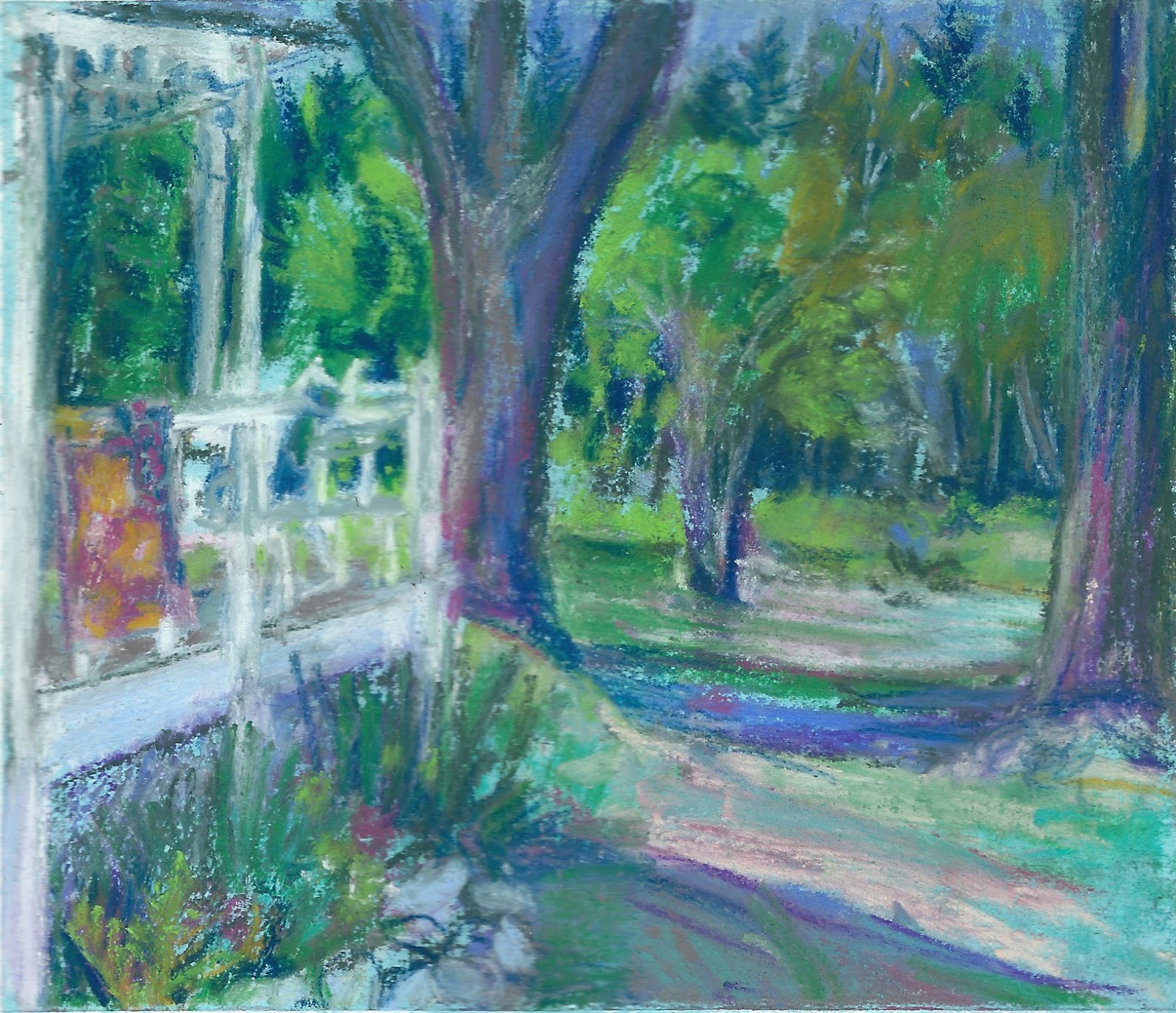
We went outdoors with Melissa Scott-Miller to find what makes Carlton Terrace characteristically itself.  Melissa wanted us to find landscape still lives.  Many people brought oil paint, which was what Melissa used.  I brought my tins of pastels and a chair. The light changed throughout the day and was it ever hot! I found I got bogged down by drawing accurately because I was drawing architecture and struggled to keep things open and energised. It was fascinating to see how Melissa works.  First in charcoal then with paint.  She  seems to use the black of the charcoal in her painting.
the start of Melissa Scott Miller's plein air painting of Carlton Terrace


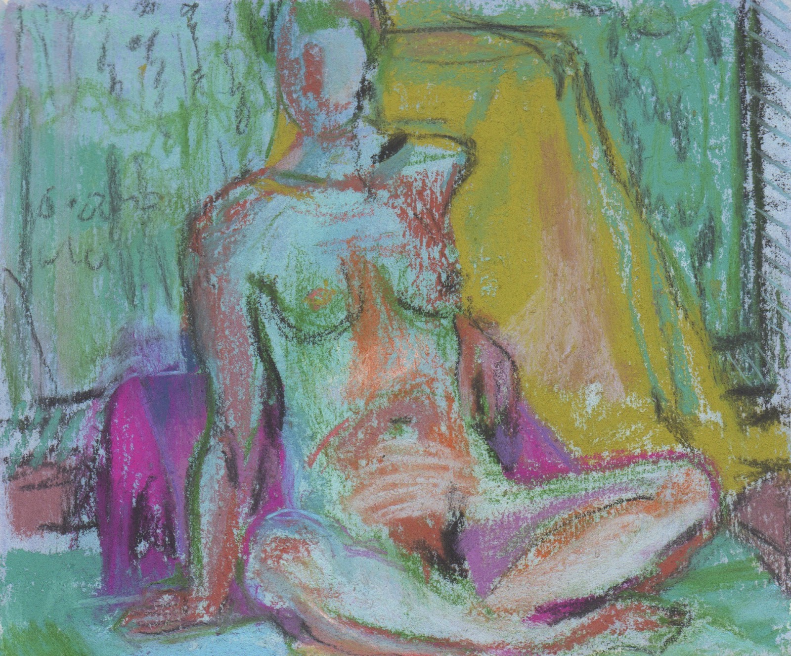
Wednesday was life drawing with Julie Jackson. We started with quick poses in charcoal and then an hour pose where we covered the page in black and worked removing the black to make marks. For various reasons I had trouble making an interesting drawing woring into the black. In the second half of the day we used ink in five cups with different dilutions of ink to create tones. 


Thursday there were no workshops and I went to my portrait group.  I decided to work in ink to see if I could use it to capture something of Feven.


Antony Wilson taught portraiture in black and white to our group. We made 10-15 minute drawings first and then Antony showed us his technique. 


The second half of the day we made a more sustained drawing of the model's head, life-sized.  Antony wanted us to try to take some of his techniques onboard which I tried to do, but with very limited success!

Tuesday, May 30, 2017

Determined to make the most of The First Rose of Summer

The First Rose of Summer, pastel on paper 16x16cm

The garden has dominated my days since I've been back from Maine. I can't just leave the garden to fend for itself. It needs me, so I go and do the things that need doing now and for the future. Sometimes I go with a cranky spirit because there are other things that I want or need to do too. Everything jockeys for my time. The garden has a loud voice and it is so needy. The thing is, once I am there I am transported in the same way that I am when I draw, to shapes, colours and an inner monologue that I don't listen to. 

It's too easy to miss the garden because I'm so busy attending to it, so yesterday, in the middle of planting out a few more seedlings and planting a few more seeds then judging the Stowmarket Art Group Exhibition, I picked the first rose of the summer, one of the remarkable purple ones,  (Rhapsody in Blue).  I cut back most of the hellebores and made a little bouquet with those and a few other things that were abundant enough to take. 

The other thing I did yesterday was to prime a few 20 x 20 panels and begin this little drawing.  I had to quit drawing before I'd finished to judge the event and it was only working in places.  Today, after taking down my Dining on Plastic work from Craftco in Southwold, I came back to it. 

More roses are out today.  

Monday, May 1, 2017

Making the most of an opportunity

Green Vases and Bowl, 24 x 22 cm, pastel on paper

I wasn't able to start drawing today until too late to finish before the light disappeared . I'm not sure if I will return to this or begin another version. Today was about green.

It's been a busy few weeks and it feels as if I have had no time to do anything other than tie up loose ends: framing, typing up bios and price lists, putting together a portfolio, picking up work, and then hanging two exhibitions and attending them.

When I can't spend all my time making work it can feel frustrating, but that is ridiculous!  All of that other stuff is part of the whole and I've learned that if I see time as opportunity then it's easier to feel good about the non-painting activities.

Last month I made three opportunities.  I took a pre-selected pastel down to the NEAC annual exhibition for final selection.  I put together a portfolio and submitted it for the New English Drawing Scholarship and I submitted an altered sketchbook for the Annual Radley Sketchbook Exhibition (Parker Harris) and one of those three opportunities was successful.  You just never know, and I find that by making the opportunities I apply myself differently and with zeal and that makes new opportunities.

The exhibition at Craftco is exciting.  I love seeing my 2D work (plastic collages) with ceramics.  Since I know Caroline's work, I have been thinking about it as I've worked and I am pleased with the way it looks hung and together.

Craftco , Southwold, Exhibition through May 30th

Monday, February 27, 2017

Marilyn in ten minutes

pastel on paper 13 x 14cm

altered book page spread  11 x 7cm pastel drawings

pastel on altered book page 21 x 14 cm

charcoal on paper 28 x 13 cm

pastel on paper 14 x 16 cm

For the first half of our drawing session, Sue asked Marilyn for five ten minute poses, although one lasted an extra five minutes.  The final pose was half an hour. I brought some images with me to inspire my palette and then began igonoring them, looking hard to see what the drawing needed that corresponded to what I was looking at.

I didn't put my pastels away at the end of each drawing so there is more consistency of colour than usual between them.  I prepared my ground and taped around the edges before I set off today and tried a few new approaches - watercolour with clear gesso and a little pastel ground, gouache with pastel ground, pastel with clear gesso.

Thursday, February 2, 2017

Using the same objects to say something else

Flowers and Musk, 26 x 26cm, pastel on paper

Using a slightly bigger piece of paper than I did yesterday, this time I coated some Fabriano with a deeper pale blue acrylic/pastel ground.  One of the things I always have trouble with in a garden is yellow and red flowers together with a backdrop of green grass… so I took out the yellow flowers, changed the background and changed vases. I like to get up close.  I like to find the shapes in the complexity.  I like a richer, deeper palette.  For me, this arrangement works better and there's nothing wimply about it!

The Mall galleries have put what they call 'selected work' up on the website for the the Pastel Society Exhibition.  I am on page six! 
http://www.mallgalleries.org.uk/whats-on/exhibitions/pastel-society-annual-exhibition-2017

Wednesday, February 1, 2017

Getting away from the Subject in Pastel

Spring on the Windowsill, pastel on paper 23 x 24 1/2
After the joy of my time looking at the 'blue room',  setting something up in another part of the studio felt impossible.  I had a crammed bouquet of spring flowers that I wanted to include, tulips, blue flags, roses and narcissus which felt impossible too (because although lovely, all those colours together defeat me every time).  I grabbed some clothes from the box under my bed, including the salwar kameez my mother made me with silk which Patrick had bought me before we were married. It is the green I associate with opportunity and love, quite a spring motif on a particularly grey day. I taped some turquoise mylar over the window so the light came through but the landscape behind was obscured and then I challenged myself to invent the window seat. The paper is medium size, for me, but I decided to stand back a little, in the same way I had been working in paint.


Getting the paper ready was troublesome as it pulled at the tape so I had to soak it and gesso it before I could even begin. Nevertheless I drew for a few hours yesterday and then all afternoon today.  There were many times when I wanted to abandon it. I find inventing part of a drawing in pastel, well, nearly impossible. Although I resolved this, as anticipated, it lands just this side of twee. Maybe I'll find a new 'blue room' tomorrow. 

Wednesday, October 26, 2016

The Time of Year for Dahlia Love

Orchid and Oriental
I've been getting work ready for a few upcoming group shows.  The Sentinel wanted pastel still lifes and it's that time of year when there isn't so much left in the garden besides the dahlias. This year my zinnias and roses have lasted until now too so there is some variety to the shapes. And for once I don't have to make excuses for grabbing the magenta when I choose my pastels.

Pinks and Greens
I'm trying to make my pastels a standard size, for framing purposes, but clearly mis-measured the top drawing.  The bottom is 16x16cm. Another observation is while the pastel spread on the top drawing in a buttery manner; I found the pastels I chose, or perhaps the pastel ground I chose in the bottom would only let me apply scratchy marks. I will always be a beginner!

Sunday, October 23, 2016

More Mini Prints

Weather Over Pear
Today I wanted to try making a few more prints.  My Akua Intaglio was a mess.  I am not the tidiest painter with ink and rarely wash my brush adequately because it is that little bit more difficult than swilling it in water.  I keep my inks in coasters and stack them to store them. Just setting them up makes my hands filthy.

I decided to refill and straighten the inks out with a palette knife before begining.  It took me over an  hour to complete this bit of housekeeping but during the process I realised a few things.  The inks had air dried to such an extent that they were much more like oil ink and had been behaving that way more… once they were cleaned up they were runnier and don't hold the line as well.  OOPS. The other thing I learned/rediscovered is that  I can mix bespoke colours using Akua pigment with blending oil, so I made a few colours. The blue int he sky is now a sky blue ready to use.
Chartreuse Light on Blue
What's nice about working this small is it is difficult to spend more than a few hours on a print, so in a day I had made two prints. Among other things, I am aiming to produce eight mini prints for my.  I'm not sure which print to send to Lesley at Red Dot to replace the print that sold, but I'm reconfiguring spaces on a small scale.

Thursday, October 20, 2016

What sticks in your mind

Jerusalem Artichoke & Opaline
I spend a little time most days on Pinterest.  I love finding new images and seeing how people resolve colour, light, composition, paint and drawing issues.  Sometimes an image sticks in my head for a long time.  Visual things sticking in my mind used to come from  the landscape, what I saw in my immediate environment, photos, paintings in galleries and museums.  Now there is so much more to look at and make sense of. I think I solve problems in the background for more of my day now. It's not that I am thinking about them, they are there in the betweenenss of my brain.

I have a deadline to get more work done so last night I went into the garden and cut two bouquets.  It was too dark to work then, but I looked at them and thought about a pinterest album I'd seen that morning of yellows.  I had filled the bouquet out with a few stems of jerusalem artichoke flowers. When I went to set something up to begin with, all of that stuff was stuck in my mind.  As I chose my colours Ivor Hitchens was tyhere helping.  Not really, obviously, but as I began working I thought of one of his bouquets.  The opaline vase is one of my flea market treasures.

Monday, October 17, 2016

Experiments with AKUA


Emily Looking left: monotype 10x15cm, Akua ink on zinc
Emily On the Stool monotype 10x15cm, Akua ink on zinc

First time back at life drawing for the season.  I arrived having forgotten my elevated drawing board so was stooping over the table. I had packed in ten minutes, throwing in a little of this and little of that.  I grabbed my traveling watercolour set at the last minute.

I had a big long table to myself; this is unusual, so I was able to spread out.  Sue organised Emily into ten minute poses and I decided that would be enough for some monotypes. I had forgotten my roller and I mixed greys with white and black for the first few.  They weren't very strong.  For the third print I decided to see what would happen if I used my watercolours with the AKUA ink. I diluted it with water and blending oil and painted it onto the plate, which I had rubbed release agent onto (leaving the ghost underneath). I mixed ink with watercolour, wiped areas away, used my fingers to dab. Logically it shouldn't have worked, but it did.

For, the final monotype of the day I worked only in black, but my palette was filthy and I seem to have picked up a bit of a pinky tint. By this point I was finding drawing backwards easier and someone in the class  had challenged me to put the whole body in the image.  Initially I wasn't all that interested in the pose, but the more I looked the more I saw.  This was almost a half hour pose and as sometimes happens, I seemed to channel Matisse.

Friday, October 14, 2016

Regrowth and Sky

Regrowth and Sky 7.5 x 10cm monotype
What I have noticed since returning from Maine is the verdancy of the fields, the brighter green and the angry sky. A few days ago while walking Lyra I was caught in a a surprise shower.  You could see the rain off in the distance as I set off and it caught me while on the back side of the farm. The weather seems to move fast and I half-expected a rainbow. 

The good news is that I sold one of my mini prints at the East Anglian Mini Print Exhibition and Lesley  (the curator) from Red Dot will be moving it to a new space in Bury St Edmunds in November.  She wants a new print. 

Early this morning I prepared some new plates, I took the ones I'd made earlier in the summer to Maine and didn't bring them back… Preparing the plates entails cutting some of them to size and filing the sides.  After that I tried to approximate the feel of a walk with the October weather and the green that dominates as the wheat comes up in Akua Intaglio ink, drawing backwards, of course.


Thursday, October 13, 2016

How do you deal with the ROMANCE OF A MOMENT

pastel over prepared book pages 20x20 cm
A few months ago I was going through my digital photos looking for something.  In the midst of my search,  I found a photo of Figgy that I had taken while she was cooking, a few years ago. I printed it out and left it on my work table, moving it to the side, propping it up, being with it but never doing anything with it.  I didn't know what I was going to do with it although I wondered if it might inspire a monoprint.

When I draw with pastel, I rarely use photos, but when I do I convert them to black and white so I am not hindered by the actual colour that is in the photo.  Yesterday afternoon, my first FREE moment in most of the past few months, I picked up the photo, chose some book pages I'd glued together and gessoed months before and painted the pages with a pale blue pastel ground.  Once it had dried,  I started to draw from the photo. The photo was rectangular so I cropped it in my mind before I began. What I didn't do was draw a black and white drawing first or convert the photo into a black and white image.  I drew from a colour photo. As the drawing progressed I struggled with the usual problems, trying to keep it loose enough not to kill it, editing it, letting the drawing decide what colour needed adjusting.  

I think the strength of the drawing is in the composition.  I may try to use the drawing to paint from.  I think an opaque jug on the left side would strengthen things.  I like the way the text makes delicate lines through the white of the shirt. And then I ask myself, is it too romantic to be strong?

Friday, September 16, 2016

The Palette of Autumn

From Porch to Weibels, 4 3/4 x 5 1/2" pastel on book page
The first thing I do when I begin is to compose the image with my hands. Sometimes I realise I need something more to make the composition interesting, or a colour to move my eye around.  This view was very green and I had prepared a book page that was slightly horizontal. What I wanted was something slightly portrait, so I began imagining how I could jiggle reality to make the compostion work but be believable. Then I went in to select something colourful to hang over the porch. 

I chose my colours after that, I ended up with 12 colours and white. I'm blending colours on the page more than I used to and I seem to be working a bit closer to the colours I see. You need yellow greens and reds at this time of year and that's fun to explore.

Thursday, September 15, 2016

Off Season Views

From Kathy's Garden, Pastel on paper 6x6"

When I was a child I came to Maine off season as well as in high season. In the winter, early spring and thanksgiving my friends and I would roam everywhere and the island felt like we owned it.  Coming to Cranberry off season, (but only just) and as an adult I find that I am tempted to look for new views, from places I would usually need to ask permission to draw from.

Today I walked down to Kathy's and stood near her porch.  It was hot and bright and clear, late afternoon and I chose eight colours. Again I wished I'd had another green but resisted.  Donna came down to 'keep the garden alive' and at about 5pm I felt the betweenness come together and I walked home. 

Tuesday, November 24, 2015

Discovering snow light

23 x 23 cm (framed) fused plastic on paper with paint and stitching

23 x 23 cm (framed) fused plastic on paper with paint and stitching

30 x 40 cm (framed) paint on book pages

I'm getting work ready for the upcoming Freudian Sheep exhibition that opens on the 5th of December, COLD. We had a little dusting of snow the other day and have had some hard frosts that bleached the grass and created the orangey-pink sky that is peculiar to the cold and I've been thinking about that.  I've just glued the work to board and I'm hoping that solves the wrinkles… if not will have to take apart and reassemble differently. 

Wednesday, September 23, 2015

Daily drawing

When I have the most to do, on days with my longest lists, when I can't afford to be in the studio all day, I always put 'make a drawing' on my list.   It's hard to get through a long list, so before dinner I stop everything else and make my drawing. 

I'm reading a book of mindfulness exercises, hoping to find ideas for our exhibition at StowHealth and obviously I am practicing a bit of mindfulness as a result. (I wasn't sure what mindfulness was until I began reading the book). I like the book particularly because it uses paintings as a way into the exercises.  When I paint and draw I guess I am 'mindful', the world falls away and the space between me and what I see changes.  It is always difficult to tear myself away from something beautiful that I am looking at, it's easy to overwork a piece.

Another thing I am trying to do is to appreciate my flowers.  I walk through the garden, smell them, look at them but I also pick them and put them on the table.  Today I cut some flowers, pinned a two page spread of a map to the wall, grabbed some cloth, began to look and to find the space between me and my subject with my pastels.

Monday, April 15, 2013

Fused plastic collage


I have decided to do a series of these, to take them beyond their mail art potential. It turns out with careful handling most plastics can be fused and incorporating paper as a layer gives me even more possibilities. Yesterday I found myself asking for a bag, even though I had a cloth bag... some of the flimsy bags produce a different kind transparency.  Heavy duty bags are absolutely opaque.