Showing posts with label Rebecca Moss Guyver. Show all posts

Saturday, March 9, 2019

The sketchbook project will depart for Brooklyn soon!

I finished my sketchbook for the Sketchbook project today. You can see the whole thing here:
https://drive.google.com/file/d/1FO_Bky9lU5IWPByQaennYgIW6pDsTjIb/view?usp=sharing Eventually it will be scanned and posted to the sketchbook project archive and if it arrives in time, it will travel too. https://www.sketchbookproject.com

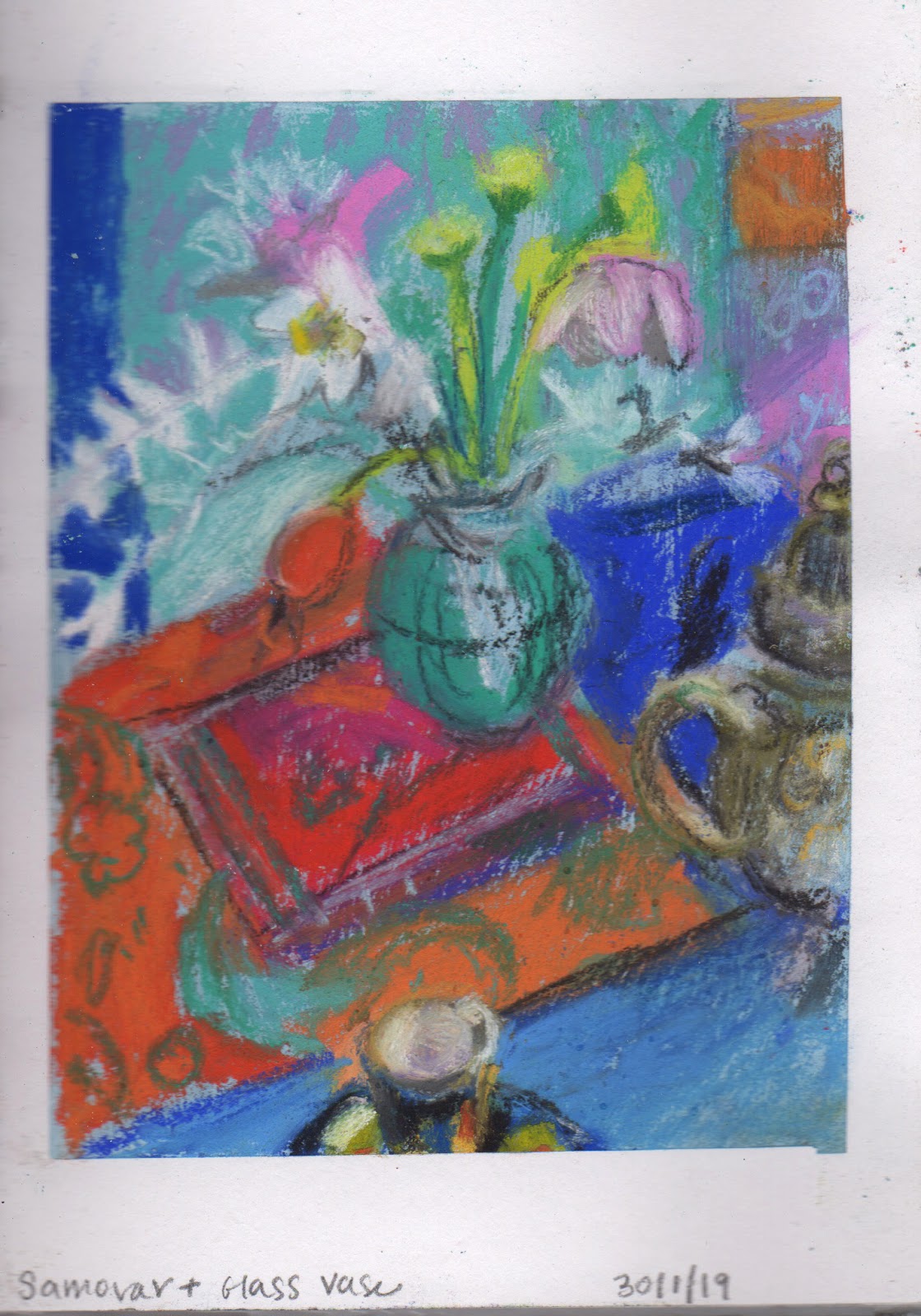
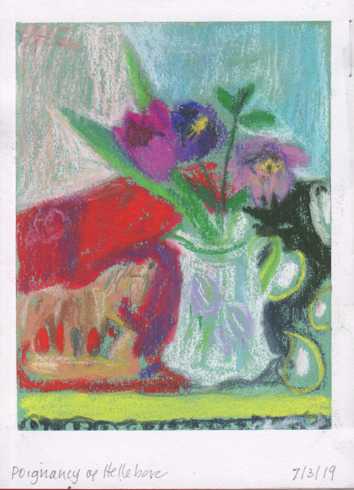
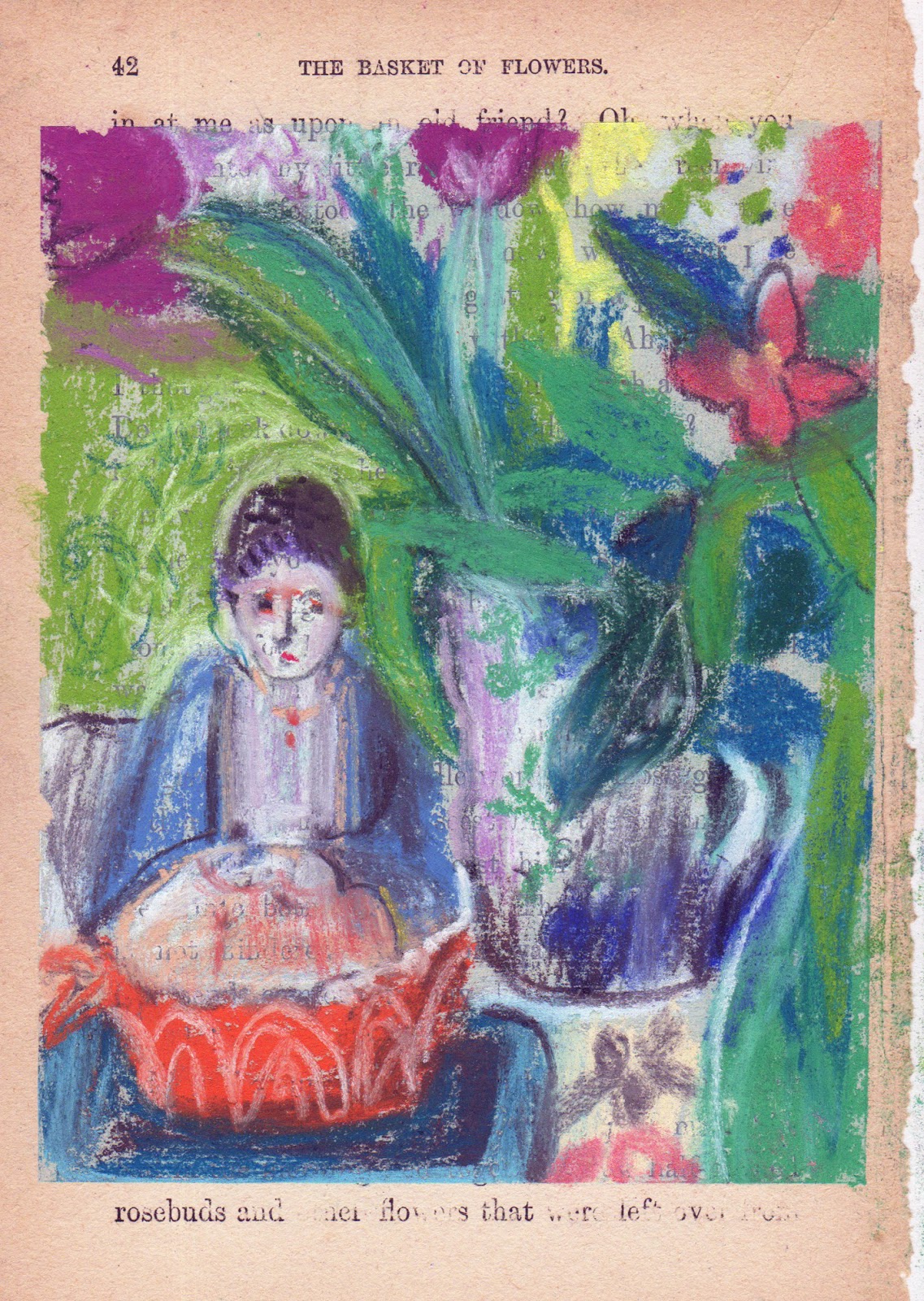
It's always brilliant to work on something with lots of smaller parts over a sustained period of time and when it's compete it feels much greater than the parts.  This sketchbook is full of quick direct drawing about the objects I collect and arrangements that allow me to make colour studies.

I made the final two drawings this morning and then bound the pages, cleaned them up and will post it on Monday. Here are a few of the drawings that have kernals of ideas which I have either already responded to again or hope to later. 


Monday, March 4, 2019

a few quick poses

Sadie 14x13cm, pastel on paper

Sadie, 12x15cm, pastel on paper

Sadie, 22x20cm, pastel on paper
Back at life drawing but only for 1 1/2 hours as had to sit an exhibition. These are 3/7 drawings I made in the session. My goal today was to be direct.  

Sunday, March 3, 2019

Risk Taking and Quick Sketches

Some people freeze at a blank page.  That doesn't happen to me but I do work more intuitively and feel liberated to move things around, change colour and make compositions in a different way when I work (quickly) in a sketchbook.  At 58, even knowing that I sending a book somewhere to potentially have an audience doesn't make me too tight.  I look forward to the time each day when I will draw without intending to do anything beyond draw. Obviously I am scanning the drawings - there will be 32 in the end that I'll send in the sketchbook to the Sketchbok project https://www.sketchbookproject.com. I'm not sure if I will ever use the drawings I'm making for anything else but I believe that just recording all these arrangements is making it easier for me to use those intuitive muscles in the future!


Saturday, March 2, 2019

What Comes Next in a Series?

Car Boot Oranges, egg tempera on panel 23 x 16cm, 
A few weeks ago I made a still-life  Jugs where I was exploring how to balance light using layers of pigment vs white mixed with pigment. The egg tempera class I'd taken with Mick Kirkbride was focused on using layers of pure pigment mixed with egg to create luminosity. Ruth Stage uses milky/eggy colours.  I had the idea that by using both kinds of painting you might be able to create light in a particular way.

I set up a new  still life up a few days ago but it wasn't until yesterday that I had time to work. The still life was made up of objects I have bought at the car boot or from local charity shops as well as a few of my brighted spined art books. My goal was to create a companion piece for Jugs.

What you can't necessarily understand is that in Jugs the light is coming from behind and the pattern at the back is a kantha folded on a radiator under a window.  This time the light is primarily natural  but I also pointed lights from both sides.  I chose similarly coloured objects to  Jugs  and this painting was made working from life.


Friday, February 22, 2019

How the tiger got into the drawing.

Placid Stalking, pastel on prepared mount board, 30x33
When my day is uncomplicated it begins with an hour or more of drawing in my sketchbooks. As I draw I explore, I revise and dream about the future. I try to keep THOUGHTS out of my head but that's pretty tough.  On a good day the planning for what's next comes after when I look at what I've done. Drawing in my sketchbooks can mean something finished, or it can be something open and about the next idea. That can be because I am impatient to get on, or it can be because I run out of time, or because I want to retain something unfinished for later. The drawings below are the pre-drawings for the drawing above. 


Add caption

I added the tiger and used it later in the bigger more finished drawing. Here I paid no attention to scale. Perhaps all of these ideas will translate into a painting?

Tuesday, February 19, 2019

Objects as inspiration

Jugs, Egg tempera on Panel, 23x16cm
The husband of one of my friends is giving a course on hoarding.  We went to the car boot sale on Saturday and I couldn't resist a few more ceramic objects.  The vase below is one of them.  My mother is drawing objects too. She sets them up and creates beautiful zen brush drawings on her iPad. So does my sister and my brother and our daughter buys jugs when she can. My mother tells me one day she will take all her objects back to a charity shop for others to be inspired by.  Whatever, I can't help arranging my own and working in all kinds of media to create a story with them.
Sympathy in Green , pastel on paper, 46x46cm

Tuesday, February 12, 2019

The Figure in Context

 Conversation with View, 23x16, egg tempera on panel
I painted a landscape of Manningtree months ago and I couldn't resolve it.  I finished it, but it wasn't resolved so it sat in my box of incomplete egg tempera panels.  When I visited the Bonnard, ten days ago, I particularly loved the figures in context and the way he paints light. So I wondered whether the idea of  'light behind' would work in this case and whether some figures might complete it.

I printed a photo of the panel and drew some figures in with a pastel pencil so I began.  what i love about working on egg tempera that has set is that you can actually wipe off the bad drawing and it reamins exactly the same.  It is permanent! and there is a differnt kind of underpainting to explore.

Thursday, January 31, 2019

Record what interests you (quickly), consider it, make changes and slow down

Tiger at the Table, pastel on paper 30x37cm
 I'm keeping up with my sketchbook drawings.  What I notice is that the energy of looking for something interesting (because I have to) and recording it so it says something exciting QUICKLY is opening up lots of possibilities for more sustained drawings like the one above, Tiger at the Table. It's not always possible to transfer the energy and excitement that comes from an quick sketch, but I think there may be a better chance to find that when you are doing lots of the quick sketches and only choose the ones that feels particularly inspiring to inspire the bigger drawing.

I visited the wonderful, beautiful Bonnard at the TATE today with Bridget Moore.  We were there for more than 2 hours and it was never unpleasantly crowded, really.  How inspiring to be beside them all. SO much to think about.


Add caption


Thursday, January 24, 2019

Using a drawing to inspire a painting

The House with Green Shutters, pastel on opened book, 23x16 cm
Occasionally when I do a drawing I think, 'Maybe I could make a painting from that idea'. That's what happened when I made the opened book above, over the weekend. The title of the book, The House with Green Shutters, inspired the drawings and led me to trawl back through images I had taken or drawn in America over the years. When I think of green shutters I think of America. In Maine every other year there are open gardens on the mainland and if I am there at the right time I love to follow my mother through the gardens and past the mansions. I'm noyt sure if I am more enchanted by the spaces or my mother in her hat and bespoke tops.

I made the drawing on the left first and when considering what to put on the right I knew I needed to make something bolder. Hydrangeas and peonies are the two flowers I think of when I think bold. I liked the scale of the figure and the acid green and purple. Still not sure about the sky. I've looked at Milton Avery, Dorothy Eisner and Fairfield Porter but will wait to let the paint dry again to test some alternatives.
Hydrangeas and Hat,  oil on canvas, 30x40cm

Monday, January 14, 2019

Jettisoning local colour for January

According to the Nabis from: https://www.theartstory.org/movement-les-nabis.htma painting was a harmonious grouping of lines and colors, with outcomes to include many different solutions. An artist's personal style was, in fact, accomplished through the choice of how to arrange these lines and colors. As an example of the Nabi approach, at the beginning of their meetings, they would recite the following "mantra" together: "sounds, colors, and words have a miraculously expressive power beyond all representation and even beyond the literal meaning of the words." 

When I visited the Barber Institute last week, in Birmingham, to see the current Vuillard exhibition, I came away remembering that I don't have to stick to local colour and that my instinct, even my handwriting has always been about colour and pattern primarily. I reflected  that last year taught me how to see acccurately and how to record what I see better but that my personality can sometimes be obscured when I think too hard about all of that.

Today, arriving late to drawing, I worked quickly to put something authentic down. The two rectangular drawings below, 19 x 28cm were 20 minute poses made before the break. The square below those, 17 x 17 cm, was a challenge in that it was a 1/2 hour pose and I had to look hard to find something to say about it. The moment that I chose the blue, I began to feel it was about shapes and colour and no longer a model.  The image at the top was the final drawing and it was about 25 minutes, 28 x 19cm, and the surfaces and the design elements of the arrangement inspired me. The ground was a lime green which guided me in colour relationships.


Sunday, January 13, 2019

January objects and artifiical light

What I found in January, pastel on tinted paper 16 x 16cm
When I picked a little bouquet of what I had in the garden it occured to me that I wanted to make the shapes of the hellebores stand out from the background.  I have a cupboard in the studio with cloth (clothes and pieces of fabric) and most of it is pattered and highly coloured. I don't have many solids and I don't have any velvets. That was what I was hankering after.  When I started, the colours were actually quite light and punchy.  In the end I migrated towards local colour, although the colour and light were never the same yesterday and again this morning - they were  grey days and I needed to turn on the natural light lamp before long. This drawing was a puzzle and when I finally introduced the ceramic lemon squeezer for balance I felt I had found the January feel of stillness indoors, and had done as much as I could with this arrangement.

Monday, January 7, 2019

Distemper as a medium

Capricorn Bouquet, distemper on panel, 20 x 25 cm
Before the holidays I took a class with Mick Kirkbride using egg tempera and distemper. This is the first chance I've had to use distemper since the course. I have been preparing surfaces for the past few days, ready for the new year and have a few books I'm using for warm up activities but today was a full painting day. 

I loved the start of the distemper process. Everything was loose and exciting.  The rabbit skin glue mixed easily and the light was good. As the day wore on the glue got pesky (I think my studio was a little cool), the light faded and I tightened up. I think the main problem is I wasn't sure what I wanted to accomplish, not knowing the medium, it's hard to know how to use it. On top of all that, I had a bouquet of flowers I bought on sale from the grocery store ( three days ago) still in their wrapping, in the sink, and although I wanted to find an interior, I felt I should use the flowers. Also, when distemper doesn't cooperate, it REALLY doesn't cooperate.  At first I thought of it like working with monotype ink - fighting the medium - In the end I had to get out a hotplate to keep the glue  and the mixed distemper warm enough to use and then it dryed out and flaked off the piece of glass. Glass is cold, so perhaps not the best surface to mix on.

I have some other ideas and motifs I want to explore with distemper and it was only my first effort but I have the sense that it may be an uphill battle.  You never know I might get up tomorrow and have a way to strengthen this, on the other hand it's probably best to move on.


Thursday, January 3, 2019

Armchair travelling

January Road Trip, pastel on paper, 16 x 16 cm
It felt great to light my log burner, open my new box of extra fine Jaxell pastels, find a few objects (some new charity shop Christmas present finds) and some paper and fabric so I could create a world or even a story... all by myself, all day. 

I sized both sides of the paper and then gessoed one side before tinting the 'drawing window' with some ultramarine, yellow ochre and pastel ground. I was too impatient to locate my erasers (rubbers in the UK) so used the one on my crossword pencil when the pastel got too thick. 

I wanted to have a good first drawing experience of 2019.  I have done a few quick sketches in between things, but this is truly the first opportunity to do anything sustained for weeks. As you can imagine, this didn't draw itself at all.  As usual I nearly gave up a few times but eventually I began to feel I knew the objects and they were beginning to speak to each other.  At first the colours were a bit too bold for my goal  - to create lush but subdued colour.  Layers and patience prevailed.

Monday, November 19, 2018

Capturing the Weight of Flesh


 Erin is an athlete.  She is tall and slim with broad shoulders. As I draw I try to show the weight of the pose and that weight can be in the feet, the hips below the frame, forward or backward.  Esme is petit, slim and athletic. Erin (above) and Esme (below) are the models we drew at Sudbury life drawing this week and last. Because I've had a headcold and been very busy preparing for the Heart of Suffolk Exhibition, my expectations for product have been even less than usual.  I have tried to do one thing… to show the weight of flesh.  Colour, line, marks and gesture are some of the tactics I have used.