Monday, January 25, 2021

Choosing a Support


The difference between working with egg tempera on paper versus a panel. My first painting of 2021 was an egg tempera on paper primed on both sides repeatedly with Sintopia then I used PVA to attach it to a piece of thick, acid free, mountboard. I pioneered this support (for me) last January and sort of enjoyed working on the surface.  I liked the outcome. One of my friends wondered why the pieces painted on paper were brighter than my panels. 


Weekend Garden, egg tempera on panel, 25 x 27 cm, Jan 2021
 
Foo Dog and Flowers, egg tempera on paper primed with Sintopia, laid on board 21 x 15 cm, Jan 2021


II’m not sure if it is the material or the way I work with it. Last year I found the sintopia was very absorbent and dried instantly.  This year I didn’t find it as dry. Painting on a panel is more satisfying.  The surface builds up evenly and it is a gorgeously smooth. The paper is more resistant. Also, the product feels more substantial. I’d be curious to hear what you think!

Thursday, October 8, 2020

The impact of looking at artists' work while drawing

Zoom life drawing classes are more than a novelty now.  On a good week I ‘attend’ three.  Mick Kirkbride structures the classes so that we have a mix of short poses and longer poses and he always shows us the work of one or two artists to frame the way we might choose to look at the poses and respond to them.  


The three classes are equivalent, same resources but different models. Last night I think the model’s name was Eleanor. We began with two three minute poses followed by a five minute poses and two longer poses, I think they were 40 and 30 minutes. After the quick poses we looked at Bernard Dunstan, RA and NEAC https://chrisbeetles.com/artist/619


I have a new blog on my website.  You can find it here:

https://www.rebeccaguyverart.com/blog-3

Tuesday, September 22, 2020

Drawing on Zoom


A4 15 min

I'm taking a life drawing class, based at Insight Art, broadcast on Zoom.  I project my computer screen on the wall and draw from that. The class lasts an hour and meets three times per week. Insight Art
Mick Kirkbride teaches by showing us examples of artists, suggesting that we consider some of these artists' sensibilities and approaches. The poses range from three minute poses to up to an hour. So far the longest pose has been about 55 minutes.  I have worked on paper up to about A3, but most of my drawings are smaller.  

A5 20 mins

A5 35 mins

part one 17 cm square 
part two 17 cm square (55 mins)

17 cm square 3 mins

monotype, 20 mins, 15 x 10 cm

15 x 25 cm, 5 mins

17 x 24 cm, 5 mins

15 x 15 cm, 25 mins

17 x 17 cm, 25 mins


A5, 15 mins
20 x 16, 15 mins


Monday, September 7, 2020

'A Scholar' in Lindisfarne sketching in an old book

Near the Sea
We arrived in Lindisfarne just as it was safe to cross onto the island, Tuesday evening 6:30ish. Patrick and I hadn't left East Anglia since February and most of the time we were home or at a food shop five miles from our door. We had both wanted to go to Holy Island since seeing it from the window of car or a train on our many trips to Scotland. Louise Kirkbride organised a painting week with Mick Kirkbride teaching, and that was perfect.  

There were five artists (plus Mick) and a few partners (jincluding Patrick) as well as Jacob, Lou and Mick's son. For a few others, Covid stopped play and they were missed.  


I got ready for the trip by preparing a book to draw in. This title was appropriate, as I had been the NEAC Scholar and Mick had been my mentor. As I drew, I found that the words on the page were also apt and they became my titles.  I have not finished the pages as I like to whiten the areas around the specific words I have chosen, I may try to resolve some of the drawings that haven't quite worked, yet, but I fear that my list is so long that may takes weeks so thought I'd show you my progress so far!

In the Sedgy

This was my first drawing, made in the harbour; it was the perfect place to begin. I was determined not to dwell on my drawings.  I can see some lobster pots but doubt you can...

It Established its Right

This was my last drawing, looking across a pool of seawater in front of the lime kilns, with the castle to the left. Patrick and I were driving back to Suffolk.  The water gave me a very hard time, changing from almost white to dark blue as the clouds went in and out.  

Rain Near Priory
Rain Near Priory was not made in my sketchbook.  It was raining too hard and I worried that the wet might damage the drawings I had made earlier in the altered sketchbook. I faced the storm which pelted down rain and puddled the pastel.  I used a rag to wipe everything off a few times when I thought the storm was abating, it never did while I sttod there. In the end I kept what I could and gave into the chaos, smudging with my fingers the pastels disintegrating in my hands.

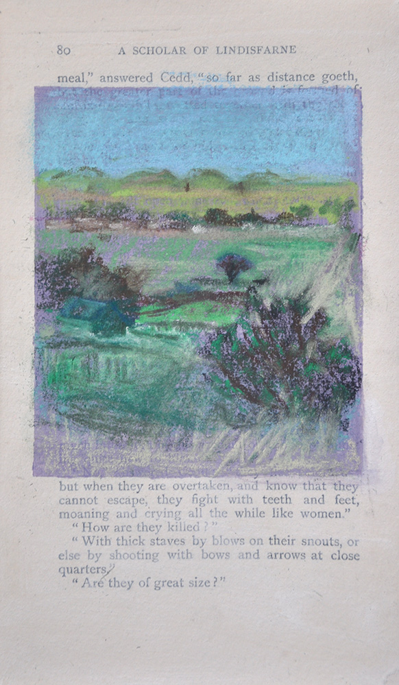
So Far as Distance Goeth

From the harbour you could look ahead and see the castle and the boats, look left and see the tussled hills and sheep, or look behind or right to see buildings. This is unfinished, delighting in one of the other less iconic views.
Standing at the Boundary Wall

Standing at the Boundary Wall was made before Near the Sea.  For me, one of the most striking things about the view was the blue, almost black, of water. People walked out onto the ledge and I could just see their stick figures in the distance.  The tide was coming in as I finished the drawing and deciding where I should freeze it in time was one of those variables of plein air drawing that it's hard to get right, for me.

Tales of the North Country

This is the only page I drew on in my second sketchbook, (same name). This was another quickie, to capture the flavour of the layers of landscape and the buildings I saw.

The Opening

Our experience was that it rained when the tide came in and as the tourists raced to get home across the causeway. The opening was made as the rain died down, shortly after Rain Near Priory. When the rain returned and we were ready to head back I had only noted the gesture of the harbour from behind the Priory gate. It wasn't a really quick sketch, instead I held back defining it. The light was viscous. The following day there would be archeologists with the Big Dig on the other side of the wall.

The Sound of the Bell

This was from the first morning of drawing.  The tide went out, the tide came in and the confusion of what was water and what was mud is all too apparent!

We Must Cross the Water

We were high up and the wind was blowing in my face.  My hat blew off, but the downward road caught my eye and I unpacked my easel. I think the fixative made this even darker than it already was.  The relationship between the wall and the water was constantly changing and my final marks made everything worse.

By the way, my new website is live.  There are still quite a few improvements to make but let me know what you think in the meantime! https://www.rebeccaguyverart.com
 

Friday, August 14, 2020

What is it about drawing in a book?

so far as we can judge, pastel on 'opened book', 40 x 35 cm framed,

This drawing in the book English Wildlife (I found the book in Needham Market car boot sale), was one of a few images I made while thinking about the word 'Borders' with reference to The River Stour. The Colchester Art Society together with Ipswich Art Society is exhibiting at Firstsite, in Colchester.  Borders exhibition details


As I was drawing, I thought about a 'walk and draw' I took with Ruth Philo from Flatford, some years ago.  Ruth introduced me to Rebecca Solnit. Rebecca Solnit mentions the blue of distance and it was that ‘blue of distance' that Ruth saw in my drawing. I am interested in the place where the horizon extends. I wonder how far it goes, or I can see. For me that border is a border of suspended disbelief, of longing, of hope, of ambiguity.


When I get a book that I think might inspire me, I look at the words at the top and bottom of each page, hoping that something will give me a starting place. 'so far as we can judge' was perfect.


I worked from drawings, memories and fragments of photos to try to conjure the Stour, as that is one border which separates Essex and Suffolk and was the essence of the Firstsite collaboration. I was delighted to learn that the drawing sold last week. If you are interested in seeing more of my drawings on books you can find some on my website. More 'opened books'.

Firstsite exhibition 

day after day without, pastel on 1/2 an opened book,  

This has been a busy family week and because of the heat (and lack of rain), my garden has needed lots of TLC so less time in the studio than usual. But while I watered etc… I was thinking of new ways to make book pages and managed to do a few drawings. In this one, 'day after day without' I took a book apart and glued part of it down onto half of the cover. I want to have the option of making portrait drawings without having to make two related drawings.  I like having the cover as part of the piece. The image is my front garden and I was thinking about lockdown and how I have noticed so much more of what is nearby.  I am attuned to nature in a heightened way.  These are CHANGED TIMES and it is a little day after day without.


Flowers and Food, pastel on book pages. 

I have noticed how bleached everything has become because of the heat and drought. Even some of my bright flowers seem muted.  The potentilla was peach and is now almost white. Having said that, some flowers are eye-poppingly lurid.  I love magenta! This still life was a response to the bleaching of my world in the hot sun. It is also narrative, a response to the words on the page. 


And in other ways of playing with the media, the lavender at the bottom, which I hope reads as a book cover, is not really a book cover.  I made book cover facsimile with bookend paper and card. The drawing is not glued down yet.  The drawing was made on three book page-spreads glued together. These experiments will go somewhere, I hope.

Wednesday, August 5, 2020

Peaches say Summer to me


Thirty years ago, when we lived in Rome, I bought most of my food from the local markets. In the summer the peaches were one of those necessary  indulgences, not just for their smell and taste but because of their form and colour.  I vividly remember bringing home a bag of peaches, I think I had bought a mix of yellow and white peaches, and spilling them out onto our table. We had very little furniture and very few things in general.  Our tablecloth was an offcut I found in a shop in Stratford-on-Avon, that apparently was the fabric used in a BBC studio.  It was blue and white.  I could barely wait to begin drawing what lay before me.  I still have the drawing, somewhere.

When I composed this I hadn't been thinking about the visceral pleasure the orange peaches on the blue tablecloth thirty years before had given me, but as I drew, I remembered and tried to evoke that intensity again. 

This was another stop-and-go still life. I picked two bouquets this time but in the end it would have been necessary anyway as I needed that white flower to still the composition.


Saturday, July 25, 2020

The Painting is Always King


Kingdom of Flora (30 x 20 cm) egg tempera on panel


I set up the still life for this painting on the 13th of July. Between then and now I finished a portrait for an NHS Hero, did plenty of pastel drawings in my sketchbooks, and gessoed 38 panels - this panel was the last of my bigger panels.  The new panels are all bigger and they have a coat of rabbit skin glue, followed by nine coats of gesso and then another coat of rabbit skin glue. There is a lot of waiting for things to dry. It's laborious but also uplifting - so much hope. The panels took two days this time.   I'm not sure when I actually began this painting but I certainly had something down over last weekend. It was stop and go but I also had a few problems from the outset.  The set up was more square than horizontal and the only panel I had was a long panel, . The flowers didn't live very long, at all.  The Gazanias died in about half a day. I couldn't really replace the flowers once they'd died.  It is the start of my dahlia season, there weren't any new ones blooming yet. I wasn't really convinced by the colours in the arrangement at all.  When I put the colours I saw on the panel, there was always something discordant, or simply ugly about it. But I I wasn't going to let that stop me.

Although I have plenty of objects to choose from, I like to vary what I am looking at and imagine people like to see different things. As a compulsive charity shopper, Covid 19 has forced me into a less consumerish way of working.  I have nothing new and exciting to begin the dialogue between the objects.

Still, as I was painting I began adding objects to the the still life to try to 'fix' things. I covered colours and objects  up and to change what I was looking at to make the composition work horizontally and to find a balance.  IT IS MUCH BETTER TO PLAN YOUR STILL LIFE CAREFULLY SO YOU DON'T HAVE TO REARRANGE ON THE PANEL. One day I decided that I needed an orangeish shape on the right hand side.  I trawled through Pinterest until I found what I needed. The plums rotted. The leaves shrivelled up and I had to redraw things as I brought fresh items to the table. On Friday (looking at my third bouquet) I remembered it was OK to paint what I needed, not what I saw. I was suddenly Rousseau looking at my tabletop peaceable kingdom. 

I think I'm convinced by it now, or is too stylised?

what I began with