Friday, November 11, 2016

On a Winter's Day Magic the Sun

This week has been a gloopy one.  I've been mired in admin and in a fog since the election. I have been getting lots done, but it has been unsatisfying stuff and I have barely done any real work.  Today was pre-selection day for the 2017 Pastel Society Exhibition and I always get butterflies in the run up to noon, so I did a little more admin and then took Lyra for an early walk, I was pretty convinced I wouldn't be able to work well just then. 

To be fair, it was a beautiful cold day and Suffolk couldn't have been more exquisite, but although I love the seasons, I know which seasons I like best. 

When I got back I logged on and found that this year I had both of my drawings pre-selected.  I call this 'art tax' because it means I have to pay even more to get them framed and to take the stuff down to London.  As faar as I can tell, so little of what is pre-selected gets through because priority goes to Pastel Society members. Nevertheless, obviously I was delighted!

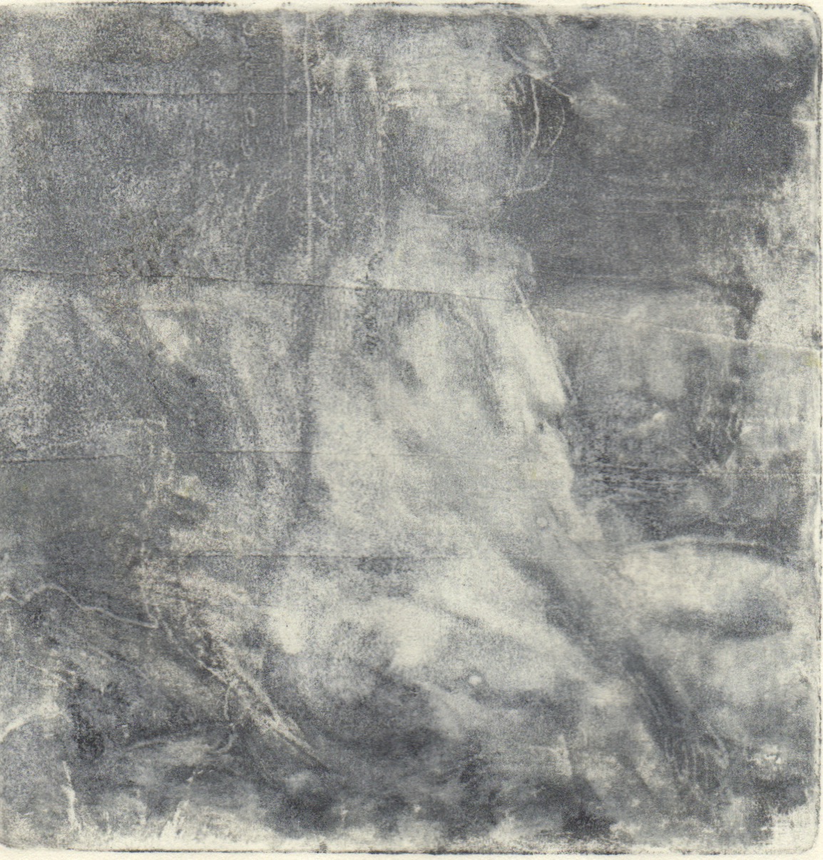
I wanted to make two prints today.  Jo Hollis, framer extraordinaire, has cut me 8 mounts and I only have three prints ready to put into them. I am imagining a wall of mini prints as one of the 'exhibits' for my open studio. When I began this mini print I tried to feel the heat on my back and to magic another time of year in the zinc.

Tomorrow is the opening of the mini print exhibition in Bury St Edmunds and I'll be heading over.

Monday, November 7, 2016

Trial & Error in LIfe Drawing

Oops, I forgot my roller again today so the monotypes are greyer than I like. I was working on a small plate 7.5 x 10cm today, though, so I was able to be more exact than I usually can be in a 15 minute pose. 

When I make monotypes the marks I make become one of the key aspects of the work. In another 15 minute pose I made the drawing on top first and then spent the remaining five minutes being specific about the marks.


In a drawing session a few weeks ago, I remembered my roller but the first print was disappointing, the plate was beautiful, but the print was a let down.  A few days later I rolled some release agent onto the plate and although it is weak in value, it has more of the feel from the plate.

Sometimes working back into a failed print or drawing gives me a head start for a different drawing.  Originally this was a print of another model.  I put some clear gesso over it and worked back in with pastels.  although I am not convinced of the colour, the overall feel is much better than the original failed print!

Sunday, November 6, 2016

Beginning the Radio 3 Series


I usually listen to Radio Three while I work. I don't know what's coming next and sometimes I actively try to ignore what is being played. When I lived in Kenya, I would listen to opera loudly on my walkman to block out the bugs that flew in my face as I drew.  I didn't listen to the music, it was more of a wall of sound to help me respond to what I saw.

I began these collages with two things in mind.  I wanted to combine fused plastic and paper in colour studies related to the music I was listening to. It was Bartok.  I worked on one piece of plastic and then cut 2 pieces of A6 from it as a starting point for the two collages. In the first collage, I chose my paper before I began fusing the paper. I wanted orange. In the second I found the paper later. There was quite a lot of serendipity in my process and pulling it all together was the challenge.

Saturday, November 5, 2016

Leftover scrap experiments and the funny bunch

Figgy has been making badges.  You can see and buy them here: https://www.etsy.com/uk/shop/TheMineralFact?ref=shop_home_edit.  

As you will know, my mum makes all sorts of textile wonders, including her gorgeous beads that I have been inspired by and drawn from many times. Remember the Turquoise Muse? 


And then there's my sister with her zentangle beads too! 


What with Christmas approaching and an open studio coming up, my fused plastic scraps have been haunting me. Yesterday I put some of them together to make badges!


Aren't we a funny bunch!


Thursday, November 3, 2016

Objects or Colour? How Do We Connect to Imagery?

Haw Red Apples 18x18 cm pastel on paper

It's the last chance to choose an image for this year's holiday card, so today's challenge was to produce something that might be suitable. Last year I bought a poinsettia, yesterday I picked up the reddest apples I'd ever seen, on my walk through the orchard. So this year I thought I'd try a colour study still life.  As I selected the patterns and colours and then my pastels, I couldn't help over-egging the batter.  For me, colour is more important than objects in suggesting the joy and excess of December.

For the ground, I cut a piece of Fabriano to about 20x 20 cm.  I mixed some pigment and clear gesso in a shimmering raspberry square. I allowed myself more pastels than usual.  The really loose phase of the drawing was strong and then I went through  a disappointing phase until I ended with this.

Wednesday, October 26, 2016

The Time of Year for Dahlia Love

Orchid and Oriental
I've been getting work ready for a few upcoming group shows.  The Sentinel wanted pastel still lifes and it's that time of year when there isn't so much left in the garden besides the dahlias. This year my zinnias and roses have lasted until now too so there is some variety to the shapes. And for once I don't have to make excuses for grabbing the magenta when I choose my pastels.

Pinks and Greens
I'm trying to make my pastels a standard size, for framing purposes, but clearly mis-measured the top drawing.  The bottom is 16x16cm. Another observation is while the pastel spread on the top drawing in a buttery manner; I found the pastels I chose, or perhaps the pastel ground I chose in the bottom would only let me apply scratchy marks. I will always be a beginner!

Sunday, October 23, 2016

More Mini Prints

Weather Over Pear
Today I wanted to try making a few more prints.  My Akua Intaglio was a mess.  I am not the tidiest painter with ink and rarely wash my brush adequately because it is that little bit more difficult than swilling it in water.  I keep my inks in coasters and stack them to store them. Just setting them up makes my hands filthy.

I decided to refill and straighten the inks out with a palette knife before begining.  It took me over an  hour to complete this bit of housekeeping but during the process I realised a few things.  The inks had air dried to such an extent that they were much more like oil ink and had been behaving that way more… once they were cleaned up they were runnier and don't hold the line as well.  OOPS. The other thing I learned/rediscovered is that  I can mix bespoke colours using Akua pigment with blending oil, so I made a few colours. The blue int he sky is now a sky blue ready to use.
Chartreuse Light on Blue
What's nice about working this small is it is difficult to spend more than a few hours on a print, so in a day I had made two prints. Among other things, I am aiming to produce eight mini prints for my.  I'm not sure which print to send to Lesley at Red Dot to replace the print that sold, but I'm reconfiguring spaces on a small scale.