skip to main |
skip to sidebar
This is a painting that is certainly not painting itself, but am enjoying the challenge of trying to juggle lots of ideas and experiments at the same time. Beginning with a life drawing I painted over another painting that had been painted over another painting. If I think about it I can see traces of each. Somewhere along the way I decided the nude needed some clothing. I will go and do a colour study and see if I can figure out what colour I need on the cloth over the chair and then I will decide about the shape of the clothing that it needs to become... I also need to find the life drawing that I filed somewhere and can't find so I can think about those feet.
The struggle over how much to say, the memory, in my ear, of Dorothy Eisner telling me not to model. The way people like a particular painting that painted itself ... I took my pastels into the room with the loved painting and drew on top of a scan of where I'd got to on this painting in the hope of finding what should happen next, wondering if the loved painting would offer answers. Back in the studio I didn't look at the pastel result as I worked, but it had warmed me up, probably. Later I compared and took from the pastel what seemed to be missing. Still not sure if it's finished.
A B
Both of these studies are 6"sq. I began study 'a' feeling very rusty about colour studies. My next task (from David Hornung's colour workshop book) was to create a 'free study' and the previous reading was about the use of white and black around colour and the impact on adjacent colour. I thought I'd see what happened with black and white and try to jog my memory around an understanding of colour relations. I used neocolour 2 (water soluble crayons) and portfolio water soluble oil pastels first. They are messy to work with if you are trying for precision. I didn't begin thinking 'this is the plan' I had a loose objective and perhaps choice of materials didn't really suit where I ended up going... but it gave my a chance to think about texture, something I hadn't considered before. The task was to use each colour at least twice. I didn't plan value or hue constraints. I wanted to use a variety of materials. I wanted to add some pattern. Could I have too many variables going on here? In the end I used paper scraps, Caran D'ache gouache, black permanent pen and white paper. Whatever colour I laid down on the square, I put the same colour on another piece of white paper to cut and collage elsewhere.
In the second study I wanted to see what would happen if I seperated the blue/greens from the red/yellows. I was also thinking I was putting the darker value at the top. But as I responded to the image I found I needed a rich, deep more prismatic red/orange. The lemon yellow is quite cool and I put the cobalt violet with the blue greens... so the end result was a wider range of values, a similar range of hues and more black in 'b'. Although much is similar I prefer the gesture in 'b'.
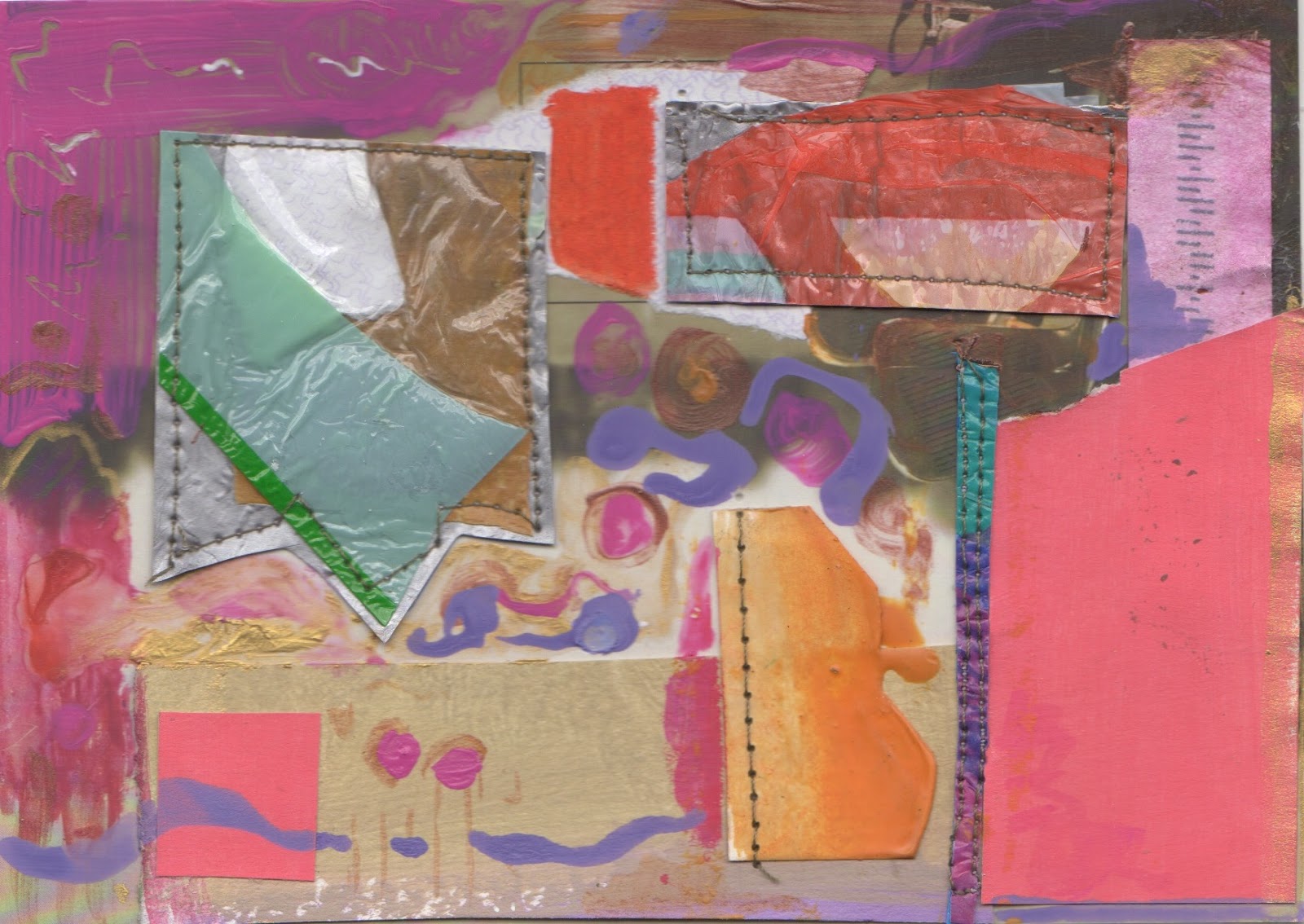
Whenever I take a break from painting and drawing, (and these breaks are always about making space for something else - in this case a family holiday and experiments in plastic), I always find it difficult to begin again. I can't remember where I left off, what I was thinking. This time I took a look at what I'd been doing and the barrier was that I wanted a bit of time to warm up before entering into that space because I liked some of the beginnings. I have never really used oil pastels, preferring chalk, and I wondered whether using an unfamiliar material would result in something different. This 16 X 24 cm drawing is a response to one of my unfinished paintings.
What with all this talk of snow again in the forecast, I got into a snow mind, rearranging some landmarks from my studio and beyond.
Woke up to white and the pink light of sun on snow. Not sure why I took today's big blank canvas and painted summer in Maine but the snow colours were definately on my mind. I think Figgy calls them 'sweet' colours. I worked the same way I had yesterday, inventing a scene in charcoal from drawings, memory/imagination and parts of a few photos. My challenge was to use some yellow green and make it believable.