Can you explain why these playful pages are so effortlessly, honestly exhuberant and why (and how) I can believe in them?
Thursday, March 5, 2015
What do you want to say and how do you say it with paint?
 |
| Orange Bouquet |
 |
| Millstone |
 |
| Night at Nayland Farm |
 |
| Sue |
 |
| Looking Down on Macabre colour |
I find that for some reason when I paint I forget who I am and what I want to say. As I am painting any one canvas I think I know but when you look at them side by side it's clear I am floundering! I am more sensitive about painting; I care what people think more than I do when I draw, make a print, fuse some plastic or make a book. As a result, when I paint I don't think I create a body of work that is identifiable or consistent. I know it's there, but I can't access it day in day out. It's curious.
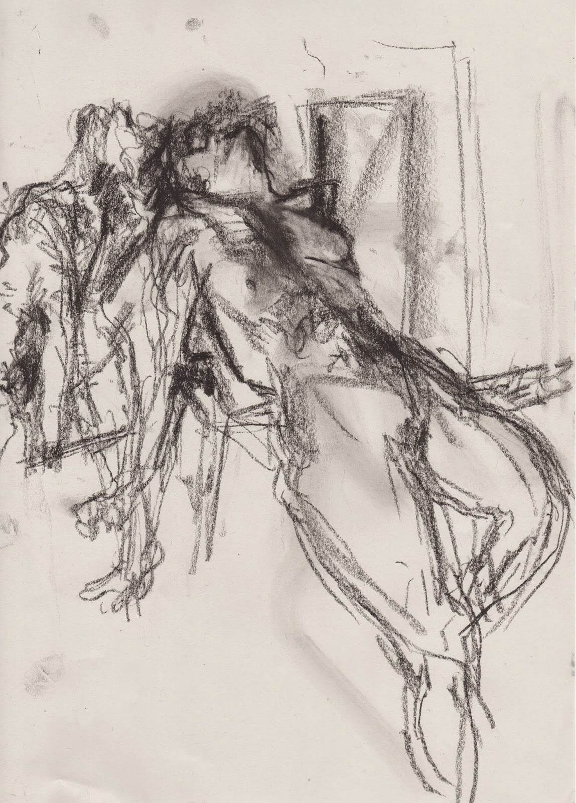
Some of my recent life drawings
 |
| Emily |
 |
| Marilyn |
 |
| Emily |
 |
| Marilyn |
 |
| Marilyn |
 |
| Marilyn |
 |
| Sue |
I went to a gallery recently to show my work and although they were really positive about some of my work, the person I spoke with felt that my life drawings were too 'traditional'.
My wonderful life drawing class is a mix of different kinds of artists, former draughtsman, artists who simply love to draw and abstract painters work alongside each other. When we draw, there are gasps and sighs and we all talk about the shapes.
Labels:
Emily,
life drawing,
Marilyn,
pastel on paper.,
Sue
Thursday, January 15, 2015
More light studies
 |
| Light from Dairy, monotype: Akua Itaglio on paper 6 x 8" |
 |
| Mother and Sister of the Artist by Edouard Vuillard, 1892 |
 |
| Light From Above Piano, monotype: Akua Itaglio on paper 6 x 8" |
This print was actually made before the one above. You can see that I was little more faithful to Vuillard's pallette. I have painted and drawn this view repeatedly in the past. This medium seems to solve it more for me.
 |
| Woman in Blue, by Edouard Vuillard, 1893 |
I include this last drawing to show that as I said in an earlier post there are many prints that I pull back the blanket to in disappointment.
 |
| Light from Upstairs Window, monotype: Akua Itaglio on paper 6 x 8" |
 |
| Light from Window upstairs, soft pastel over 1st pull monoprint |
Tuesday, January 13, 2015
Light behind wedding chest
For every satisfying print there a handful of disappointments. It comes back to the tension between light and colour, for me. I am planning to do a few black and white prints to work in tone to convey light, but the thing is, I LOVE COLOUR, so marrying those two things is the ideal.
Today I consulted Vuillard. Wonderful Vuillard who tells stories with rooms using light and colour. I think he helped.
Today I consulted Vuillard. Wonderful Vuillard who tells stories with rooms using light and colour. I think he helped.
Thursday, January 8, 2015
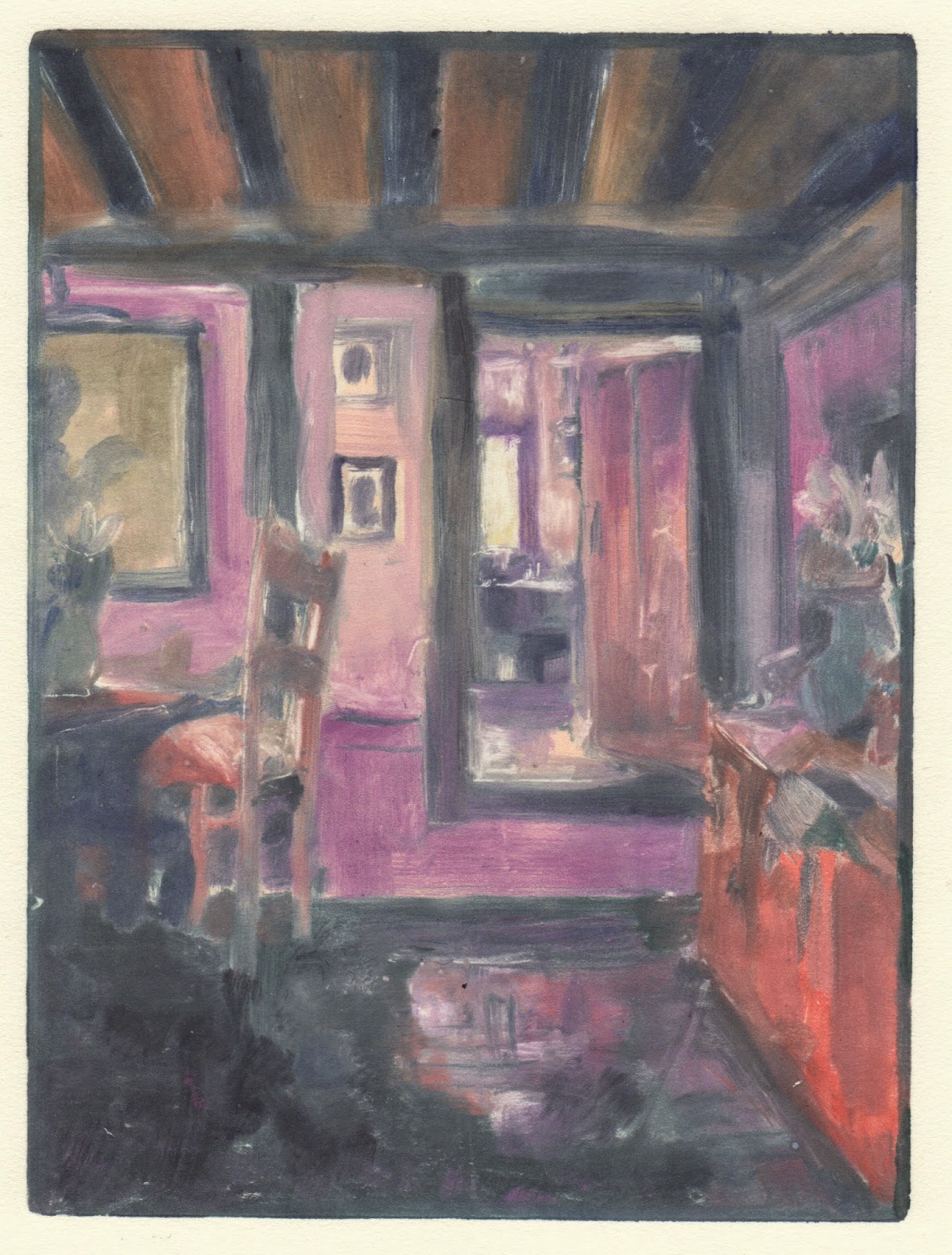
Light around corners
 |
| Light in Hallway: monotype Akua Itntaglio on Rives BFK 6 x 8" |
Today, especially this morning when I got to work, it was dark, even though it should have been light and I seized the opportunity to go around the house looking at the light around the corners. I took lots of photos. I decided to flick throuhg my Hiroshige book to look for colour inspiration. The spread below felt like the day, and I liked the wedge of green, so that's where I began.
I got the room prepared, for the first time since I've had the press! I cleared off surfaces, made a wetting station, a working station and adjusted the press, even re-filed the edges, changed the paper, etc. If I don't begin at the beginning, I don't take the work seriously, and I rush. I am delighted with the colour of the print! The ink has potential, even if it doesn't do quite what oil-based ink does. I also used plenty of brushes and found cleaning them and using them immediately after cleaning straightforward for the first time. I used hot water with the soap!
I'm excited to see what happens next.
Wednesday, November 19, 2014
Studying Matisse's colour
There's a part of me that likes to go out and 'find inspiration' and I consider wandering and gathering ideas important, but when I started this blog, a long time ago, I also knew that I have more than enough material to keep me busy FOREVER and it's a just a case of looking at what I have around me, intently, to see what's next.
What better place to look again than with Matisse.
Subscribe to:
Comments (Atom)


