|
| 16.5 x 16 pastel on paper |
Back to the discipline of the ticking clock, the fleeting pose and Sue calling, 'change please' before I have managed to tie things together sufficiently. Begin again. Today I forgot me tea.
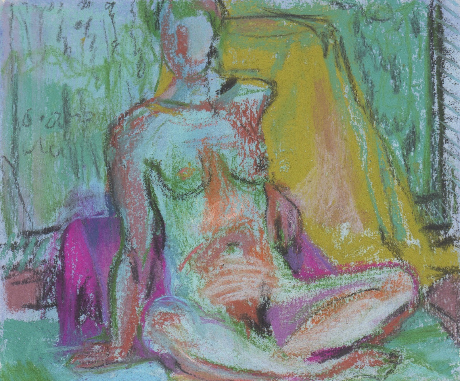
I love to draw Emily because her poses are so natural and believable, but creating the mood in colour in ten minutes isn't always possible. In a ten minute pose I need to choose a book to draw in, find a backgrouind colour that feels 'right', choose seven or so colours and begin in a place that will make a strong composition.
Very often I find I mis-measure as I begin making marks. I go round and round on the page adjusting with each subsequent mark. Sometimes my figures are not in the right place. I may choose to rub things out or I may try to find a way of making bad placement work.
Today was a day of feeling like I never had quite enough time to finish, let alone choose colours or think composition. There were six ten minute poses and one 30 minute pose. Sue had placed Emily in my favourite location, in front of the mirror, so there was plenty of complexity, too much to understand things, which is the way I like it.
With any luck there will be something that interests me in each of the drawings, something that I may be able to use somewhere in something I do later.
 |
| 17.5 x 17 cm, pastel on paper |
 |
| 17 x 19 cm |
 |
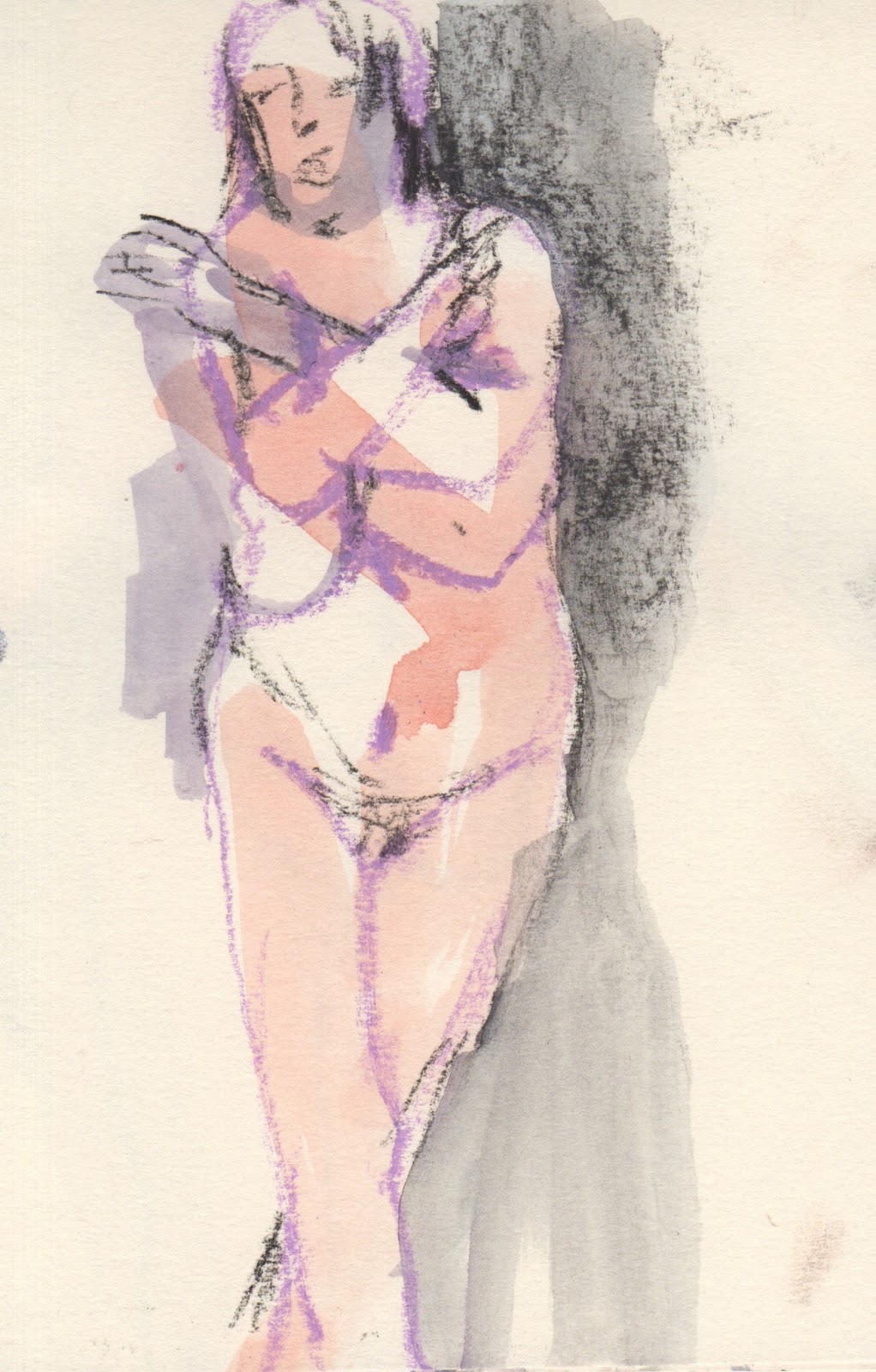
| 13 x 13 cm |
 |
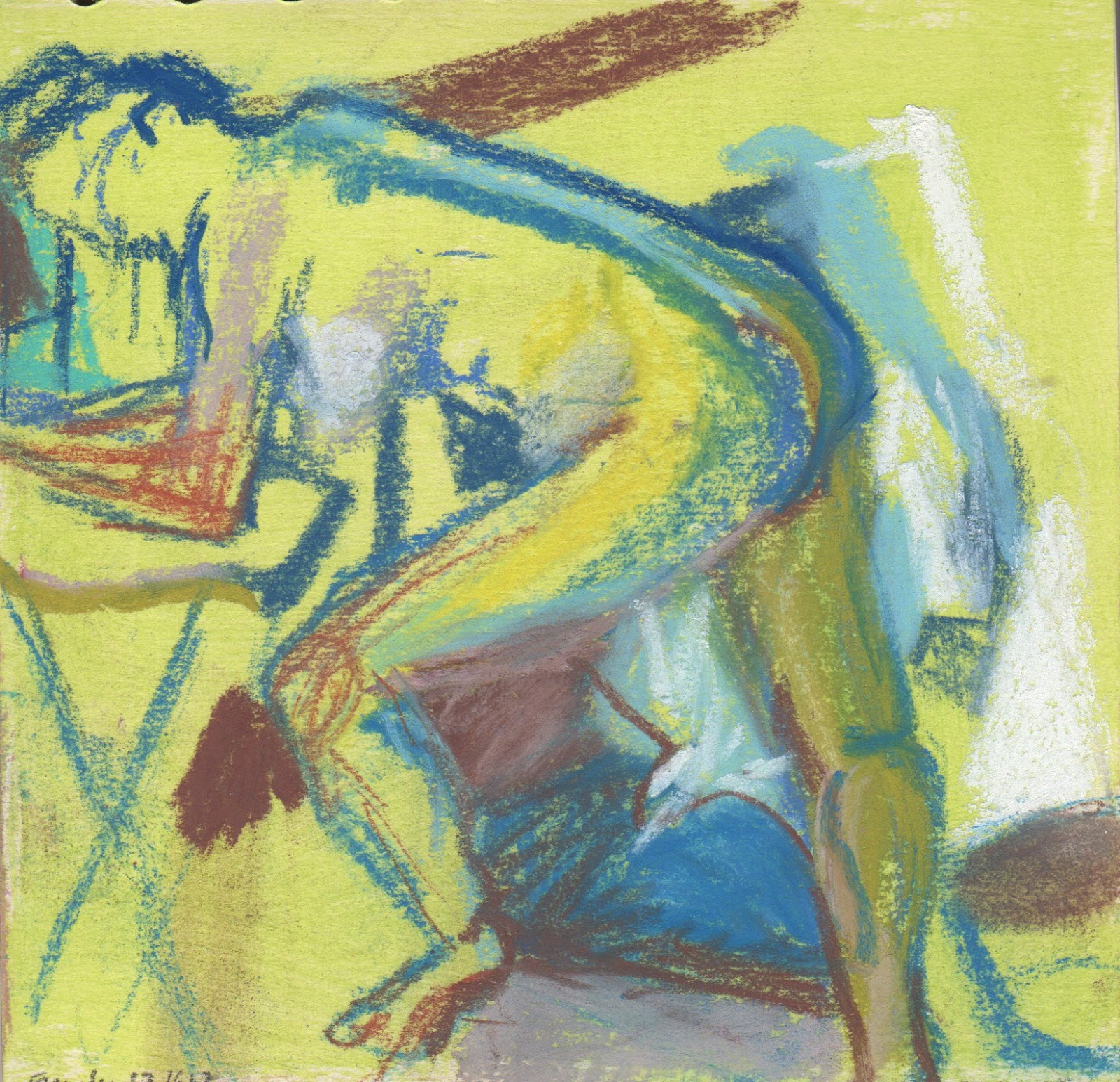
| 13 x 13 cm |
 |
| 17 x 19 cm |
 |
| 17.5 x 17 cm, pastel on paper |