In the last few weeks I have been thinking about a new project. One of my artist friends told me about a group who call themselves 'inspired by Becker'. Harry Becker was an artist who lived from 1865 - 1928 in rural Suffolk. In 2002 the Wildlife Gallery had a show of Becker's work and although I didn't see it, our friends, the Hawkins have lots of his work so I have seen examples of his paintings, drawings, etching and lithos and watercolours regularly over the years. But I find that if your eye isn't in and you aren't attentive to a particular aesthetic/artist you don't necessarily appreciate him/her.
Last week Christopher gave me a copy of the beautiful Becker book by David Thompson: http://www.oldpond.com/becker-harry-becker-1865-1928.html and I have been reading it and imagining the time when he lived, what he saw and considering how suffolk has changed. I am now feeling inspired by Becker.
At the same time, I have been thinking about an exhibition of Degas' monoprints that is at the MOMA in NYC. My friend, Ann Sullivan, sent me a postcard from the exhibition, knowing that if I could visit it I would! Years ago I looked a lot at Degas and Prendergast monotypes and one of the directions I took was to make a series of monotypes using black etching ink which I put pastel over. This technique was one of the experiments that Degas made.
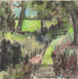
I wondered if I could translate the Suffolk light, one of Becker's concerns, the light he called the "true light of day" using this technique.
The top monotype is the first pull. I rolled lamp black ink onto a zinc plate and removed it with rags, turps and stand oil. I used a limited pallette of about 7 pastels. I printed onto Snowden which I sprayed with water and wiped dry with a j-cloth. The monotype below was the ghost and I made some changes to the plate, but did very little painting on it. I printed onto Arches. The paper is off white and softer. When I chose my pastels I wanted the field behind to be a higher key.


