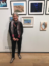
There's an exhibition coming up (The East Anglian Mini Print 2016) in Aldeburgh to coincide with the Food Festival in the Garage Gallery. I have had so much on lately I didn't think I'd submit anything for it, but I have had some reminders and in the end I ordered some teeny tiny plates in the nick of time. I've applied my Inspired By Becker sensibilities to these 10.5 x 7.5 cm monotypes and will work on the 10cm square fomat next to see how that feels. It's a juried show, so no idea if anything will be selected, but am having fun exploring the very small plate.
Showing posts with label inspired by Becker. Show all posts
Showing posts with label inspired by Becker. Show all posts
Tuesday, August 2, 2016
Thursday, July 28, 2016
Value and colour, a struggle to convey a place
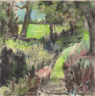
Committed to printmaking for the moment, I rolled the sky and sketched with ink onto the plate. Next I made a provisional print, to remove some of the ink. I did this by placing a rougher paper than I usually print onto on top of the plate and rubbed lightly with my hand. The result was a print, but it was not in the least resolved, I didn't intend it to be. These quick sketches can be the start of a pastel drawing. After print two, I painted with pastels on top of print one (above). I was interested in marks and wanted to create some sort of cohesion with marks. I omitted the animals and house from the scene because this version didn't seem to need either motif.
The next print (above) took the better part of the day. I wanted to keep it painterly and to use colour in a satisfying way. There are passages that I like but there are many small pieces so the space didn't feel confident and I wasn't satisfied with the values.
When I began this series, a few weeks ago, I wanted to use value to capture the light and mood and imagined using light pastel over prints to tint the image. I thought I might be able to convey the moodiness of the landscape that way. So, to salvage the idea and to reuse the drawing I'd already done, I painted back onto the plate with a blackish ink to approximate the feeling of the light. Once printed (onto wet paper this time) I tinted the values.
Tuesday, July 26, 2016
Nothing like a bit of pressure
We have had a rather exciting time recently and all the celebrating, visiting, driving and moving stuff has thrown my work routine off kilter. I have found a little time here and there, but yesterday when I finally had most of a day to be in the studio, I felt flabby and not in the least match fit. I couldn't remember where I'd left off and what I was thinking. I began, but it was uncomfortable.
Ruth Philo told me about Rebecca Solnit's book A Field Guide to Getting Lost and I am reading that, slowly, alongside other things. I have been looking too, noticing the bands of colour that compose the fields. I can't believe I have never noticed how the ragged robin sprouts above the wheat and barley, to edge the fields in pink, and the washed out lavender of the thistles. The colours of high summer make a beautiful palette. The landscape is dry, the skies are moody and what wonderful shapes growing makes.
I have a rather tight deadline to get my work for the Inspired By Becker exhibition made. I did get the frames and matts made to fit my plate appropriately, so at least I don't need to finish in time for framing…. but I haven't succeeded in making a monotype yet that captures something about the light of Suffolk and evokes Harry Becker on some level. For the past two days I worked in colour (Akua Intaglio) and value and then used soft pastel on top. I am hoping for something looser, moodier and more surprising.
Saturday, April 23, 2016
Experimenting with Becker's light
In the last few weeks I have been thinking about a new project. One of my artist friends told me about a group who call themselves 'inspired by Becker'. Harry Becker was an artist who lived from 1865 - 1928 in rural Suffolk. In 2002 the Wildlife Gallery had a show of Becker's work and although I didn't see it, our friends, the Hawkins have lots of his work so I have seen examples of his paintings, drawings, etching and lithos and watercolours regularly over the years. But I find that if your eye isn't in and you aren't attentive to a particular aesthetic/artist you don't necessarily appreciate him/her.
Last week Christopher gave me a copy of the beautiful Becker book by David Thompson: http://www.oldpond.com/becker-harry-becker-1865-1928.html and I have been reading it and imagining the time when he lived, what he saw and considering how suffolk has changed. I am now feeling inspired by Becker.
At the same time, I have been thinking about an exhibition of Degas' monoprints that is at the MOMA in NYC. My friend, Ann Sullivan, sent me a postcard from the exhibition, knowing that if I could visit it I would! Years ago I looked a lot at Degas and Prendergast monotypes and one of the directions I took was to make a series of monotypes using black etching ink which I put pastel over. This technique was one of the experiments that Degas made.
I wondered if I could translate the Suffolk light, one of Becker's concerns, the light he called the "true light of day" using this technique.
The top monotype is the first pull. I rolled lamp black ink onto a zinc plate and removed it with rags, turps and stand oil. I used a limited pallette of about 7 pastels. I printed onto Snowden which I sprayed with water and wiped dry with a j-cloth. The monotype below was the ghost and I made some changes to the plate, but did very little painting on it. I printed onto Arches. The paper is off white and softer. When I chose my pastels I wanted the field behind to be a higher key.
Subscribe to:
Posts (Atom)


