Saturday, June 17, 2017

Open Studios 2017

Open Studios Saturday,  pastel on paper 16.5.x 16.5 
It's the second Saturday of Suffolk Open Studios and I've had a few people today. In a break from the trickle of visitors I stood up my plein air easel (that I use as a table for drawing) and got out two trays of pastels I hadn't put away from previous drawings.  I chose seven pastels but ended up with about 16 and tried to make order from the view out of the studio door. 

Yesterday I took a class with Neil Pittaway at The Mall Galleries as part of the NEAC scholarship. His main task was to make thumbnail sketches of various paintings and then to draw them together into something to use as our own art.  In a funny way that's all drawing from life is. I see lots of little vignettes bumping up against each other here and the challenge is to make them into a whole.

When Craig Jefferson was talking about his paintings he talked about how he chooses a different background priming colour.  His very vibrant picture began with yellow so I began with a lime yellow today.

It's a beautiful day and I look forward to a big run at five pm.

Tuesday, June 13, 2017

A departure - drawing a clothed model

charcoal on paper 17 x 17cm
A few weeks ago a circular went around asking if anyone wanted to share the cost of a clothed model to draw, for portraiture. When I finished my Still Red Room pastel, I thought I might like to set up an interior in the studio and possibly hire a person to sit for me in it.  Then I went to Maine and now it's open studios so I haven't tackled a new big project yet. 

Today I went to this new group.  I was hoping that the model would be in a really inspiring setting, wearing wonderful clothes but she was in a portraiture setting. She has a compelling face and the light was beautiful.

I began with charcoal. I haven't drawn a model in this way in years and years. I thought I'd work tonally. It's a three hour drawing session andI was working on the top of my pastel 'table', a box easel with the easel part taken off so I couldn't work on anything big on that. I had brought a few sketchbooks appropriate for life drawing shorter poses. Never mind.

It turns out it doesn't matter how long the pose is.  I can begin again in a different way when I'm done.  The second drawing was on book pages.  Teven, the model,  liked that one and took a photo of it.  The final drawing was looser and I rearranged the room in my head and thought of Dorothy Eisner.

Pastel on book pages 13.5 x 20 cm

pastel on paper 16 x 16 cm

Monday, June 12, 2017

Sometimes there's no time to look for another colour

16.5  x 16 pastel on paper
Back to the discipline of the ticking clock, the fleeting pose and Sue calling, 'change please' before  I have managed to tie things together sufficiently.  Begin again. Today I forgot me tea.

I love to draw Emily because her poses are so natural and believable, but creating the mood in colour in ten minutes isn't always possible.  In a ten minute pose I need to choose a book to draw in, find a backgrouind colour that feels 'right', choose seven or so colours and begin in a place that will make a strong composition. 

Very often I find I mis-measure as I begin making marks.  I go round and round on the page adjusting with each subsequent mark. Sometimes my figures are not in the right place.  I may choose to rub things out or I may try to find a way of making bad placement work.

Today was a day of feeling like I never had quite enough time to finish, let alone choose colours or think composition.  There were six ten minute poses and one 30 minute pose. Sue had placed Emily in my favourite location, in front of the mirror, so there was plenty of complexity, too much to understand things, which is the way I like it.

With any luck there will be something that interests me in each of the drawings, something that I may be able to use somewhere in something I do later.

17.5 x 17 cm, pastel on paper

17 x 19 cm


13 x 13 cm

13 x 13 cm

17 x 19 cm

17.5 x 17 cm, pastel on paper

Monday, June 5, 2017

Marilyn

Marilyn - 30 min pose, 15 x 16 cm pastel on paper
 We began today's life drawing with three 5 minute poses with Marilyn holding the same pose but at three distances (see last three images). When asked, the person working next to me, Roy Freer, said that he didn't take any notice of the scale issue; Sue had inteded it as a scale exercise. Like Roy, I was just drawing, first in black and white, then in colour. What I noticed was that the light was very different on the figure as she moved forward.  Up close Marilyn was mostly just skin and it all had a similar colour. 

I tried to find the figure today, making lots of marks before I discovered her. although I was drawing straight on and there was nothing behind the model, I looked hard at the background and tried to discover something interesting but 'real'.  

I am excited to be heading to see a Milton Avery exhibit in London next week. I can see that I have been looking at him in at least one of these drawings.
Marilyn - 10 min pose, 10 x 14 cm, pastel on paper

Marilyn - 10 min pose 9 x 8 1/2 cm, pastel on paper 

Marilyn - 5 min pose,  (distant) 12 x 25 cm, charcoal on paper
Marilyn - 5 min pose, (mid distance), 9 1/2 x 14 cm, pastel on paper

Marilyn - 5 min pose (close up) 11 1/2 x 19 1/2 cm, pastel on paper


Saturday, June 3, 2017

Re-using a monotype plate

Rapeseed, Oak and path  10 x 10cm, first version 1/1 monotype: Akua Intaglio
I think that working small can feel claustrophobic, sometimes.  It's tough not to get tight, to get enough distance and to have realistic expectations.  As a result there are instances when the print doesn't live up to my imagination…When that happens what I usually do is to begin again with the ghost still on the plate, trying to address the areas that don't work. The second print can be freeing.  By then I have worked out some problems and I have translated the landscape in some way and that leaves me space to experiment with colour and composition differently  I might work from my imagination in a way I wouldn't in the initial print. The second print usually takes less time. Occasionally I find that making the second print convinces me that the first print is OK.
Rapeseed, Oak and path  10 x 10cm, second version 1/1 monotype: Akua Intaglio
What's interesting when I show people two similar prints, one made directly after the first is that a 'favourite' isn't always universal. Deciding which is better can be difficult. Sometimes I even have to make a third print.  Sometimes I put the prints in the 'not fully realised box'.
Aldeburgh Beach  7.5 x 10cm, first version 1/1 monotype: Akua Intaglio

Aldeburgh Beach  7.5 x 10cm, second version 1/1 monotype: Akua Intaglio
And tonight we had a drink in the field.  I took my new altered sketchbook for UK landscapes. A Bold Venture.
Field with Lime Tree, pastel on book pages (altered sketchbook)


Tuesday, May 30, 2017

Determined to make the most of The First Rose of Summer

The First Rose of Summer, pastel on paper 16x16cm

The garden has dominated my days since I've been back from Maine. I can't just leave the garden to fend for itself. It needs me, so I go and do the things that need doing now and for the future. Sometimes I go with a cranky spirit because there are other things that I want or need to do too. Everything jockeys for my time. The garden has a loud voice and it is so needy. The thing is, once I am there I am transported in the same way that I am when I draw, to shapes, colours and an inner monologue that I don't listen to. 

It's too easy to miss the garden because I'm so busy attending to it, so yesterday, in the middle of planting out a few more seedlings and planting a few more seeds then judging the Stowmarket Art Group Exhibition, I picked the first rose of the summer, one of the remarkable purple ones,  (Rhapsody in Blue).  I cut back most of the hellebores and made a little bouquet with those and a few other things that were abundant enough to take. 

The other thing I did yesterday was to prime a few 20 x 20 panels and begin this little drawing.  I had to quit drawing before I'd finished to judge the event and it was only working in places.  Today, after taking down my Dining on Plastic work from Craftco in Southwold, I came back to it. 

More roses are out today.  

Thursday, May 25, 2017

The land, the land!

Turqoise of Barn, pastel on book page
I'm recently back from Maine where I go annually to rake and dig and weed and haul garden debris with my brother, sister and mother. The weather was mostly fine this year.  We had the gamut: downpours, incessant rain, sun, whitecaps and overcast sky. One night Ben photographed an amazing sunset that I missed because I was glued to the news coverage. The temperature was really quite cold to unseasonably hot. I tend to draw early or just before I begin preparing dinner and I chase the light across the grass. 

Suffolk Pink and Rapeseed, Akua Intaglio on paper - monotype 10 x 7.5cm
Back in Suffolk, those intense fields of yellow rapeseed are now leggy and fading. There is a prevailing scent of brassicas and it's warmed up here, now.  But I remember the yelow! This is my first monotype in a while and it feels bolder and brighter than usual, less subtle, but maybe that's the rapeseed?

Kantha, Limes and Daffodils, pastel on book pages
 On the morning after we all arrived in Maine, before we had even reached Cranberry, we stopped at the Job Lot store (a family tradition). I found a haul of vintage kanthas and we bought a few.  The patterns and colours provided me with a backdrop for this visit.  There are plenty of objects to draw, but I was restricted by the flowers available.

Kantha and Rhododendron, pastel on book pages

Kantha and New Vase, pastel on book pages

View from the island, pastel on book pages


Saturday, May 6, 2017

Downtime mail art making and letting go


When I had just graduated, my father offered the advice that I should never give anything away because doing that devalues what the artist makes. It made sense at the time.  Luckily I came to my senses! 

My mail art is a way to unwind.  It's playful and as I make it I am thinking about who I should send it to. The who is it for, makes we work differently.  In general I never think I'll do this this time because someone might buy it. I (most artists?)  just don't work that way.  With mail art there is human connection and rather than taking away, for me this adds a dimension, allows me empathise in another way.

Above are twelve quickly worked pieces (postcard size) which I began with mounted photos I had found at the car boot sale and then cut up a few years ago as postcards to make mail art on. The black and white textures and shapes provided an intuitive base for playing with shape and colour.  

I owe lots of mail art and I never make mail art that I don't like myself or that I don't like making.  I gave myself yesterday evening to make some mail art and made four of these postcards.  (They are arranged in order with the first at the top).  I gave myself a few hours this afternoon again. Inevitably I will keep some. But they are mail art and most will be mailed away and only this photo and the process will remain.

Friday, May 5, 2017

Struggling with Green

Green Vases Flowers and Bowl, Oil on canvas 40 x 50 cm
Getting Green right in a painting and in reproduction seems to be tricky. A long time ago I remember telling my father that I thought green was the hardest colour. It went something like this:  I had been making a monoprint of my mother (bent over gardening) between the house and the barn.  It was late in the season and the grass was fading but I decided the grass should be a yellow green. My dad walked by and I was in that tormented state when nothing seems to fit with anything else in the picture. I asked him what colour he thought was the most difficult to make work.  He asked me in reply and I told him, green. 'I thought you were going to say that,' he said. In the end I reconciled the green in some way and the monoprint hangs in the bathroom, reminding me of the conversation and him. 

For some reason I challenged myself to work through colours for the month of May.  From experience I find yellow and lime green are tough to make work in any quanity in a picture so I began there.  The sketchbook page, below, works better for me than the painting above. I painted all day yesterday and in the end wiped down large areas and changed the composition.  The colour isn't quite what it is.  The green on the right is deeper.  It's quite wet after working back into it this morning, so it needs some time before I can think about it again. I came across Annie Williams on Pinterest https://www.royalwatercoloursociety.co.uk/artists/109-annie-williams/overview/
and had been thinking about her work as I put things together to draw.


Monday, May 1, 2017

Making the most of an opportunity

Green Vases and Bowl, 24 x 22 cm, pastel on paper

I wasn't able to start drawing today until too late to finish before the light disappeared . I'm not sure if I will return to this or begin another version. Today was about green.

It's been a busy few weeks and it feels as if I have had no time to do anything other than tie up loose ends: framing, typing up bios and price lists, putting together a portfolio, picking up work, and then hanging two exhibitions and attending them.

When I can't spend all my time making work it can feel frustrating, but that is ridiculous!  All of that other stuff is part of the whole and I've learned that if I see time as opportunity then it's easier to feel good about the non-painting activities.

Last month I made three opportunities.  I took a pre-selected pastel down to the NEAC annual exhibition for final selection.  I put together a portfolio and submitted it for the New English Drawing Scholarship and I submitted an altered sketchbook for the Annual Radley Sketchbook Exhibition (Parker Harris) and one of those three opportunities was successful.  You just never know, and I find that by making the opportunities I apply myself differently and with zeal and that makes new opportunities.

The exhibition at Craftco is exciting.  I love seeing my 2D work (plastic collages) with ceramics.  Since I know Caroline's work, I have been thinking about it as I've worked and I am pleased with the way it looks hung and together.

Craftco , Southwold, Exhibition through May 30th

Thursday, April 6, 2017

Color possesses me


The title for this piece comes from a Paul Klee quote, Color possesses me. I don't have to pursue it. It will possess me always, I know it. That is the meaning of this happy hour: Color and I are one. I am a painter." 

I began with the latest pieces of plastic I had acquired: a Marks and Spencer's bag, a Jacobs cream crackers packet, a bag of mixed nuts, salad bags, and a Doriano biscuit wrapper.  I added a bit of that kelly green from an old RA mailing (not members this year) because I needed that. I had been thinking about Klee, Mali Morris - she's coming to talk in Colchester on Friday, Howard Hodgkin and Rothko.  In my mind these people gravitate towards bold shapes and colours. The Marks and Spencer's bag and my recent foray into grids for Nichola Orlick's exhibit in Kyoto was still in the back of my mind. I had finished putting a portfolio together for something coming up, so felt light, happy.  It was happy hour.

With my stitching I like to accentuate colour relationships, to move them back, bring them forward and the colours in the frame seemed to make the most of the inner life of the happy hour. It was hard to keep it simple but I resisted the temptation to complicate things.

High Stile was where we stayed in the Lakes.  Happy Hour in HIgh Style says Jazz to me.

The above is copied from my post in Dining on Plastic: http://diningonplastic.blogspot.co.uk
(sometimes I like to highlight the overlap between my experiments in plastic and all the other experiments I make in other media … apologies if you see it in two places.  


This bouquet was sent to me for Mother's Day by our adorable children from a florist in Kersey, a village nearby. I was still quite sick on Mother's Day and rushing to prepare for our trip to the Lakes, but I managed to record something about it in my new altered sketchbook:

The flowers travelled in the Defender up to the Lakes, back down and were beautiful until Saturday morning when I went out and picked a bouquet with my niece, Gracie. You might recognise some of the objects, reconfigured.  I glued some paper onto the vase. 
Spring Green and Book, pastel on paper,  A4

Friday, March 24, 2017

Library with Red Sarong - oil on six canvases

Library with Red Sarong  - oil on six canvases 40 x 30cm each
Paintings are problems and as I've got older I have learned to accept imperfection, to compromise and to let go.  It used to be that I loved starting things and dreaded seeing them through to their conclusion.  I would paint over everything at the first sign of something that didn't work. Now, if I have to move something, late into the painting or take it out completely it isn't such a drama. If a colour doesn't work I'll look for a long time and then begin testing alternatives. Believablity is what matters more than everything else. And I don't mean, 'is it realistic?'

Painting these six canvases has been an interesting problem and coming back and forth to it for a week has been fun. When I composed the still life I thought about the composition of each of the panels so had done some of the work before I began.  I knew quite a lot about the subject because I had made a big pastel drawing of it the week before. I only had to move things around a little as I worked. 

In order to paint something so long I had to move it and myself lots, so my perspective was changing more than usual but I tried not to let that bother me, as long as it was believable. There were lots of patterns and how much to simplify, how true to the colours I saw I wanted them to be, and how to tie everything together in terms of colour, shape and value were the main problems.

I anticipated taking the pieces apart to work on the individual parts, but in the end I decided this time I wouldn't.  Next time I will.  That will be a different experiment. I am very curious to see what they look like framed individually next to each other,how that will change things, and I'm sure that will inform my next experiment.

A few days ago, when I was beginning to despair of the red, I started a new sketchbook and invented new colours, stood at a totally different angle and unwinded with my pastels.

Hyacinths, Tulips and Daffodils

So later today I'll pack up the still life and begin thinking about what comes next. 

Sunday, March 19, 2017

Grids of sorts


At 16 - I went to the Animal Fair, Battisford, England, 2017

Later in the year one of my mail art friends, Nichola Orlick is hosting an exhibition at a gallery in Kobe, Japan. It is called Half Hundred Swing and is an homage to Joseph Cornell. We have been asked to make box collages. I have been thinking about it for some time and I earmarked this weekend to complete it. I read a book about Cornell Vision of Spiritual Order by Lindsay Blair that I found in a charity shop four or five years ago.  Before I began working on the collage, I  browsed throught the book and wrote down these words: 'childhood, swan, owl, bunny, body, self, repetition, arrangement, demarcation, compartmentalisation, colour, coding, tangential relationships, people, outside, set rules, ritual, alternative worlds.'

I had been saving a box that I found around Christmas and what I had been thinking about was how I could divide up the space to create depth using fused plastic. I thought I could use some mount board in some way. I got out my big bin of  plastic and started pulling pieces out looking for inspiration. I'm not sure you can see but each of the rectangles is a different height. It was fun and I think it may lead to something else later on. Arranging the rectangles was tricky.  I think  in the future playing more with colour, light and height could be interesting. This time I wanted to use some of the motifs Cornell was interested in.


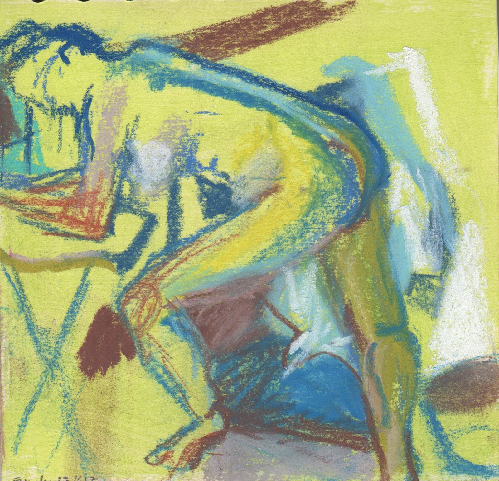
At the end of last week, I began painting my six 40 x 30 canvases. I decided to attach them together to begin with and so far I haven't taken them apart.  I think I will.  Such a long canvas is unwieldy and it is difficult to see things, also the idea is six canvases, in the way Hockney did that. It's still early days and my goal is to make each of the rectangles work in itself.  The bouquet in the middle looks nothing like it did when I began, all the flowers were in different places and I was struggling with that.  That panel is the weakest one so far. Having spent so long drawing a version of the arrangement has meant that I have solved some of the problems and am able to focus on the colour and the shapes in a different way. I nearly changed the red because I've used a lot of red lately, but now that I am working on it I am loving the red.


Thursday, March 16, 2017

Still Red Room

Still Red Room, pastel on fabriano 64 x 46 cm
One reason I love to work from life is that I can create something that reminds me of a place.  When I put together a still life I am inventing a place and trying to get it to feel real.  This time, without meaning to, I put many barriers in my way to success. 

I was determined to use some yellow lillies that two of my Albanian friends, who I know from Suffolk Refugee Support, gave me as a present.  I have spoken about having a hard time making yellow and red work for me, in garden and in drawings so by choosing a red, a very red, backdrop I was bringing this to a head. There were also some flourescent orange roses in the bouquet and again, that was troublesome. Additionally as I worked I realised, there were too many open cups and something too small in the foreground of the set up; so with a mix of invention, addition and seeing colour differently to the way it existed in front of me, I think I found a way to resolve things. For me, the overall feeling of this is quite still, maybe serious in a camp kind of way. Perhaps I could have varied the marks a bit more, but in order for it to be believable, this was what I found.

I'm going to get some new flowers later on so that tomorrow I can begin on the six canvases!

Saturday, March 11, 2017

From Sketchbook to something bigger

Looking at part (of the still life) I

Looking at part (of the still life) II

View of Patrick's side of the bureau and the view from above the bureau
My altered sketchbook only has four pages left. As I've worked through it, it has increasingly dominated my life. Deciding to draw in it every day has amplified the feeling that I might have run out of ideas.  So I am in a heightened state of alert.  I've noticed things I might not have noticed and that's great. What I've remembered is that there are beautiful still life possibilities everywhere and all I need is a hand full of pastels and my sketchbook and my day is sorted. I'm drawing on both sides of the page, so these drawings will remain bound in the sketchbook.  


What's interesting is that I am always drawing anyway, but deciding to make the drawings in one place has changed the structure of my whole day. With that in mind, it's time to get on with some of my ideas, so yesterday I primed six canvases and today I constructed a big still life in my studio and prepared three big drawing surfaces to use to respond to the still life. Seeing the Hockney made we want to try using a series of canvases to interpret a scene, and since my scenes seem to be still lifes right now, I'm beginning with that.


Wednesday, March 8, 2017

Fishing for Biscuits with Cups and Clutter

Cups and Clutter

Fishing for Biscuits, fused plastic collage with stitching and paint (21 x 21cm)

Tomorow I go down to London to pick up my unsold drawing from the Pastel Society show. Although it would have been even better if it had sold, I am looking forward to meeting Keith (who I met at the opening of the exhibition) and seeing the Watercolour Competition Exhibition at Bankside where a few of my firends have work.  Today we celebrated International women's day with Suffolk Refugee Support at Burlington Halls, in Ipswich. It was fabulous to see the women in their finery and to sample some of their cuisine but it was most of the day and I didn't have much time to work.

I was able to finish last week's Dining on Plastic, though.  It was predominately made of vegetable wrappers - mostly different kinds of lettuce.  Earlier in the week, I polished off a packet of water biscuits and the shimmery royal blue comes from that. Andrex toilet paper blue is a staple and I didn't find any roadside plastic!

Yesterday I drew in my sketchbook as the light was fading.  I found a box of old pastels, so old I can't remember where they come from… were they Patrick's?   New colours are always inspiring and chasing the light makes you concentrate hard!