While walking the dog today, I noticed a few local places that I want to draw. I intended to pack my plein air easel, a pad and some drawing materials and return to one spot when I passed the newly opened silver birch that is just unfurling its leaves at the front of our house.
I find the Suffolk landscape too open. I like to look through and to make sense of confusion. Maine is perfect for that. It turns out Suffolk can be too. And today I didn't have to take my easel far. There is nothing better than chasing the afternoon light across the page… When I started the planes in the grass were stark and linear. Later they were more like zebra stripes and the shadow on the house repeated the triangle at the bottom. Magic!
Monday, April 20, 2015
Repeating a pose
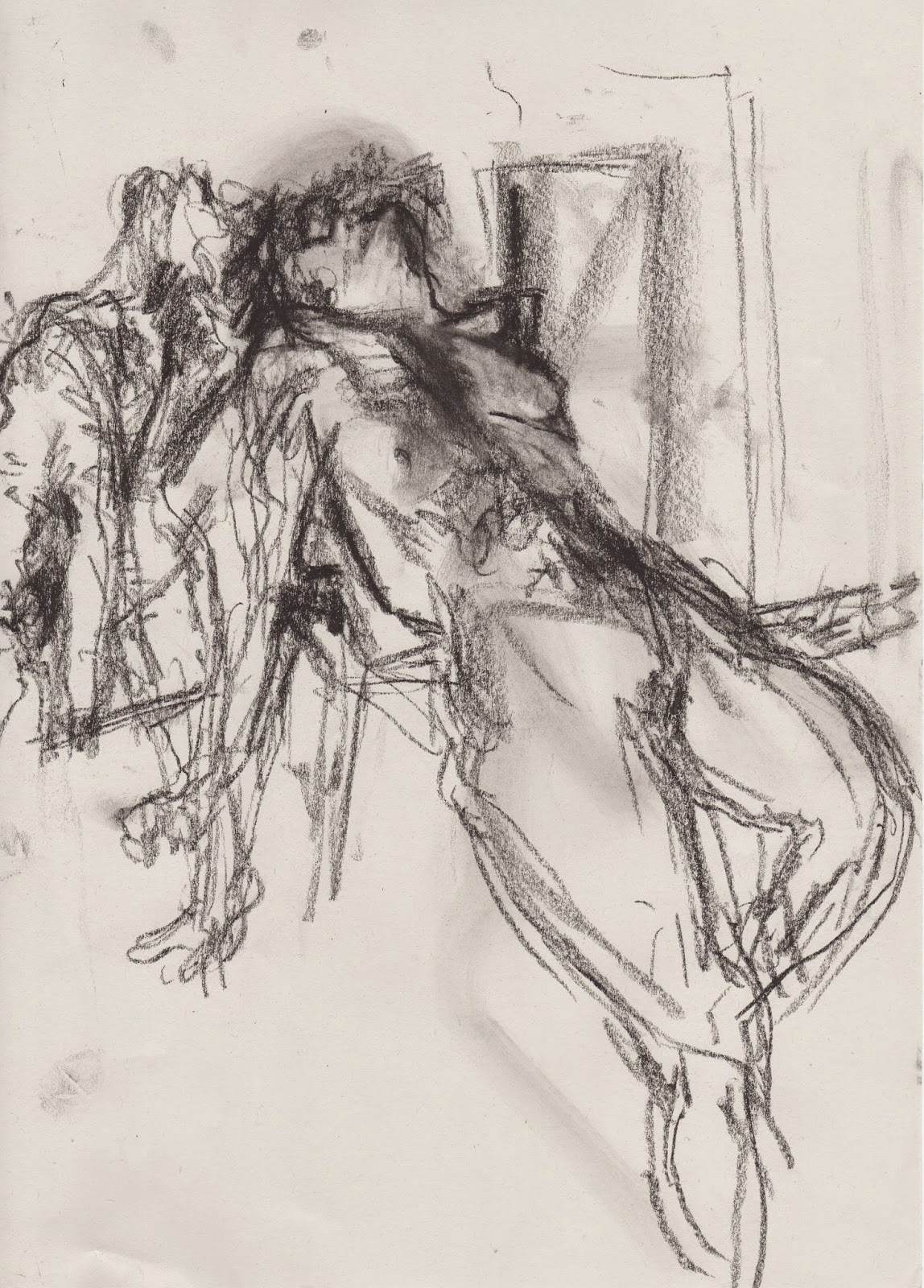
The format of my weekly life drawing group has changed. For one, there is no more tea. Sigh. because of this, the fixed timings are no longer fixed. After break we used to have two twenty minute poses. Now the break is ten minutes and at no particular time, so it's a little more fluid. Today the consensus was to do a series of the same three poses three times. Timings were 2, 5 and 15 minutes. Of course the poses weren't exactly the same. The top drawing is 6 x 6 and was a 15 minute pose. the two altered book pages (5 x 8) were each 5 minutes. The bottom drawing 4.5 x 8.5 was another 15 minute pose.
Tuesday, March 31, 2015
 |
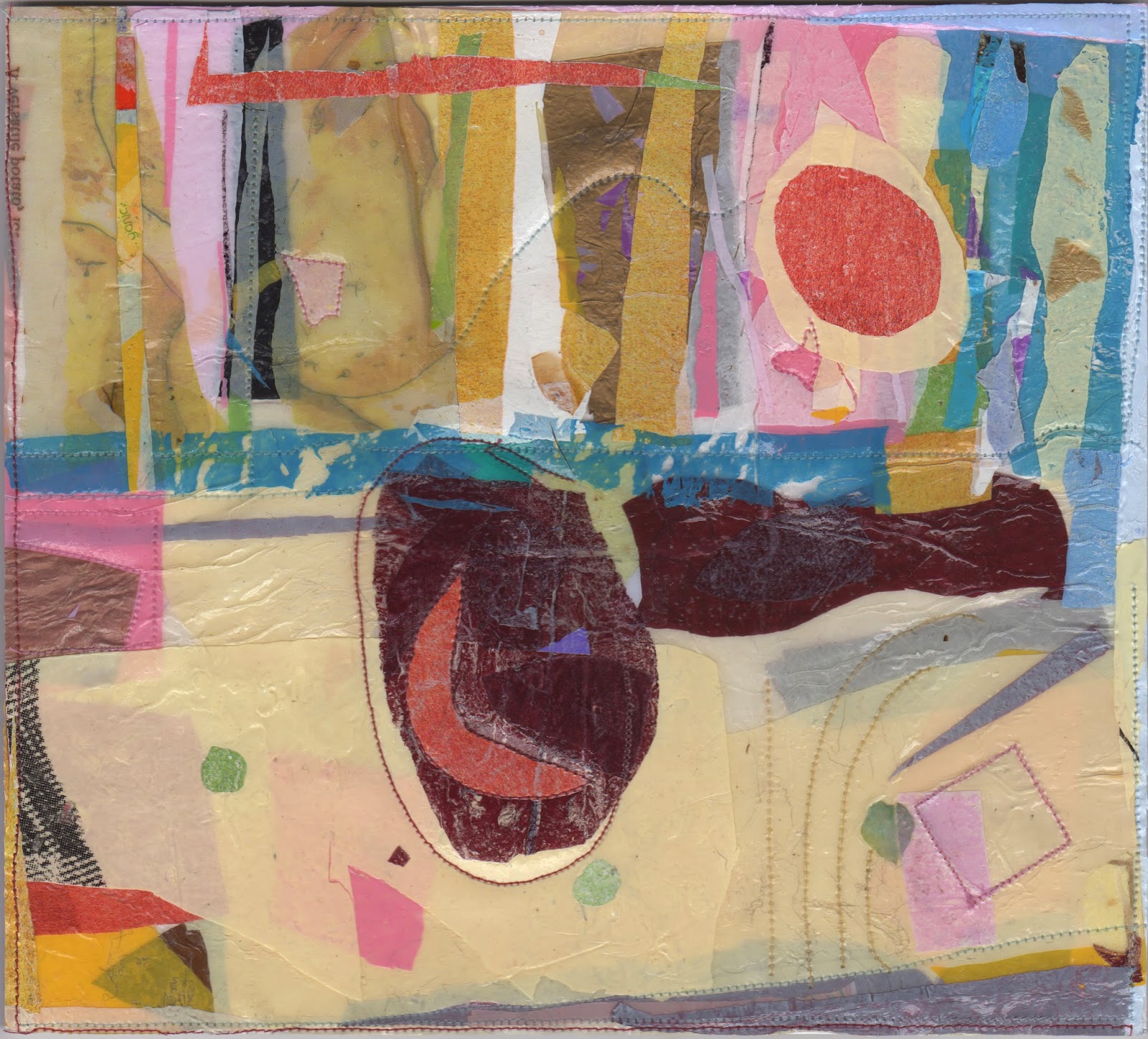
| Sun Trap (painted paper collage) 17 x 24 cm |
After visiting the Diebenkorn exhibit at the RA, I felt I wanted to work bigger in fused plastic. This has been problematic because pieces don't always want to lie flat and I am not sure about how well they will hang. I experimented with sewing and gluing them onto paper and flattening them under books but the movement was compromised. I was able to make some bigger work eventually. This piece is glued onto foam board.
 |
| Solar Yoga (Fused Plastic Collage) 23 x 26 cm |
Thursday, March 5, 2015
Freedom and colour studies
Can you explain why these playful pages are so effortlessly, honestly exhuberant and why (and how) I can believe in them?
What do you want to say and how do you say it with paint?
 |
| Orange Bouquet |
 |
| Millstone |
 |
| Night at Nayland Farm |
 |
| Sue |
 |
| Looking Down on Macabre colour |
I find that for some reason when I paint I forget who I am and what I want to say. As I am painting any one canvas I think I know but when you look at them side by side it's clear I am floundering! I am more sensitive about painting; I care what people think more than I do when I draw, make a print, fuse some plastic or make a book. As a result, when I paint I don't think I create a body of work that is identifiable or consistent. I know it's there, but I can't access it day in day out. It's curious.
Some of my recent life drawings
 |
| Emily |
 |
| Marilyn |
 |
| Emily |
 |
| Marilyn |
 |
| Marilyn |
 |
| Marilyn |
 |
| Sue |
I went to a gallery recently to show my work and although they were really positive about some of my work, the person I spoke with felt that my life drawings were too 'traditional'.
My wonderful life drawing class is a mix of different kinds of artists, former draughtsman, artists who simply love to draw and abstract painters work alongside each other. When we draw, there are gasps and sighs and we all talk about the shapes.
Labels:
Emily,
life drawing,
Marilyn,
pastel on paper.,
Sue
Thursday, January 15, 2015
More light studies
 |
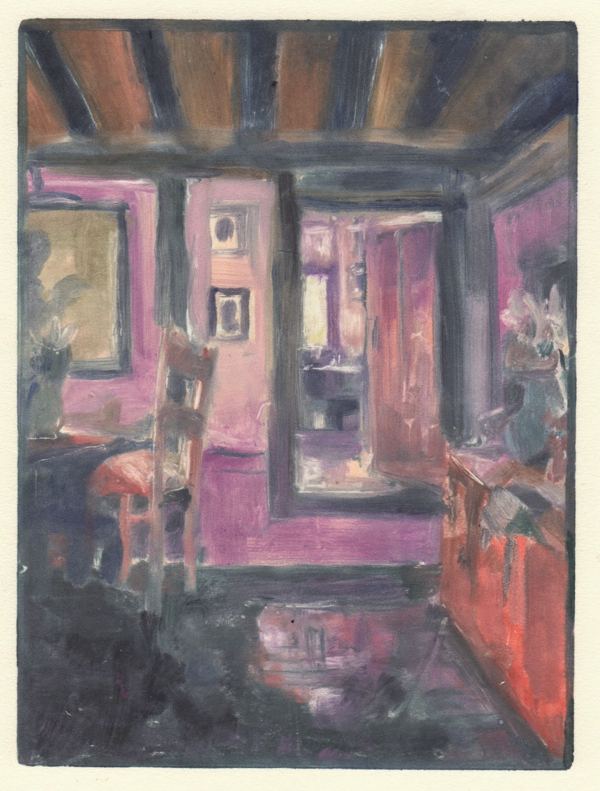
| Light from Dairy, monotype: Akua Itaglio on paper 6 x 8" |
 |
| Mother and Sister of the Artist by Edouard Vuillard, 1892 |
 |
| Light From Above Piano, monotype: Akua Itaglio on paper 6 x 8" |
This print was actually made before the one above. You can see that I was little more faithful to Vuillard's pallette. I have painted and drawn this view repeatedly in the past. This medium seems to solve it more for me.
 |
| Woman in Blue, by Edouard Vuillard, 1893 |
I include this last drawing to show that as I said in an earlier post there are many prints that I pull back the blanket to in disappointment.
 |
| Light from Upstairs Window, monotype: Akua Itaglio on paper 6 x 8" |
 |
| Light from Window upstairs, soft pastel over 1st pull monoprint |
Subscribe to:
Comments (Atom)


