It's one of those reassuring January things when the flower of the hellebore appears. As you know, it's been busy around Nayland Farm and frankly amazing that I have mananged to do anything let alone a little painting on book pages. I wedged myself in the corner of the studio while Figgy and Jonny made monotypes for the week they were home. Over a few days, before the hellebore drooped and closed I worked in spurts. I made a conscious decision not to have any pattern and wanted a feeling of white so chose my objects with that objective. I would have painted on (but needed to teach Figgy to frame her own gorgeous monotypes) and I still could but there is a certain freshness that I suspect I will just leave. But what do you think, should I crop it to the edge of the painting or not, or should I crop it into a square?
Meanwhile, I returned to London on Friday to visit John Dobbs (WONDERFUL) and to draw, or in this case make monotypes with the NEAC drawing school. Kate sat for the full two hours and I made two prints and two ghosts.Monday, January 22, 2018
Wednesday, January 17, 2018
Colour and nightlight
I've been talking about nightlight and still yearn to make more night light drawings, but drawing at night is difficult if you don't have your head torch… Towards the end of 2017, while in London, I made a few evening drawings before going to a drawing session at the Mall. The cold, the fading light and just standing outside in the dark didn't have much to recommend it. But I was still mezmorized by the light and the colour, so took a few pictures to remind me, with the hope of using them to trigger a memory to paint from later.
A few times a week I promise myself that I will get in a car and draw with my head torch. It's still just been too busy, so to date it's a wish not yet realised. Yesterday I found the images I'd taken on my phone and did some quick studies in my Silent Traveller in London altered book, to see where that idea went.
Keeping on the theme of light and lack of it, this afternoon I went to Carol's to draw David. Carol has a studio at the end of her garden and the light was a beautiful pink while it lasted. I thought about James Bland and his red ear and looked for the highest and lowest key colours. I didn't erase anything and feel the resulting drawing (above) shows that struggle a bit.
As the session wore on the light disappeared. At one point we really only had a silhouette of David to work from. I was working in charcoal, trying to establish the darks and the darkers. Then we switched the light on . The drawing is about the tension of light, colour and value, (and I think I lost).
Tuesday, January 16, 2018
Urban and Rural Landscapes
![]() |
Wet Field Combs, pastel on paper, 16 x16 cm |
I sat in the landrover today and twisted myself into a position where I could see the view from the verge. There are signs all over that say CONSERVATION Keep off. This is new. If I'd had my plein air easel I would have been able to position myself and to stand. As it was I was cramped but warm and protected from the howling wind.
The clouds raged across the sky and sometimes it was white and blue and sometimes it seemed to threaten rain and go all grey. I caught it somewhere between the two. The unploughed field looked brown and red and blue and purple and yellow and then on the verge in front, there should have been grass but it was puddling and muddy in the middle. I kept thinking about Barbara Rae.
My mother loves the trees when they are leafless. Patrick and Juliet can identify them by shape. I just find them a little sad. I met someone at a preview in Colchester, not long ago, who told me he only paints unbeautiful things. Today when I was drawing in the car I felt the view was so beautiful that no matter what, I was on the verge of schmaltz. Perhaps beauty is the curse of the rural landscape for this slightly cynical New Yorker?
![]() |
Rainy Museum Day, pastel on altered book page, 9 x 12.5 cm |
I hate the idea of drawing buildings. Perspective makes me a little sick, because I don't know any and all those angles overwhelm me. I could read a book and learn but that would be at odds with my teaching, so I struggle… The thing is, I love breaking the paper up with angles so it's a bit of a catch 22. And I guess city drawing can be less (on the surface) beautiful so you need to really commune with it to find something to say!
Labels:
beauty,
Combs,
London,
on paper,
pastel on altered book page,
Rebecca. Moss Guyver,
rural,
urban
Monday, January 15, 2018
Line,colour and tone - quick studies at Sudbury Life Drawing
![]() |
Emily, pastel on altered book page, 9.5 x 14 cm |
![]() |
Emily, charcoal on cartridge, 26 x 29cm |
![]() |
Emily, pastel on paper,12.5 x 21cm |
![]() |
Emily, pastel on paper, 16 x 16cm |
![]() |
Emily, pastel on altered book page, 9.5 x 14 cm |
Labels:
Emily,
life drawing,
pastel on paper,
Rebecca Moss Guyver
Saturday, January 13, 2018
New Year, new defiant start - NEAC Drawing School
I ran into Mick from The NEAC drawing school at the Life Room exhibition at the RA. That bit of serendipity felt like a great beginning to my January in London - such a small town that I run into one of the only people I know! I'd already seen the Drawing Year exhibition at the royal Drawing School so I mooched around dragging my bag of tricks, a new bag of tricks until 5:40, having a tea here and happening upon an exhibit there.
When I arrived at the Mall Galleries studio space at the back, ready to begin my second six months as a Drawing Scholar I felt puffed up and determined to BE MYSELF and produce work that isn't just jumping through hoops. NO, that's not fair… It has not been jumping through hoops, it has been back to art school and art school is about being open enough to do some things that you don't succeed at so well, trying things and gaining new perspectives and skills, to see where it takes you - to grow. I've been doing that and it's been great, but over the break I realised that I also need to apply this learning to 'my practice' so I don't just produce work that doesn't feel like me in the sessions and end up hating what I show at the exhibition in June.
Mick was wonderfully receptive and in the two hour session I made two prints and printed two ghosts. I brought my pastels but was so excited about the journey of the line and the pentimento that direct monotypes bring to life drawing that I never got there. Perhaps next week!
Thursday, January 11, 2018
Looking again - why I like after studies
![]() |
Waiting for the Party, Oil on prepared book page, 10 x 15 cm, |
The image above is a little darker than the real thing. It is another grey day here in Suffolk and I photographed a few minutes ago when the day is getting darker. Still it gives the flavour of the slightly different arrangement point of view, shape of paper (not canvas this time). The still life extension to the front. The apple sits inside the spoon with the blue handle. When I came to paint, holding up my frame deciding on my point of view, I realised it would be better to omit that stuff in the front. I was moving in and cropping out.
I like after studies because problems have been solved. But this time I made new problems in version two which were equally difficult to deal with. Luckily this little painting is small - 10 x 15 cm painted on a prepared book page. But small is difficult in a different way.
I traded a simple orangey cloth for some of the pattern of the previous, but it was difficult to keep the colour from becoming insipid. I painted and painted until it was believable. Each shift somewhere else meant I had to go back to it. That red vase is a devil! I picked two of them up a few days after Christmas. when I looked at them I knew their modern form would confound me but why not? My mum chivied me on. The pom poms make me think of a mexican hacienda.
Thiking about it, what I like about after studies is the same thing you like about a sequel - the opportunity to connect with the subject in a different way so that it lives again in a new guise.
Wednesday, January 10, 2018
Christmas Relics
This January once everyone was off to their own homes, I decided to find a selection of objects that evoked this Christmas. Every November I try to say something about the coming of Christmas for my Christmas card. This year I wanted to punctuate the holiday season by paying tribute to the colours we associate with Christmas while developing my theme of objects in conversation at a moment in time. I used mostly newly acquired Christmas gifts and focused onthe colour RED.
I am trying to synthesise some of my NEAC artist advice. I keep hearing this voice saying 'What are you trying to say'? I ask myself, 'is it consistent'? Is the painting - brush strokes, areas of detail, focus interesting enough but tied together and convincing. Am I using enough paint. should I glaze or not glaze. Do Ibegin by drawing or by blocking colours next to each other. It's a minefield of my own making!
I nearly quit many times and stopped when I felt I had the balance right on most levels. Red continues to be a difficult colour to use and why do I always make such patterned and complex set ups?
Sunday, January 7, 2018
A New Year in Intense Colour
![]() |
Yellow Figurine on Orange, pastel on paper, 16.5 x 16.5 cm |
HAPPY NEW YEAR
Monday, December 11, 2017
Looking for the meaning
I attended a brilliant life drawing workshop with John Dobbs on saturday at Heatherley's Art School. John is interested in capturing the essence of the subject . You can see his work here: http://www.johndobbs.net . The day began with a series of really quick sketches (1 minute timed) where we tried to work intuitively to find a way to indicate what the key element in the subject and pose were. Richard held a rope, crouched, stretched and I used scrap paper and a stick of vine charcoal to indicate direction. weight, light.
John showed us some of the artists he thinks do what he is interested in best including Park, Lobdell, William Theophilus Brown, Rembrant - there were about ten.
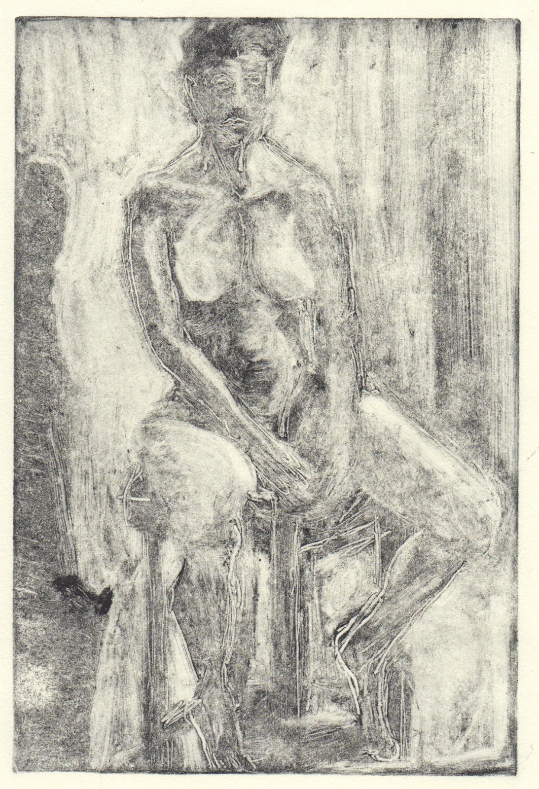
John wasn't so interested in whether the drawing was accurate but more whether we could say something about the subject that was meaningful. He had us do an exercise that I won't share as I think doing it is the important thing but it helped me to experience the difference between 'copying' and 'observational drawing'.
The above drawing was the penultimate and longer than anything previously, nearly an hour. My goal was to get Richard to READ THE BOOK and to show the mood through his posture. I like the pieces of the drawings below as I believe them too.
At Sudbury life drawing I decided I needed a colour fix so only used pastel for the two hours. What I wanted to address was combining light and colour more effectively. One of the stand out messages in the workshops has been YOU NEED MORE DARKS. The last drawing, the one at the top may be more effective although Pete's left thigh doesn't do what it should. I like the gesture of the three last drawings.
I was still a little sick when I wen to my last NEAC drawing school session with Mick Kirkbride on the 24th of November. It had been a long day with visits to the Modigliani and lunch at the RSA with some family friends and Patrick. It's interesting that with a big piece of paper and an hour, I run out of time now. It's a case of constantly adjusting. I know I need to look more, though.
![]() |
Last drawing with John Dobbs |
John Dobbs with former scholar |
And Carol Webb invited me back to a daytime portrait session. She's had models who can only sit in the evening this term. David Stone, an artist: http://davidstone-art.co.uk, sat for us for a few hours last Wednesday. I had planned to paint but in the mad rush from refugees and school meeting I forgot half my supplies so drew instead.
Thursday, December 7, 2017
Exhibition round-up
It's been a week of exhibitions with the latest in Bermondsey, London. Not so long ago I responded to an open call for The Concept Space's Winter Salon. http://www.theconceptspace.org/?exhibition=winter-salon-power-play and was delighted to be selected. It was the private view on Tuesday so Patrick and I travelled down, arriving first! I had bought advance tickets and for some reason our return ticket was 8:30, so we stayed for an hour and a half but missed KB Stowe's little talk and the performance art. https://www.instagram.com/tconceptspace1/ I met lots of people, including Robert Fitzmaurice whose work was between my two pieces. It was remarkable how well the hang worked.
The miniprint exhibition was in Halesworth over the weekend, but I wasn't able to visit it this time. Lesley has found a venue in Bungay, so there is one more chance to see the work before the spring. The private view will be 6pm on the 15th.
But before the Miniprint, it's Colchester Art Society's Winter Exhibition at the Minories. I hope I have some work in that (not sure yet) but will be going along to the PV tomorrow (6pm) anyway.
Tuesday, November 21, 2017
Lillias, Andrew and the NEAC Drawing School
We couldn't have had more different models over the past two sessions and my approach to drawing them was quite different too. Andrew struck a standing pose and we all wondered if he could hold it for the hour. He was defiant and turned out to manage it with ease. I only noticed his thumb moving back and forth, which I assume was a coping strategy for what must have needed intense concentration. I wish I knew anatomy as Andrew was an anatomical study, for sure.
Andrew's second pose was kneeling but the structure of what I saw and drew of his position was similar without being exactly the same. I was looking down on him a little bit in the second pose. What was fun about drawing Andrew was that he had so much attitude and it was that I wanted to hone in on.
Lillias couldn't have been more natural. Paul was painting a portrait so she stayed in the pose for the whole 1 hr 45 mins. As I look at it, I think that if I'd had time to really look (which is what I should be doing during the tea break) I would have realised that defining the room probably gets in the way of our interaction with the subject. Lillias had some bright light on her cheek that I failed to carve adequately as well.
I intended to move around and do a series of drawings but it's so easy to get carried away.
![]() |
Add caption |
Labels:
A1,
Andrew,
charcoal on paper,
Lillias,
NEAC Drawing School
Thursday, November 16, 2017
Use more paint
I would still be painting but it was so dark without articfical light at three that I had to abandon it. Not only is there a very dark shadow on the white vase, I can't see the colours I'm mixing. annoyingly, I'm not sure when I will be able to return to this. In London tomorrow, at a Colchester Art Society Lunch Saturday and then the inevitable massive clean-up that precedes a visit from friends coming all the way from America.
Subscribe to:
Posts (Atom)