Thursday, November 3, 2016

Objects or Colour? How Do We Connect to Imagery?

Haw Red Apples 18x18 cm pastel on paper

It's the last chance to choose an image for this year's holiday card, so today's challenge was to produce something that might be suitable. Last year I bought a poinsettia, yesterday I picked up the reddest apples I'd ever seen, on my walk through the orchard. So this year I thought I'd try a colour study still life.  As I selected the patterns and colours and then my pastels, I couldn't help over-egging the batter.  For me, colour is more important than objects in suggesting the joy and excess of December.

For the ground, I cut a piece of Fabriano to about 20x 20 cm.  I mixed some pigment and clear gesso in a shimmering raspberry square. I allowed myself more pastels than usual.  The really loose phase of the drawing was strong and then I went through  a disappointing phase until I ended with this.

Wednesday, October 26, 2016

The Time of Year for Dahlia Love

Orchid and Oriental
I've been getting work ready for a few upcoming group shows.  The Sentinel wanted pastel still lifes and it's that time of year when there isn't so much left in the garden besides the dahlias. This year my zinnias and roses have lasted until now too so there is some variety to the shapes. And for once I don't have to make excuses for grabbing the magenta when I choose my pastels.

Pinks and Greens
I'm trying to make my pastels a standard size, for framing purposes, but clearly mis-measured the top drawing.  The bottom is 16x16cm. Another observation is while the pastel spread on the top drawing in a buttery manner; I found the pastels I chose, or perhaps the pastel ground I chose in the bottom would only let me apply scratchy marks. I will always be a beginner!

Sunday, October 23, 2016

More Mini Prints

Weather Over Pear
Today I wanted to try making a few more prints.  My Akua Intaglio was a mess.  I am not the tidiest painter with ink and rarely wash my brush adequately because it is that little bit more difficult than swilling it in water.  I keep my inks in coasters and stack them to store them. Just setting them up makes my hands filthy.

I decided to refill and straighten the inks out with a palette knife before begining.  It took me over an  hour to complete this bit of housekeeping but during the process I realised a few things.  The inks had air dried to such an extent that they were much more like oil ink and had been behaving that way more… once they were cleaned up they were runnier and don't hold the line as well.  OOPS. The other thing I learned/rediscovered is that  I can mix bespoke colours using Akua pigment with blending oil, so I made a few colours. The blue int he sky is now a sky blue ready to use.
Chartreuse Light on Blue
What's nice about working this small is it is difficult to spend more than a few hours on a print, so in a day I had made two prints. Among other things, I am aiming to produce eight mini prints for my.  I'm not sure which print to send to Lesley at Red Dot to replace the print that sold, but I'm reconfiguring spaces on a small scale.

Thursday, October 20, 2016

What sticks in your mind

Jerusalem Artichoke & Opaline
I spend a little time most days on Pinterest.  I love finding new images and seeing how people resolve colour, light, composition, paint and drawing issues.  Sometimes an image sticks in my head for a long time.  Visual things sticking in my mind used to come from  the landscape, what I saw in my immediate environment, photos, paintings in galleries and museums.  Now there is so much more to look at and make sense of. I think I solve problems in the background for more of my day now. It's not that I am thinking about them, they are there in the betweenenss of my brain.

I have a deadline to get more work done so last night I went into the garden and cut two bouquets.  It was too dark to work then, but I looked at them and thought about a pinterest album I'd seen that morning of yellows.  I had filled the bouquet out with a few stems of jerusalem artichoke flowers. When I went to set something up to begin with, all of that stuff was stuck in my mind.  As I chose my colours Ivor Hitchens was tyhere helping.  Not really, obviously, but as I began working I thought of one of his bouquets.  The opaline vase is one of my flea market treasures.

Wednesday, October 19, 2016

a crazy quilt of colour

I came up with this way of making my cards a few years ago and now when I get low on cards, which has happened often recently, I get to make more. 

One of the 'stations' in my studio is my sewing machine.  Another 'station' is a temporary, very chaotic station, the plastic station.  I also need my printer and my computer. 

When I finish a series of cards (I often use a particular colour of thread per series), I put them in one of my vintage tins, ready to take to the next event.

Monday, October 17, 2016

Experiments with AKUA


Emily Looking left: monotype 10x15cm, Akua ink on zinc
Emily On the Stool monotype 10x15cm, Akua ink on zinc

First time back at life drawing for the season.  I arrived having forgotten my elevated drawing board so was stooping over the table. I had packed in ten minutes, throwing in a little of this and little of that.  I grabbed my traveling watercolour set at the last minute.

I had a big long table to myself; this is unusual, so I was able to spread out.  Sue organised Emily into ten minute poses and I decided that would be enough for some monotypes. I had forgotten my roller and I mixed greys with white and black for the first few.  They weren't very strong.  For the third print I decided to see what would happen if I used my watercolours with the AKUA ink. I diluted it with water and blending oil and painted it onto the plate, which I had rubbed release agent onto (leaving the ghost underneath). I mixed ink with watercolour, wiped areas away, used my fingers to dab. Logically it shouldn't have worked, but it did.

For, the final monotype of the day I worked only in black, but my palette was filthy and I seem to have picked up a bit of a pinky tint. By this point I was finding drawing backwards easier and someone in the class  had challenged me to put the whole body in the image.  Initially I wasn't all that interested in the pose, but the more I looked the more I saw.  This was almost a half hour pose and as sometimes happens, I seemed to channel Matisse.

Friday, October 14, 2016

Regrowth and Sky

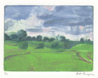
Regrowth and Sky 7.5 x 10cm monotype
What I have noticed since returning from Maine is the verdancy of the fields, the brighter green and the angry sky. A few days ago while walking Lyra I was caught in a a surprise shower.  You could see the rain off in the distance as I set off and it caught me while on the back side of the farm. The weather seems to move fast and I half-expected a rainbow. 

The good news is that I sold one of my mini prints at the East Anglian Mini Print Exhibition and Lesley  (the curator) from Red Dot will be moving it to a new space in Bury St Edmunds in November.  She wants a new print. 

Early this morning I prepared some new plates, I took the ones I'd made earlier in the summer to Maine and didn't bring them back… Preparing the plates entails cutting some of them to size and filing the sides.  After that I tried to approximate the feel of a walk with the October weather and the green that dominates as the wheat comes up in Akua Intaglio ink, drawing backwards, of course.