And then there's my sister with her zentangle beads too!
Saturday, November 5, 2016
Leftover scrap experiments and the funny bunch
Figgy has been making badges. You can see and buy them here: https://www.etsy.com/uk/shop/TheMineralFact?ref=shop_home_edit.
As you will know, my mum makes all sorts of textile wonders, including her gorgeous beads that I have been inspired by and drawn from many times. Remember the Turquoise Muse?
What with Christmas approaching and an open studio coming up, my fused plastic scraps have been haunting me. Yesterday I put some of them together to make badges!
Thursday, November 3, 2016
Objects or Colour? How Do We Connect to Imagery?
![]() |
Haw Red Apples 18x18 cm pastel on paper |
For the ground, I cut a piece of Fabriano to about 20x 20 cm. I mixed some pigment and clear gesso in a shimmering raspberry square. I allowed myself more pastels than usual. The really loose phase of the drawing was strong and then I went through a disappointing phase until I ended with this.
Wednesday, October 26, 2016
The Time of Year for Dahlia Love
![]() |
Orchid and Oriental |
![]() |
Pinks and Greens |
Sunday, October 23, 2016
More Mini Prints
![]() |
Weather Over Pear |
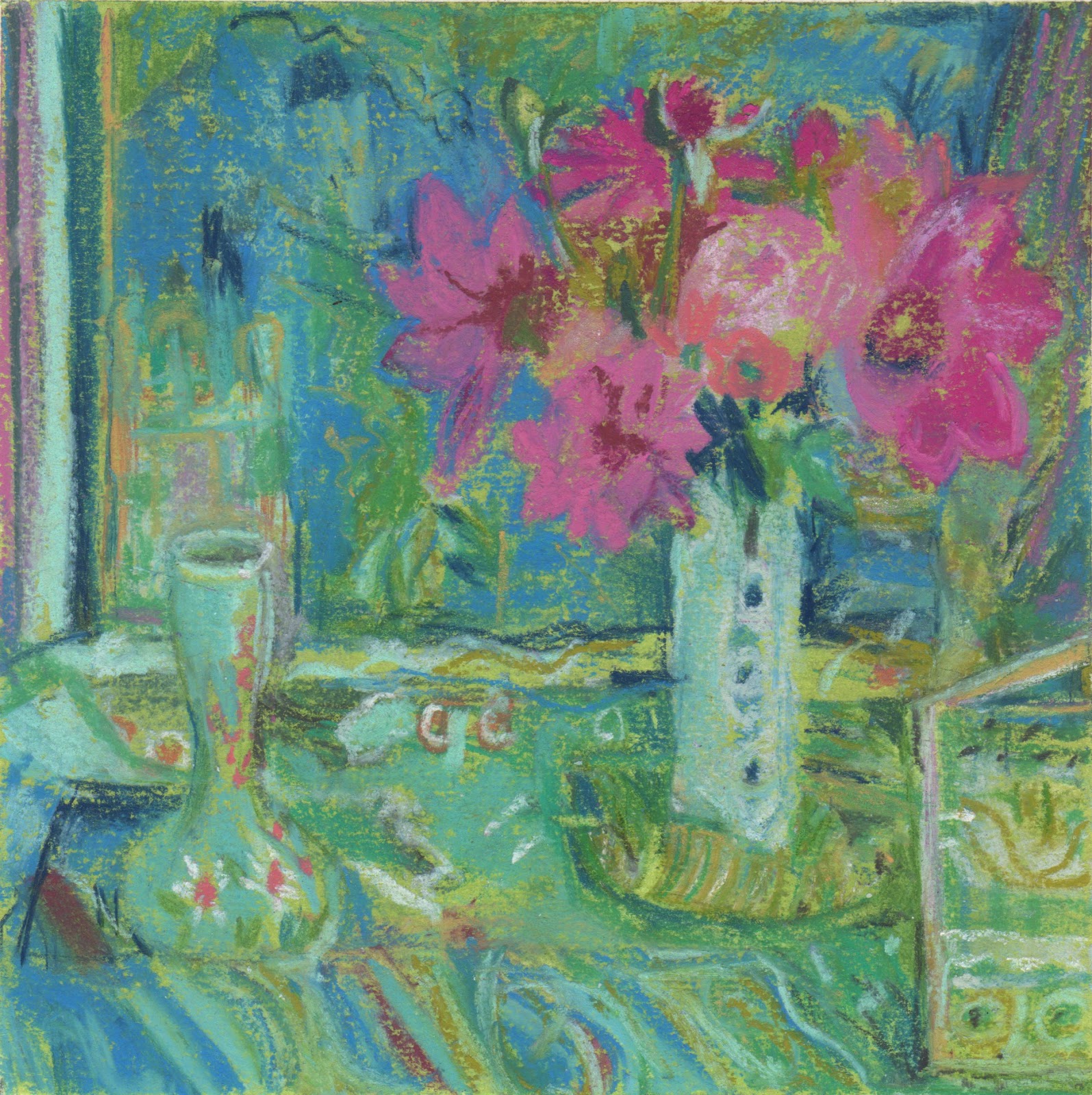
Today I wanted to try making a few more prints. My Akua Intaglio was a mess. I am not the tidiest painter with ink and rarely wash my brush adequately because it is that little bit more difficult than swilling it in water. I keep my inks in coasters and stack them to store them. Just setting them up makes my hands filthy.
I decided to refill and straighten the inks out with a palette knife before begining. It took me over an hour to complete this bit of housekeeping but during the process I realised a few things. The inks had air dried to such an extent that they were much more like oil ink and had been behaving that way more… once they were cleaned up they were runnier and don't hold the line as well. OOPS. The other thing I learned/rediscovered is that I can mix bespoke colours using Akua pigment with blending oil, so I made a few colours. The blue int he sky is now a sky blue ready to use.
![]() |
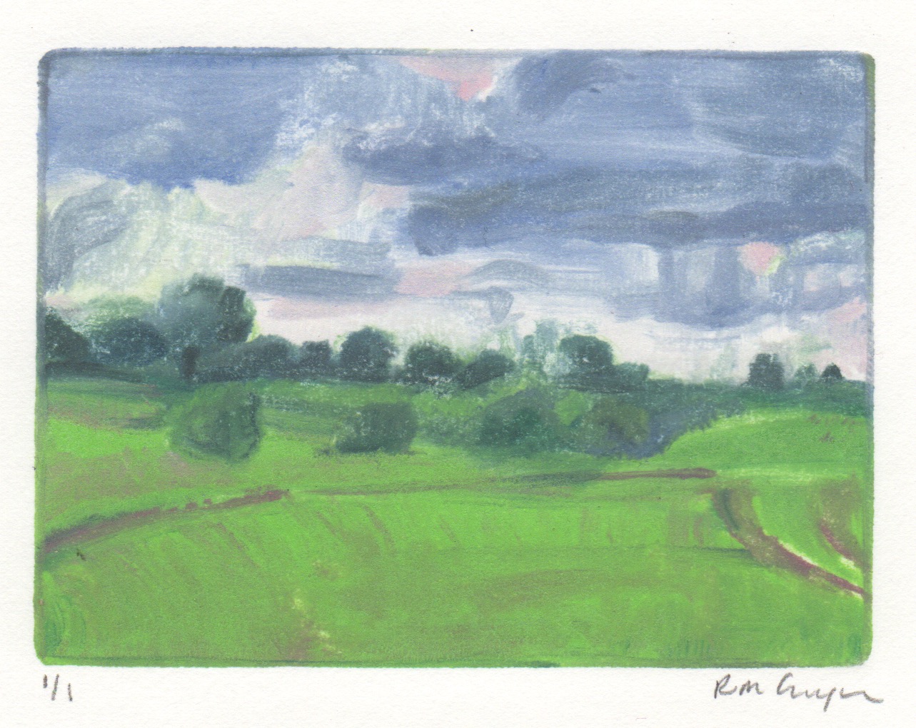
Chartreuse Light on Blue |
What's nice about working this small is it is difficult to spend more than a few hours on a print, so in a day I had made two prints. Among other things, I am aiming to produce eight mini prints for my. I'm not sure which print to send to Lesley at Red Dot to replace the print that sold, but I'm reconfiguring spaces on a small scale.
Thursday, October 20, 2016
What sticks in your mind
![]() |
Jerusalem Artichoke & Opaline |
I have a deadline to get more work done so last night I went into the garden and cut two bouquets. It was too dark to work then, but I looked at them and thought about a pinterest album I'd seen that morning of yellows. I had filled the bouquet out with a few stems of jerusalem artichoke flowers. When I went to set something up to begin with, all of that stuff was stuck in my mind. As I chose my colours Ivor Hitchens was tyhere helping. Not really, obviously, but as I began working I thought of one of his bouquets. The opaline vase is one of my flea market treasures.
Wednesday, October 19, 2016
a crazy quilt of colour
I came up with this way of making my cards a few years ago and now when I get low on cards, which has happened often recently, I get to make more.
One of the 'stations' in my studio is my sewing machine. Another 'station' is a temporary, very chaotic station, the plastic station. I also need my printer and my computer.
When I finish a series of cards (I often use a particular colour of thread per series), I put them in one of my vintage tins, ready to take to the next event.
Monday, October 17, 2016
Experiments with AKUA
![]() |
Emily Looking left: monotype 10x15cm, Akua ink on zinc |
![]() |
Emily On the Stool monotype 10x15cm, Akua ink on zinc |
I had a big long table to myself; this is unusual, so I was able to spread out. Sue organised Emily into ten minute poses and I decided that would be enough for some monotypes. I had forgotten my roller and I mixed greys with white and black for the first few. They weren't very strong. For the third print I decided to see what would happen if I used my watercolours with the AKUA ink. I diluted it with water and blending oil and painted it onto the plate, which I had rubbed release agent onto (leaving the ghost underneath). I mixed ink with watercolour, wiped areas away, used my fingers to dab. Logically it shouldn't have worked, but it did.
For, the final monotype of the day I worked only in black, but my palette was filthy and I seem to have picked up a bit of a pinky tint. By this point I was finding drawing backwards easier and someone in the class had challenged me to put the whole body in the image. Initially I wasn't all that interested in the pose, but the more I looked the more I saw. This was almost a half hour pose and as sometimes happens, I seemed to channel Matisse.
Friday, October 14, 2016
Regrowth and Sky
![]() |
Regrowth and Sky 7.5 x 10cm monotype |
The good news is that I sold one of my mini prints at the East Anglian Mini Print Exhibition and Lesley (the curator) from Red Dot will be moving it to a new space in Bury St Edmunds in November. She wants a new print.
Early this morning I prepared some new plates, I took the ones I'd made earlier in the summer to Maine and didn't bring them back… Preparing the plates entails cutting some of them to size and filing the sides. After that I tried to approximate the feel of a walk with the October weather and the green that dominates as the wheat comes up in Akua Intaglio ink, drawing backwards, of course.
Thursday, October 13, 2016
How do you deal with the ROMANCE OF A MOMENT
![]() |
pastel over prepared book pages 20x20 cm |
When I draw with pastel, I rarely use photos, but when I do I convert them to black and white so I am not hindered by the actual colour that is in the photo. Yesterday afternoon, my first FREE moment in most of the past few months, I picked up the photo, chose some book pages I'd glued together and gessoed months before and painted the pages with a pale blue pastel ground. Once it had dried, I started to draw from the photo. The photo was rectangular so I cropped it in my mind before I began. What I didn't do was draw a black and white drawing first or convert the photo into a black and white image. I drew from a colour photo. As the drawing progressed I struggled with the usual problems, trying to keep it loose enough not to kill it, editing it, letting the drawing decide what colour needed adjusting.
I think the strength of the drawing is in the composition. I may try to use the drawing to paint from. I think an opaque jug on the left side would strengthen things. I like the way the text makes delicate lines through the white of the shirt. And then I ask myself, is it too romantic to be strong?
Thursday, October 6, 2016
Back to Base
![]() |
Dahlia Joy and Plates |
Today I finally had an afternoon and even though I also wanted to get out my plastic, catch up on mail art and PAINT, once I'd picked a late summer bouquet it was obvious it was time to make use of those pastels. THE JOY OF A LATE SUMMER BOUQUET…
There were seven of the the new pastels and I let myself use them all and then added a blue, a white and a chartreuse. The shapes and colours behind the bouquet are heightened and not necessarily as they were. I would have gone on drawing longer but the light in the scullery made it impossible; perhaps as a result this feels loose and playful.
Friday, September 16, 2016
The Palette of Autumn
![]() |
From Porch to Weibels, 4 3/4 x 5 1/2" pastel on book page |
I chose my colours after that, I ended up with 12 colours and white. I'm blending colours on the page more than I used to and I seem to be working a bit closer to the colours I see. You need yellow greens and reds at this time of year and that's fun to explore.
Thursday, September 15, 2016
Off Season Views
![]() |
From Kathy's Garden, Pastel on paper 6x6" |
When I was a child I came to Maine off season as well as in high season. In the winter, early spring and thanksgiving my friends and I would roam everywhere and the island felt like we owned it. Coming to Cranberry off season, (but only just) and as an adult I find that I am tempted to look for new views, from places I would usually need to ask permission to draw from.
Today I walked down to Kathy's and stood near her porch. It was hot and bright and clear, late afternoon and I chose eight colours. Again I wished I'd had another green but resisted. Donna came down to 'keep the garden alive' and at about 5pm I felt the betweenness come together and I walked home.
Wednesday, September 14, 2016
Finding the balance in shifting light
![]() |
From Deck to Barn, pastel on paper 6 x 6" |
On a sunny day, midday, the light paints lines across the grass as quickly as you can note them in pastel, and then they shift.
The way I work is to get an overall impression across the page and then to measure the betweenness over and over until the whole thing feels right. That shifting light is a real challenge. And which moment to try to freeze time is always the trick. I read somewhere that you could tell the weather by Constable's skies. My time and light is not nearly as exact and I am really interested in the colours and the shapes, not recording things accurately so much. My time is a shifting time.
Today I enjoyed the loose way I was seeing things. Before I began I decided to foreshorten the lawn as a compromise to composition. Perhaps letting go of the reality helped. I chose 7-8 colours and didn't add anything even though I longed for more diversity of green. Limiting helped me today.
SaveSave
Monday, September 12, 2016
![]() |
Under the Apple Tree 6 x 6" pastel on paper |
![]() |
Dahlia an Blue Hydrangea 6 x 6" pastel on paper |
![]() |
Light on Livingroom Floor 6 x 6" pastel on paper |
Thursday, September 1, 2016
The Art of Acadia
I was very excited to receive my copy of The Art of Acadia yesterday and have barely had time to peruse it, let alone read if from cover to cover, but I can't wait to do that! Carl and David Little have put together their map of artists who have brought Acadia (Maine) to life over the years and they included me and one of my drawings!
Monday, August 22, 2016
Mini Monotypes of Suffolk at the East Anglia Mini Print Exhibition
Delighted that all three of my mini prints were accepted into the East Anglia Mini Print Exhibition which will be held at the new Garage Gallery in Aldeburgh, Suffolk. The exhibition runs from 23-28 September at:
Lesley Jackson, from Red Dot art consultancy, is curating the exhibition and has a facebook page where you can see more about it here: https://www.facebook.com/eastanglia.miniprint and a website here: http://www.reddotartconsultancy.co.uk/east-anglia-mini-print
I think the monotype above will be my mini print for the browser, inspired by a recent visit to Wyken Vineyard.
The Garage Gallery
152 The High Street
Aldeburgh Suffolk
Opening Times
Fri 23 - 11am - 7pm Mon 26 - 11am - 5pm
Sat 24 - 11 am - 7pm Tues 27 - 11am - 5pm
Sun 25 - 11am - 4pm Wed 28 - 11am - 3pmLesley Jackson, from Red Dot art consultancy, is curating the exhibition and has a facebook page where you can see more about it here: https://www.facebook.com/eastanglia.miniprint and a website here: http://www.reddotartconsultancy.co.uk/east-anglia-mini-print
I think the monotype above will be my mini print for the browser, inspired by a recent visit to Wyken Vineyard.
Saturday, August 20, 2016
Lemon and Pomegranate before the rain
![]() |
Lemon and Pomegranate 24x24cm |
I gessoed a 25 x 25cm piece of Fabriano on both sides so it would lie flat when I painted a pastel ground over it. I used a pinky tint. The objects were selected and placed in the way I work when I am collaging abstractly, thinking purely of objects as blocks of colour. I worked from what I saw but I also tried to listen to the image that was appearing. The left side is not as I saw it but what I think the painting needed. I kept feeling as if I were tightening up and was disappointed that I wasn't responding in the way I had hoped… I am taken by the work of John Bokor at the moment: http://kingstreetgallery.com.au/artists/john-bokor/ I am sharing the studio at the moment with our daughter and her friend and I wanted to be painting (where I think I can be a bit freer) but opted to draw instead because it takes less space, etc. Today I found I needed to describe accurately as well as to move around plutting colour down. That's usually what happens when I haven't been working in a while. In the end I thought Gillian Ayres meets Jane Freilicher, or something.
SaveSave
SaveSave
Subscribe to:
Posts (Atom)