Showing posts with label Rebecca Moss Guyver. Show all posts

Wednesday, October 31, 2018

Opened Books


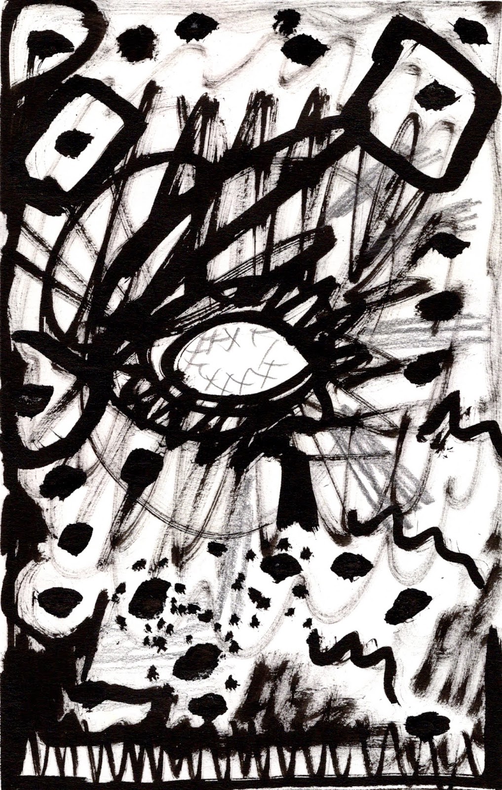
Touched with Poetry, opened book, pastel on prepared book pages

I'm not sure what drives me to glue the pages of books together and then to draw on them but for the past few years that has been something that I have loved to do. Mostly I use the title as a theme and the glue pages together, gesso them and use a tinted ground so I can use it as a sketchbook.  I think doing this narrows the parameters of what I am looking at, and I love having an artifact that says something more than the pieces. Lately I have been trying to make pieces on the book pages that stand alone.

The most interesting part of this project may be that in some cases I have worked from drawings instead of from life which is something I find problematic.  Maybe it's the playful nature of the book surface, even if it takes a long time to create,  that helps me to 'let go?' 

The top pages are what I might do in an altered sketchbook, two drawings side by side that are related and work together (for me). The bottom image is a vista, a drawing made from drawings and photos taken while climbing a mountain in the lake district. 

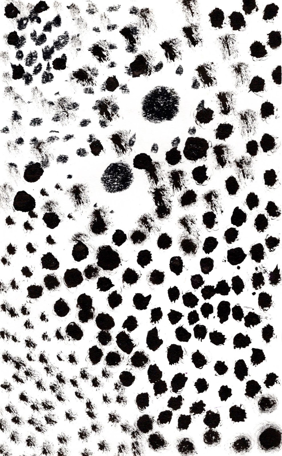
I am trying to decide what to submit for the pastel society annual show.  I am feeling poor so will only choose a couple this year, entry is £18 per item! I can't make my mind up about whether to choose what  I do or the other thing I do… I will find it hard to sleep tonight even though whatever I do is bound to be not quite the right thing for the group of people in the room who select.

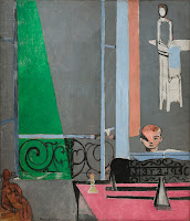
Fairfield and her Friends, opened book, pastel on prepared book pages

Tuesday, October 16, 2018

One More Summer

One More Summer, altered book pages with pastel, 19 x 27 cm
As I've kept reading Contemporary Drawing, I have been preparing surfaces to work on. I prepared about twenty panels with rabbit skin glue and gesso. I prepared book pages. I have worked bigger, smaller, roughe,r smoother. I love reading alongside working as I think a little more about choices I make in light of the text. 

In this, I glued pages together in a book I began altering ten years ago. It was no longer relevant and I didn't feel I needed to preserve the pages any longer.  I could imagine the name and some of the words on the page in a double page spread - it could be something relevant now, something intentional that would use the surface to say something more. I went through my sketchbooks and found a drawing that felt like the title then I found some photos from the area to change the composition and choose some specifics from.   The original drawing is vertical. I know this scene.  It is a windy day and the summer is ebbing so I was looking at the pastel and making choices from my memory mostly.

Thursday, October 11, 2018

Using the Colour of Autumn for Seasons' Greetings

Fried Green Tomatoes, pastel on paper, 16.5 x 16.5 cm,October 2018
It's that time of year again when I need to send an image off for a christmas card. I had an idea to use red foliage but on walking around the property, discovered that we don't really have any.  I toyed with the idea of buying one of those bushes that turns flame red at this time of year...  I could plant it, I thought (after I gave it a haircut), but that seemed silly.  I  wondered about knocking on a neighbours door with my pruning shears at the ready, but that felt like procrastination. Instead  I gathered what we had and thought about how the shapes could create a different kind of arrangement. In the end I couldn't resist picking one of my roses, a daisy and a dahlia too. It was a confusing mish mash  that took more focus than ever to untangle.

I made a few changes to this image but it was too dark to photograph the final product, but you get the idea.

Wednesday, October 10, 2018

Materials and surface

pastel on board 54 x 34 cm, Category Four, October 10, 2018


After what felt like a busy week, making Pauline's book cover, going to London twice and having a friend (and her mother) who I haven't seen in 30 years visit, everything was a bit on top of me.  To avoid feeling hysterical, or paralysed I started a weekly habit of thinking about what I need to do over the week and spent my first free evening making a book to put those lists in. Ah, the art of distraction!

After Charles' class, one of the things on my list was to read ( or probably re-read) a book on contemporary drawing my mother bought for me or our daughter. 

Much of what Charles said or hinted at or  maybe what I was thinking about as I went through his exercises is the focus of the book. I began taking notes…


Contemporary drawing:
Margaret Davidson, 2011

1.    ‘What the surface is determines the nature of the mark. Furthermore, a focus on both the surface and the mark and the relationship between the two is one of the hallmarks of contemporary drawing, and one of the most fundamental abstract issues drawing artists deal with.’ p 10
2.    ‘One distinguishing feature of contemporary drawing is the choice being made by some artists of the source of the mark-making.  Some artists let natural forces produce, or help produce their drawing marks.  Others look for cultural influences to map out or even control their mark-making. Many combine those two factors into a third realm of mark-making wherein they set up the parameters but cannot foresee the outcome… (these) contemporary choices add a significant layer of meaning to the drawings.’ P 10
3.    ‘The relationship between space and surface is a key thing, as well as the artists’ intentions with illusion and reality.’ P 10
4.    ‘Composition is a structure of one kind or another within which artists present their imagery and clarify their ideas.’  P. 10
5.    Scale – 3 points of view:‘how the scale relates to the artist, how the scale relates to the mark (which has to be quite different, depending on the size of the drawing), and how the scale relates to the viewer of the art, upon whom the impact is, maybe, the greatest.’ P. 11
6.    ‘the concept of materials (and tools)’ p. 11
7.    ‘some artists today are crossing media boundaries, making drawings that are also sculptures… if you find that following the direction the art is taking you means going outside the boundaries, well do it.  In the end, the boundaries don’t matter.’ P. 11
8.    Intentionality:  ‘must be learned, and then practiced on one’s own art, and when looking at other art.’ P. 11


So today when I began drawing, all of that was in my mind. I went through the usual stages of feeling overwhelmed, sick, disgusted and then slowly found my bearings. I think the image here is a little greyer than it is in the flesh. 

At one point when I thought it was garish and all was lost, I looked at Matisse for answers.  Seeing his riot of colour helped calm my nerves…


Below is my experiment using pigment mixed with pva and methyl cellulose in an altered book. I liked the freshness and it feels like the pigment will stick to the page!

Monday, October 8, 2018

Outcomes from Charles Williams' Workshop

The Human Stain I

Charles Williams' class was about drawing and thinking about drawing.  Why have people made the art they have and what role does drawing play in the paintings they make?  As you will recall, this is my biggest question! 

Charles went at the issue by showing us slides of artists who have different sets of values when they make their art. Charles described his own training and compared that with other artists and how that context can be a lens through which to look at their work.  

At the Royal Academy, Charles was taught to draw tonally. Our first exercise was to use only tone (no lines at all) to hone our perception of two or three ping pong balls on a surface.  My surface was a folded paper box on top of a stand. We had quite a long time, about 45 minutes, for this. I was working in an A4 sketchbook. I masked the edges and worked right up to them.  Although I was told not to focus on the composition I just couldn't help myself! This was not meant to be expressive.  It was meant to be objective.  Of course I was most interested in the expressive moments but I worked to refine and reassess the shapes. I love working tonally.  I find it almost therapeutic.
tonal drawing - no line


Riot
Next we made quick drawings responding to words.  This was not meant to be an illustration of the words but something else.  I found there was a lot of talking going on in my head as I worked on this.  Although it was intuitive I was curious how you make something feel riotous, or hidden without a gimmick. I was exploring ways of making marks to say something without reproducing an image... We could use any material and I introduced colour with the word 'lover'. 
annhilation

Lovers


Boundaries

Examination
The next reductive task was to use only dots to respond to the subsequent set of words. Drawing is always thoughtful but I found these exercises even more so. I don't like rules and I kept thinking that using recognisable forms might enhance the work because in using one strategy I felt as if one hand was tied behind my back, but I followed Charles' rules
Aggression

Silent

Hidden
The Human Stain II - A1


'The Human Stain' was the final exercise and I made two drawings in the 45 minutes.  The first was small and in my book (at top).  Charles wanted me to make something bigger next. I interpreted this task as a working and re-working that left a trace of my journey, across the paper and through the day. I was thinking more about the vocabulary of mark making and how to exploit it to create interest.  I kept turning the paper around and I'm not sure which way it goes, probably in the bin.

Friday, September 28, 2018

Inspired by Objects and Garden

Partisan Day, pastel on board, 27 x 27 cm
I've been drawing in pastel regularly over the past few weeks, taking inspiration from the objects I find and what is growing in the garden. I have tried new corners of the studio to set things up and although I intend not to use flowers in every drawing it turns out they are w ay for me to put colours together that make sense that it's hard to do any other way.  There's also the thing of not wanting the flowers to die before I have captured them.

The image above began as a matching exercise: I decided I was going to begin with Matisse's colour scheme, colours I might not gravitate to myself. 
Henri Matisse, The Piano Lesson
I moved around looking for objects and colour to compose something that would have my sensibility and evoke the Matisse. 
Cold Incessant Rain, pastel on board, 27 x 27 cm

Wednesday Carboot, pastel on paper, 17 x 18 cm

Tangerine Zinnia and Tie, pastel on paper, 16 x 16 cm

Monday, September 24, 2018

Seeing the model through the material

ink and pastel on pastel ground on paper 16 x 16 cm
I was describing to my friend, Jo, today about how when I draw I feel I am struggling against the materials. It is as if through the struggle I make sense of what I am seeing. It seems like the material I use results in a different way of seeing the subject. 

Today at life drawing in Sudbury as I prepared my materials for a three hour session, I decided on ink and pastels.  Jason Bowyer held a workshop in the summer and I found mixing those materials was an exciting lens to look through.  I think tonally and about the shapes and as I work and layer marks, colours and tones on top.
ink and pastel on pastel ground on paper 16 x 16 cm

ink and pastel on pastel ground on paper 17 x 25 cm

ink and pastel on pastel ground on paper 16 x 16 cm

ink and pastel on pastel ground on paper 14 x 13 cm

On Friday I went back to the NEAC life drawing class with Mick Kirkbride.  I thought we would be working in one of the gallery spaces and so did Mick so when it was changed back tot he usual space which is smaller, we had a bit of a squeeze to fit and I opted to sit in a chair to help out. I was looking up at the model.  The lights had been taken down but I liked my view and the lighting was fine for me. I began in charcoal and moved onto pastel.


charcoal on paper 20 x 30 cm 
Mary, the booked model, had goofed and was not in the country so we had a stand-in model at the last second. Roberta had modeled years ago but had not modeled in ten years - she was fabulous on Friday. Someone said she was like a statue and that's why I decided to do the second drawing, from the same place in my London altered sketchbook: The Silent Traveller in London' on the page about statues.
Since making the scans below I have recalibrated my colour profile so the images below are not very good… Still they show monotypes made last week in life drawing where I struggle the most to amek the material become the model.
montype 10 x 20 cm


Thursday, September 20, 2018

Drawing on a Blustery Day

Curry Night, 27 x 27cm, pastel on card
I've been in a school this week; in the preparation phase I made an enormous mess.  Add that to the car full of untidy boxes (after three classes of children) and I spent the first few hours today cleaning up.  Before lunch I assembled a still life at the other end of the room from where I usually work, the end with more light.  It was darkish and windy today. I usually find it difficult to get going after I do a stint in a school.  I was determined not to let that happen today.

I decided to work on a piece of acid free mount board that I prepared by masking around an area of 27 x 27cm.  In the square, I did a few coats of pastel ground mixed with some pinky orange gouache. 

When it was time to name the piece I thought I'd try a new naming technique: using something from my day as a title, ignoring the image itself. It was curry night tonight.

As I was getting ready I wondered whether I should move all my tables to the other end of the studio so that I would have a bigger space with good light as the days get shorter and darker...

Thursday, September 13, 2018

Different sketchbooks for different motifs

For some reason I like to keep my sketchbooks of a theme.  Earlier this year I piloted a sketchbook where I put everything in time order.  It was interesting and I could find everything but somehow if everything that is thought of in a particular way stays together, even if they each inhabit a page and don't 'talk to each other', I just like it that way better.

Yesterday I put little pieces of yarn (colour coordinated) through my spiral sketchbooks to indicate if they were Maine, still life, life drawing/portrait or landscape. I was tired of pulling all the sketchbooks off the shelf to find the one I wanted to look through or work in. I should have been getting ready for the school workshop I am doing next week but hey ho.

When I went to maine this summer I made three altered sketchbooks.  The drawings here are from the one titled, 'The Friendly Road'.  I put the drawings about people and places in Maine in that one and carried it around with me wherever I went. The other two are: "Gardens" and "Lady with the Lamp". Gardens is self-explanatory and focued mostly on my mother's garden.  I put one still life in it and one in the Friendly Road.  Lady with the Lamp is about night light. Unfortunately I didn't have time to do much night drawing this summer.

It makes we wonder how other people use their sketchbooks. I asked the NEAC members I met.  For me my drawings are personal and immediate and fix time right then and there.  I am not so keen on thinking about the past, maybe that's why I like to organise them in some other way.


Monday, September 10, 2018

Domestic Bliss

Nectarine and Dahlia 15 x 17cm
So I am back in the studio! The garden is full of flowers and before I went to Maine i reorganised the place and can remember where I put everything! That means I can find my stuff and have the time to arrange things and draw them.  My objects speak about domestic bliss, perhaps? 

Life drawing group began again today so the morning was devoted to that but yesterday and today I made these two pastel drawings. I used some prepared paper that I found in a sketchbook and a box of Jaxell and Rembrandt pastels.  Nectarine and Dahlia was made after e next few weeks I hope to make a series of drawings with the aim that I will find a few to submit to the Pastel Society exhibition. 
Echinacea Autumn Tea 15 x 17cm

Wednesday, July 11, 2018

I even have a Brandy Toreador

Brandy Toreador Fiesta, 16 x 17cm, pastel on  paper, 
I didn't go to the carboot sale today, instead I put together some of my carboot sale spoils along with the first zinnias, nicotianas, daisies, carnations, and bachelor buttons.  When I painted with Alex Fowler and Tessa Coleman recently, Alex's technique of putting coloured paper to break up the spaces was something I thought I'd try at some point.  What a good trick, now I don't need to rely on the fabric I own.

The brandy toreador was one of someone's collection, hawked at the car boot.  It still has a little brandy to the glass figurine's knees. The book in the front is something I will alter one day; the embroidered shirt is something my mum brought back from Mexico and all the other things I've gathered here and there.

The drawing isn't very big and I worked on it all day so that thing where even when you erase and the colour doesn't want to adhere happened. Still I was pleased with the overall depth of colour and the way I created surfaces .  I had to change a plane because the reality was disturbing, though. 

** If you read my last post you might be wondering why I am back to pastels.  Actually I have been working in pastels all week but I guess I'm feeling a bit less determined to stop working the way I do, here and there, with this media and that because another person I respect (the husband of the other person who gave me advice) told me not to worry, to just keep drawing in whatever way I want to…

Wednesday, June 27, 2018

The Second Pull Isn't Always the Ghost


Back at Home, Monotype: Akua Intaglio on Heritage Paper, 6 x 8 inches
When there is something on the etching plate, even just a hint of something (like there was when I returned to this), I  find I am more patient.  Today's second pull is crisper than yesterday's ghostly first print. It is hot and yesterday the ink was drying as I worked  - today I rolled the release agent on to begin with so the ink moved better and I used more blending oil.

In a way the way that edges blend is what interests me most of the time in monotypes, There isn't much of that in this… I may have overcompensated for something that bugged me in yesterday's print - the fuzzy, dark middle of yesterday's print - I was careful to make things intentional (sharper) where two colours met. 

I'm not sure, does this feel more like an illustration than a print… I was thinking Fairfield Porter and Alex Katz as I worked today.

Tuesday, June 26, 2018

Based on Home

I'm back in the studio after two weeks going down to London almost every day. My computer is dying and I had a grey screen all last week. 

There are  few things I need to make work for, but I also have some ideas I want to test, lots of ideas. There has been so much input recently that I need to explore my own responses to things, and play.  Today and tomorrow I have set aside for monoprints - above is 6 x 8inches and the first stab at going back to my starting place, the combination of landscape/figure, inspired by my most recent studio visit.

Last week I visited Bridget Moore. Bridget was in my original group of people I really, really wanted to visit but it was tough to organise and it is not an understatement to say that it lived up to my expectations and was worth the wait.  You can see a little of her work here: https://www.newenglishartclub.co.uk/artists/bridget-moore-neac-rba-rws?art=101

Bridget was a generous visit, feeding me and then letting me look through her work myself and showing me piece after piece, and explaining the context. I saw her gouache plate, her tubes and some absolutely exquisite paintings and drawings. We talked about using memory, drawings and old photos, something I used to do but have lost the confidence to do, these days. We talked about that and she is a role model for working that way.

What happened when I got home is that the things that I look at daily (or DON'T look at) became visible - I had never noticed how mysterious almost iconic, a semi detatched house can be, until Bridget showed me. She likes silouettes and the light around the edges.  So do I.

Monday, June 11, 2018

Countdown to the New English 2018 Exhibition


Today was the hanging of the New English Art Club's annual exhibition, and I was there! It was great fun to see how the show gets hung and to meet a few more of the members. Paul (the other scholar) and I will share a wall and we arranged our work and affixed labels to the back. All the while members were carrying paintings from one place to another to see what worked best. It was amazing to see how fabulous the little wall looked hung and slowly other walls appeared.  I left before our was hung but will be back tomorrow to see it completed!

I picked up a catalogue while there and was obviously delighted to have my work and some words in it!