Thursday, July 28, 2016

Value and colour, a struggle to convey a place


Committed to printmaking for the moment, I rolled the sky and sketched with ink onto the plate.  Next I made a provisional print, to remove some of the ink.  I did this by placing a rougher paper than I usually print onto on top of the plate and rubbed lightly with my hand.  The result was a print, but it was not in the least resolved, I didn't intend it to be. These quick sketches can be the start of a pastel drawing. After print two, I painted with pastels on top of print one (above). I was interested in marks and wanted to create some sort of cohesion with marks. I omitted the animals and house from the scene because this version didn't seem to need either motif.
 The next print (above) took the better part of the day. I wanted to keep it painterly and to use colour in a satisfying way.  There are passages that I like but there are many small pieces so the space didn't feel confident and I wasn't satisfied with the values.
When I began this series, a few weeks ago, I wanted to use value to capture the light and mood and imagined using light pastel over prints to tint the image.  I thought I might be able to convey the moodiness of the landscape that way. So, to salvage the idea and to reuse the drawing I'd already done,  I painted back onto the plate with a blackish ink to approximate the feeling of the light. Once printed (onto wet paper this time) I tinted the values.

Wednesday, July 27, 2016

Suffolk Light on Barley


I am itching to paint.  When I make monotypes it's more like making a sustained drawing.  I use old socks to remove ink, I use small brushes, the handle; I am working small.  I don't go through the expansive period like I do in a painting, that would feel good right now… I looked at Becker and the planes of colour that are the fields of Suffolk on my doorstep for inspiration.

I began this monotype by rolling the sky colour over the whole plate - I didn't even take the previous image off the plate...  Then I removed ink where the darkest places of what I was looking at were.  I mixed a purple black and described the trees and the far horizon line.  I used a lot of Akua Transparent base which probably wasn't what I wanted, I think of it as burnt plate reducing oil but it isn't really.  It isn't as viscous and it wipes differently. The tree on the right looked dark on the plate but later when I went to print it it was not as dark as I needed.

The finished print was reworked with quite a bit of pastel over it which gives it a more painterly feel, I think.  The colours are surpringly bright, much like the light as it went in and out of the clouds but I miss the feeling that the landscape emerged.  It feels more as if the landscape was pieced together like a puzzle.


Tuesday, July 26, 2016

Nothing like a bit of pressure


We have had a rather exciting time recently and all the celebrating, visiting, driving and moving stuff has thrown my work routine off kilter. I have found a little time here and there, but yesterday when I finally had most of a day to be in the studio, I felt flabby and not in the least match fit.  I couldn't remember where I'd left off and what I was thinking. I began, but it was uncomfortable.

Ruth Philo told me about Rebecca Solnit's book A Field Guide to Getting Lost and I am reading that, slowly, alongside other things.  I have been looking too, noticing the bands of colour that compose the fields. I can't believe I have never noticed how the ragged robin sprouts above the wheat and barley, to edge the fields in pink, and the washed out lavender of the thistles.  The colours of high summer make a beautiful palette.  The landscape is dry, the skies are moody and what wonderful shapes growing makes.

I have a rather tight deadline to get my work for the Inspired By Becker exhibition made.  I did get the frames and matts made to fit my plate appropriately, so at least I don't need to finish in time for framing…. but I haven't succeeded in making a monotype yet that captures something about the light of Suffolk and evokes Harry Becker on some level.  For the past two days I worked in colour (Akua Intaglio) and value and then used soft pastel on top.  I am hoping for something looser, moodier and more surprising.

Thursday, July 7, 2016

What happens with an idea


During Open Studios I had the pleasure of welcoming lots of people with different interests and tastes.  My work is varied, but in my mind it is all related, and open studios gives people the chance to see how each piece relates to another piece and to see what inspires me.

Talking about my work in this context helps people who may not relate to one aspect of it to understand things differently. The above 'tinned view' is an idea I am working on for a mail art project I have begun. I am a mail artist and send mail art out widely, internationally.  Mail art means that I get lots of wacky and often beautiful ideas all the time in the form of post. I am always pushing myself to find a different voice to send in the mail. The tinned view is the result of my Inspired by Becker project which you can learn more about here: http://ibbas.co.uk.  My previous post shows some of the first experiments in monotype  I'm working on for their annual exhibit.

I love making colour notes as I walk and these tinned views are acrylic on paper, something new for me.


I explained to the person who bought the fused plastic collage above about my process, how all those views informed this fused plastic collage.  I talked about how the gesture and the symbols meant something to me as I made them, moved them, composed them committed to them.  The title: Seaglass of Fields helped her to understand the piece and how I came to make it.


I often work across media, using an idea in a different way, or as inspiration for the next thing.  In my mail art I call these versions.  The Fused plastic collage with stitching and paint below is called Moated View, relating to my house and the shapes I see daily.


There are two new exhibitons coming up where I'll be showing some of this work.  Maybe you'll want to come along?


Friday, June 17, 2016

Monotype and landscape


It is one of those grey overcast days and this morning while walking Lyra, it was even a bit foggy. 
The hedges were grey-green and milky. This is the first day this week when I have had a whole day to work so I decided to make monotypes, responding to the local Suffolk landscape.  One of the chapters I read in the Degas book was about versions and how Degas used the monotype to experiment with different versions of an idea, or to progress through ideas. What's nice is that at the end of the print run I had three very different experiences of the landscape recorded.


I was tied to the bleached colour I saw, though, so in response I collected my effusive bouquet of roses that I cut yesterday evening.  I found a recipe online for making your own special sauce so that flowers last a little longer: 1 t bleach, 1 t sugar, 2 t lemon juice + water. So far it's a success and the resulting monotype satisfies me more than the landscape monotypes!  You will notice that I used lots of the colours I'd already mixed for the landscapes. I didn't wet the paper and I think these Akua colours are fab!
Smell the Roses, monotype - Akua Intaglio on paper, 10 x 15cm


Wednesday, June 15, 2016

Inspired by Degas and Becker


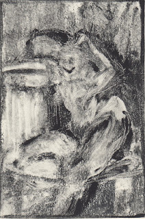
Light on shoulder, Monotype Akua intaglio on paper , 10 x 15cm

Light on Hip, Monotype Akua intaglio on paper  10 x 15cm

I am reading the book from the MOMA exhibit in NY, A Strange New Beauty, (which is a catalogue with essays about a show on Degas' monotypes) after receiving a postcard about the exhibit from a friend. I have always made monotypes this way but seeing Degas 'experiments' has made me want to explore my method and beyond anew. I used a toothbrush, a rag, Qtips and the back of my brush to make marks.  I forgot my brayer , my water bottle and my release agent when I went to my life drawing group so made do with what I had and rubbed the back of the paper with a wooden spoon.  I made a few other prints, but these were the most satisfying and successful.  They were both drawn 'backwards' so the resulting image is as I saw things.


Afternoon light on birdbath, Monotype Akua intaglio on paper with pastel, 10 x 15cm
In the afternoon, it was splattering with rain so I stood under the front porch with my plein air easel and my water-based ink.  I couldn't find the release agent (I have now) or the transparent base but I did have my brayer so I worked removing the black to indicate the light. I worked backwards and had to move the flower beds a bit closer than they really are to I could get it all on the plate. In the evening I added some pastel and returned to it today when there was a bit of sun.

I've joined a group: 'Inspired by Becker' http://ibbas.co.uk and want to make a seires of works capturing Suffolk light in the landscape with energetic marks.


Open Studio 2016


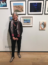
The first weekend of Open Studios 2016 was a joy! More than twenty friends and new visitors came for a look around the studio and to see my work. the conversations were interesting and different people had different favourites.  I am fortunate to have sold a few frame pieces too. 

If you haven't been before,  this view is one wall of my hanging system. There are two more... and I have three boxes of work by the window on the right.